Using Scriptable DevOps to Save Time

While developing an APEX app, I check my latest changes into a Git repository after reaching a feature milestone. In this article I’ll explain how I took advantage of APEX’s scriptable devops features to automate multiple steps in my daily workflow that I had previously been doing manually. The result are two simplified commands:

  • apex2git – exports an APEX app to a Git work area, staging changed files
  • git2apex – imports an app from a Git work area to an APEX workspace

In case the scripts could be useful to you to study or use, I’ve included a link to download the source at the end of the article along with a short video that illustrates how I use these commands in my daily work.

My Workflow Before Optimization

When adding a new feature to an existing app, I used to do all of the following steps one by one:

  • pull the latest app version from remote Git repo to my local work area
  • create a Git branch named after the feature ticket I’m working on
  • import the app from my Git work area into my APEX dev workspace
  • implement the new feature using the APEX App Builder
  • export the enhanced app to a temporary staging directory (e.g. /tmp/f1234_stage):
    1. as a single SQL file (e.g. f1234.sql), and also
    2. as individual component SQL files organized into directories, and also
    3. as readable YAML for easy diffing
  • copy new f1234.sql file to Git work area as my-app-name.sql
  • review the diffs between temp dir files and those in the Git work area
  • cherry-pick changed files from the temp dir and copy to Git work area
  • add the changed files to the Git staging area
  • commit the staged changes to the local Git repo
  • push the changes up to the remote team Git repo
  • initiate a merge request for my branch’s changes

That’s a lot of steps. Luckily I was able to simplify some of them as I learned a few new tricks.

Git Automatically Ignores Unchanged Files

The first optimization opportunity I discovered was a happy accident. Prior to this revelation, I was using a tool — Beyond Compare on Windows or Kaleidoscope on Mac — to compare the APEX export files in the temporary directory with corresponding files in the Git work area to identify which ones my feature work had changed. Then I would carefully copy only the changed files over to the Git work area.

Once, by mistake, I copied all of the files from the temp directory to the work area, and even mistakenly added them all to the Git staging area. After doing this unintentional blunder, I typed git status . To my surprise, despite all the files having a later timestamp, Git had automatically ignored adding to the staging area any file whose logical contents had not actually changed! This productivity gift meant I could simply bulk copy all the exported files to my work area without manually cherry-picking the changed files myself. Bravo, Git!

Using SQLcl to Export APEX Apps

While exporting and importing APEX apps in the browser is straightforward, I researched how I could do it from the command line instead. This felt like an enabling ingredient to automating more of my common workflow. I learned that SQLcl supports the apex export command that looked promising.

Through a series of trials, I converged on the following command that, given an application’s numeric id (e.g. 1234), would export it as a single SQL file into a target directory (e.g. /tmp/f1234_stage), including supporting objects, using original component ids, and skipping the inclusion of the export date. While the command is intended to be entered as a single line, I’ve formatted it below for better readability:

$ sql appuser/password@host:port/servicename
SQL> apex export -applicationid 1234
                 -dir /tmp/f1234_stage
                 -skipExportDate
                 -expOriginalIds
                 -expSupportingObjects Y 
                 -expType APPLICATION_SOURCE

The result of running the apex export command above is the single file f1234.sql containing the entire application source for application 1234, and this file gets created in the /tmp/f1234_stage directory.

The option to include supporting objects is self-documenting, but it’s important to understand the other two. Excluding the export date ensures component files with no other changes don’t differ from the existing version only due to the date on which they were exported. Using original ids maintains internal id numbers of components as teammates import the app and export it again from other APEX workspaces. Failure to use either of these two latter options could lead to unnecessary differences in files. Of course it’s also important to follow the best practice of using the same workspace id and be running the same APEX release (including patch set!) across different environments like Dev, Test, Prod, and private development. Failure to follow this best practice can cause uninteresting differences in the component files due only to the different workspace id values or different patchset levels.

While the single SQL file is useful for one-click installation, I also want to retrieve the individual application component SQL files organized into a directory hierarchy. This makes it easier to understand what components have been added, changed, or removed with each new feature. This requires adding the -split command line option. So the command to do an application export split into separate component SQL files is:

SQL> apex export -applicationid 1234
                 -dir /tmp/f1234_stage
                 -skipExportDate
                 -expOriginalIds
                 -expSupportingObjects Y 
                 -expType APPLICATION_SOURCE
                 -split

This results in a directory named f1234 containing all the split SQL component files organized into subdirectories, and the f1234 directory gets created inside the /tmp/f1234_stage directory.

Starting with APEX 22.1, the readable YAML export option allows much easier code reviews since it presents the application component metadata in an easy-to-understand text outline with property names and values that match what you see as a developer in the APEX builder. To export the readable YAML version of an app, we can use the new READABLE_YAML export type:

apex export -applicationid 1234
            -dir /tmp/f1234_stage
            -skipExportDate
            -expOriginalIds
            -expSupportingObjects Y 
            -expType READABLE_YAML

This results in a directory named readable containing readable YAML files for application artifacts organized into subdirectories, and the readable directory gets created inside the /tmp/f1234_stage directory.

Using SQLcl 22.1 against an APEX 22.1 workspace schema, it’s possible to include multiple export types in the same export command by using a comma-separated value for the -expType command line option. So I was able to combine the export of the “split” application component SQL and the readable YAML into a single command like this:

apex export -applicationid 1234
            -dir /tmp/f1234_stage
            -skipExportDate
            -expOriginalIds
            -expSupportingObjects Y 
            -expType APPLICATION_SOURCE,READABLE_YAML
            -split

This results in a directory named f1234 containing both the readable directory of the readable YAML files as well as all the split SQL component files organized into appropriately-named subdirectories, and the f1234 directory gets created inside the /tmp/f1234_stage directory.

Automating APEX to Git Export

The recipe I identified to export an APEX app with id 1234 into the Git work area for repository my-app in my home directory includes these steps:

  1. Create a temporary staging directory /tmp/f1234_stage
  2. Use SQLcl to apex export app 1234 to this staging directory
  3. Copy /tmp/f1234_stage/f1234.sql to ~/my-app/my-app.sql
  4. Deep copy /tmp/f1234_stage/f1234 to ~/my-app
  5. Add all files to Git staging area (Git includes only ones that really changed)

Since I was already familiar with Apache Ant for build automation, I used it to implement the recipe above and created an apex2git shell script and Windows batch file that simply invoke the Ant build script, passing along the command line arguments for application id, repo directory name (assumed relative to my home directory), and database connection string:

$ apex2git 1234 my-app appuser/password@host:port/servicename

Since it is common for a larger APEX application to be assembled out of several smaller applications, I implemented the Ant build script to accept the name of the Git repo directory or a subdirectory. So, for example, if you were implementing an application called MediPay that was broken down into a backoffice application and a mobile application, you might export the two distinct applications into distinct subdirectories of a medipay Git repo directory like this:

$ apex2git 1001 medipay/backoffice $MEDIPAY_CONNECTION
$ apex2git 1002 medipay/mobile     $MEDIPAY_CONNECTION

In this case involving a subdirectory, the Ant build script first converts the directory separator characters \ or / to a hyphen to end up exporting the more meaningful application export SQL scripts into:

~/medipay/backoffice/medipay-backoffice.sql
~/medipay/mobile/medipay-mobile.sql

Using SQLcl to Import an APEX App

Importing an APEX application from the command line involves calling the apex_application_install package to set the target workspace name, the target application id, and preference related to the installation of supporting objects, followed by running the application’s single-file SQL script.

So, for example, to import application 1001 from the medipay/backoffice Git repo directory into workspace medipay , we can using SQLcl’s sql or sqlplus to run the following PL/SQL block followed by the application’s SQL script:

begin
   apex_application_install.set_workspace('medipay');
   apex_application_install.set_application_id(1001);
   apex_application_install.set_auto_install_sup_obj(
                               p_auto_install_sup_obj => true );
end;
/
@/home/smuench/medipay/backoffice/medipay-backoffice.sql

Automating Git to APEX

The recipe I identified to import an APEX app with id 1234 from Git work area my-app in my home directory into workspace target-wksp includes these steps:

  1. Create a temporary staging directory /tmp/f1234_stage
  2. Copy ~/my-app/my-app.sql to directory /tmp/f1234_stage/f1234.sql
  3. Use SQLcl to set install options, then run /tmp/f1234_stage/f1234.sql

Again I employed an Ant build script to carry out these steps. Then I created a git2apex shell script and Windows batch script that invokes the Ant build script, passing along the command line arguments for application id, repo directory name (assumed relative to my home directory), target workspace name, and database connection string:

$ git2apex 1234 my-app target-wksp appuser/password@host:port/servicename

As before, to accommodate solutions comprising multiple smaller APEX apps, I implemented the Ant build script to accept the name of the Git repo directory or a subdirectory. So, for the MediPay application comprised of a backoffice application and a mobile application, you might import the two distinct applications from distinct subdirectories of a medipay Git repo directory into a workspace named medipay like this:

$ git2apex 1001 medipay/backoffice medipay $MEDIPAY_CONNECTION
$ git2apex 1002 medipay/mobile     medipay $MEDIPAY_CONNECTION

Ant: Using Templatized SQL Scripts

The apex2git command runs a apex2git.xml Ant build script that copies an apex2git.sql template SQL script to the temporary staging directory, substituting @APPID@ and @DIR@ tokens in the process using the values of the application id and repository directory parameters passed in:

REM apex2git.sql - v1.0
apex export -applicationid @APPID@ -dir @DIR@ -skipExportDate -expOriginalIds -expSupportingObjects Y -expType APPLICATION_SOURCE
apex export -applicationid @APPID@ -dir @DIR@ -skipExportDate -expOriginalIds -expSupportingObjects Y -expType APPLICATION_SOURCE,READABLE_YAML -split

Then it runs the resulting SQL script using SQLcl’s sql command against the provided database connection to produce the single SQL file, multiple component SQL file, and YAML exports in the temporary staging directory. It then proceeds to copy the exported files to the Git work area and add them all to the Git staging area.

Similarly, the git2apex command runs a git2apex.xml Ant script that substitutes command-line parameters into the following git2apex.sql template SQL script and then uses sqlto run it against the provided database connection.

REM git2apex.sql - v1.0
REM First setup the import options
begin
   apex_application_install.set_workspace('@WORKSPACE@');
   apex_application_install.set_application_id(@APPID@);
   apex_application_install.set_auto_install_sup_obj( p_auto_install_sup_obj => true );
end;
/
REM Then install the application by running its SQL script
@@DIR@/f@APPID@.sql

My Streamlined Workflow

Using the apex2git and git2apex scripts, I’ve streamlined my development workflows. When working alone on an APEX app, I tend to eschew branches and just push my changes directly to the repository, accompanied by a descriptive commit message that explains what new feature I’ve implemented:

  • pull the latest app version from remote Git repo to my local work area
  • import the app to my private dev workspace using git2apex
  • implement the new feature using the APEX App Builder
  • export the enhanced app to Git using apex2git
  • commit the staged changes to local Git repo mentioning feature I finished
  • push the changes up to the remote Git repo

In contrast, when working with others, I use feature branches and Git pull requests to facilitate code review by my peers:

  • pull the latest app version from remote Git repo to my local work area
  • create a Git branch named after the feature ticket I’m working on
  • import the app to my private dev workspace using git2apex
  • implement the new feature using the APEX App Builder
  • export the enhanced app to Git using apex2git
  • commit the staged changes to the local Git repo
  • push the changes up to the remote team Git repo
  • initiate a merge request for my branch’s changes for peer review

Checking Out the Scripts

In case you want to explore the scripts to see how they work, you can download them from here. Unzip the archive in your home directory, and make sure that the ./utils subdirectory it creates is in your system path. To keep things simple, the scripts currently rely on having all the apex2git* and git2apex* files in this utils subdirectory of the currently logged-in user’s home directory. Of course, you’ll also need to have SQLcl 22.1 and Apache Ant installed and have both sql and ant commands be available in your system path.

The simple usage documentation for the scripts is:

git2apex appId repoDirectory workspaceName connectionString

apex2git appId repoDirectory connectionString

The repository directory is interpreted relative to your home directory. You can see the commands in action in the short example video below.

Example of git2apex & apex2git in Action

In this short video, I show using git2apex and apex2git without using a feature branch for simplicity. This is the process I use when working alone on an APEX app that I source-control in a private Git repository up on GitHub. For example, the donor-tracking system I built for a local Italian non-profit and several personal productivity apps follow this approach. When working on sample apps as part of my day job at Oracle, we use an internal Git repository instead of GitHub for that. The git2apex and apex2git scripts work the same regardless of whether the git repo is only on your machine or whether it’s remote.

Next Stop: CI/CD Pipelines

APEX’s scriptable devops features let you create custom solutions to automate frequent tasks in your app development lifecycle. We’ve seen a simple example of their use in this article with apex2git and git2apex commands. My colleague Carsten has also documented a technique for exporting and importing APEX applications using a REST service in scenarios where that approach proves useful.

These options make it straightforward to incorporate APEX application export and import into more involved “pipelines” of continuous integration and continuous delivery. These automations are often triggered automatically by the merging of new code to the main branch of your Git repository, and can include steps that setup test data, execute unit tests and integration tests, and finally install a validated build of your application into a target environment if all tests pass. In future releases of Oracle APEX, we aim to make doing some of these steps even simpler from directly inside the builder. However, it’s good to know that in the meanwhile any kind of build automation is already possible to achieve with the ingredients APEX provides today.

SmartFiltering Multiple Regions

A fellow Oracle employee wielding the power of APEX to solve an internal business problem for her team asked an interesting question on our internal discussion forum this week. Her app shows resources partitioned into three categories in side-by-side cards regions. She wanted to use a single SmartFilter region to filter the results showing up in these three regions, each based on the same underlying table with a slightly different WHERE clause.

Wherever possible, my brain tends to map questions onto the familiar EMP and DEPT tables to simmer a question down to its essence. So I imagined side-by-side cards regions with employees in three different departments as shown below.

Three EMP-based cards regions partitioned by department

Setting Up the Page

I started by setting up the three cards regions based on the EMP table, and including an appropriate DEPTNO=10 where clause in the “Accounting” region, DEPTNO=20 predicate in the “Research” region, and DEPTNO=30 in the “Sales” region. Then I added a SmartFilter region and positioned it in the Before Navigation Bar slot with the w100p class to make to stretch to 100% width and fill up the space left in the center of the navigation bar.

A Twist on The Gift That Keeps on Giving

By default, a SmartFilter region filters the results of only one other region on the page. However, my colleague Carsten’s article Add a Chart to your Faceted Search Page is the gift that keeps on giving, because it inspired me with the idea I used to achieve the result our fellow APEX user desired. Carsten explains therein how to use the open_query_context() function in the apex_region package in a pipelined table function that returns the results from another region’s data source, automatically taking into account the search filters currently applied by the end user in that region. The implementation uses functions in the apex_exec package to retrieve the data.

My twist on his idea was to create a pipelined table function get_region_results_pk_values()to return only the primary key values of a given region’s filtered results. Assuming a numeric primary key column, the get_region_results_pk_values() function can accept three parameters:

  1. Page id
  2. Static ID of a region on that page
  3. Name of the primary key column whose value we should return

The function’s pipelined result rows will each contain a NUMBER column named ID containing the primary key values identifying the rows that the filtered region is returning. For our employee-based example here, it will return ID values representing the EMPNO values of the filtered region’s query results. With this function in place, we can update the WHERE clause of the three employees cards regions to reference get_region_results_pk_values() in an additional predicate like this:

  • “Accounting”
    • deptno=10 and empno in (select id from get_region_results_pk_values(:APP_PAGE_ID,'RESULTS','EMPNO'))
  • “Research”
    • deptno=20 and empno in (select id from get_region_results_pk_values(:APP_PAGE_ID,'RESULTS','EMPNO'))
  • “Sales”
    • deptno=30 and empno in (select id from get_region_results_pk_values(:APP_PAGE_ID,'RESULTS','EMPNO'))

Configuring the Filtered Region

To play the role of the SmartFilter region’s Filtered Region, we need an additional region based on the EMP table with no WHERE clause of its own. This is because using any of the Accounting, Research, or Sales cards regions would only filter the employee rows of one particular department and consequently its list of filtered EMPNO primary key values would not correspond to any employees in the other cards regions who, by design, belong to a different department.

So, I added an EmployeesResults classic report region based on the EMP table and configured this classic report region to be the SmartFilter region’s Filtered Region. I set the static ID of this region to RESULTS as referenced in the three WHERE clause function calls above.

A Chain Reaction of Filtering

When the end-user changes the filters on a SmartFilter, it automatically refreshes its filtered region. So in our example, the EmployeesResults classic report region will be refreshed. When this happens, we need the other three cards regions on the page to also get refreshed. Luckily, this is simple to achieve with a dynamic action event handler on the EmployeesResults region’s AfterRefresh event. I included three dynamic action steps in the TRUE branch of the event handler. Each one uses the built-in Refresh action to refresh one of the cards regions.

AfterRefresh dynamic action on filtered region refreshes employees cards regions

At this point, I had a working page with a SmartFilter at the top, whose search filters would restrict the rows in the filtered EmployeesResults region at the bottom, and whose filtered list of primary keys were correctly filtering the three separate Accounting, Research, and Sales cards regions as desired. However, seeing the classic report at the bottom was ruining the magic effect, so I sought out a way to hide it.

Classic report filtered region displays, ruining the magic

Hiding the Filtered Region

My first experiment was to set the Server-side Condition on the filtered EmployeesResults region to Never. This succeeded in hiding the classic report, but it also broke the chained filtering functionality being implemented by the dynamic action. I guess a region that’s not rendered on the server can’t be used to trigger events on the client, which I could understand.

For my second attempt, I went looking for properties of the classic report region that I could adjust to limit the data that it was retrieving. After all, I primarily cared about the filters applied to its data source, not seeing the results themselves in the classic report. These applied filters are important to correctly produce the filtered list of primary keys to filter the Accounting, Research, and Sales cards regions appropriately.

With the classic report EmployeesResults region selected, I studied the Attributes tab of the property palette and noticed a Number of Rows property which I tried setting to zero (0). I figured the classic report functionality related to pagination might be producing some content on the page, so I also set the Pagination > Type to the value No Pagination (Show All Rows). Since I knew that the SmartFilter region uses partial page refresh to update the filtered region, I kept the Partial Page Refresh switch in the ON position.

Setting the classic report to retrieve no rows & skip pagination, keeping partial page refresh

These changes got me very close to the desired result, but as shown below the column headings were still showing.

Almost There! The Filter chaining works, but the filtered region’s column headers still show

I managed to resolve this final issue by hiding the classic report’s column headings using the CSS property display:none. I accomplished this by adding a CSS class called hidden to the page-level CSS > Inline settings:

hidden {
   display: none;
}

After doing this, I configured the EmployeesResults classic report region’s Column CSS Classes to be the name of my hidden CSS class. After doing that, I had a working SmartFilter that was filtering the three separate cards regions, without showing the classic report region involved in triggering the chain reaction of filtering.

Filtering Code In the Demo

In practice, the APEX 21.2 demo app that you can download using the link below is based on an EMP-like table called EBA_DEMO_WORKLIST_EMP and the filtering code for the function is in a package named EBA_DEMO_WORKLIST whose specification looks like this. The package body looks very similar to Carsten’s blog article, but it’s simplified to only return the single primary key column of results in each row.

create or replace package eba_demo_worklist as 
    type eba_demo_worklist_pk_t_row is record (
        id number
    );

    type eba_demo_worklist_pk_t_tab is table 
        of eba_demo_worklist_pk_t_row;

    function get_region_results_pk_values( 
        p_page_id          in number,
        p_region_static_id in varchar2,
        p_pk_column_name in varchar2 )  
    return eba_demo_worklist_pk_t_tab pipelined;
end;
 

You can download the demo app from here, and install it into an APEX 21.2 (or later).

Upgrading Dynamic Sort to 22.1 Order By Page Item

Overview

Your end users appreciate seeing your application data in the order that best suits the task at hand. While some region types like Interactive Report offer end-user sorting as a native capability, other popular types like Cards lacked this feature. While it was definitely possible before APEX 22.1 to create Cards regions with user-controlled sorting, the new Order By Page Item feature in APEX 22.1 now makes it incredibly easy to implement. This article explores upgrading an existing dynamic sorting cards region to the new 22.1 Order By Page Item to improve the clarity and maintainability of your application.

Understanding the Existing Implementation

We’ll look at upgrading an existing APEX 21.2 example app with a single Cards page showing a list of friends (Download). The region’s select list page item allows end users to sort the friends list by name, age, or time you’ve known the person.

APEX 21.2 Friends app cards page with dynamic sorting

The page contains a P1_SORT_ORDER select list item with a static list of values showing the end-user the different available sorting orders, with a corresponding code value. The default value for this page item is set to the value NAME so the default sorting order will be alphabetical by friend’s name. The page item uses the Maintain Session State setting of Per User (Disk), so the user’s preferred sort order is remembered automatically across sessions:

Static list of values behind the P1_SORT_ORDER select list

The cards region’s data source is a Function Body returning a SQL Query. It returns a SQL query with an ORDER BY clause determined using a CASE statement that depends on the value of the :P1_SORT_ORDER page item as shown below. Note that the NVL() function is used here to ensure that the APEX builder can successfully parse the function body’s resulting SQL query at design time (where the value of the :P1_SORT_ORDER bind variable will be null).

return  q'[  select id,
                   name,
                   to_char(birthday,'Mon fmdd') born_on,
                   trunc((sysdate - birthday)/365) age,
                   static_image_file_name,
                   apex_util.get_since(met_on) met_them
              from friends
              order by
        ]'||
        case NVL(:P1_SORT_ORDER,'NAME')
            when 'NAME'               then 'name     asc'
            when 'AGE_OLDEST_FIRST'   then 'birthday asc'
            when 'AGE_YOUNGEST_FIRST' then 'birthday desc'
            when 'KNOWN_LONGEST'      then 'met_on   asc'
            when 'KNOWN_SHORTEST'     then 'met_on   desc'
        end;

Notice the order by clauses use a combination of ascending and descending sorting clauses. Finally, the P1_SORT_ORDER page item is configured with a Page Action on Selection property set to Submit Page, so the page re-renders to reflect the new sorting order. This also has the side-effect of sending the new value of the P1_SORT_ORDER item to the server so it can be saved into per-user session state by the APEX engine.

Setting the Order By Page Item

After importing the 21.2 Friends starting app into an APEX 22.1 workspace, editing the page, and selecting the Friends cards region in the Page Designer, we see it currently has No Order By Item.

Clicking on the No Order By Item button opens the Order By Item dialog where we can choose the existing P1_SORT_ORDER item in the page as the Order By Item for this region. After doing this, the dialog helpfully updates automatically to reflect the display and return values of the existing list, reminding us of which sorting option key values we need to provide ORDER BY clauses for:

Order By Item dialog after setting Order By Item name to existing P1_SORT_ORDER select list

We proceed to fill in the Clause field for each entry, using the ORDER BY clause fragments currently returned by the CASE statement in the Function Body Returning SQL Query code. After completing this task, the dialog will look like what you see below:

Order By Item dialog with ORDER BY clauses filled in based on existing CASE statement fragments

After clicking OK, the Order By Item reflects the name of the order by item and indicates how many Order By options are available in the related select list:

Order By Item property reflecting name of order by item and number of order by clauses

Simplifying the Region Query

Now that we’ve “refactored” the dynamic query clause selection to be done declaratively using the new Order By Item, we can simplify the Friends region source to be an easier-to-read-and-maintain SQL query instead of the function body returning SQL query. We start by copying the text of the SELECT statement to the clipboard so we’ll be able to easily paste it into the SQL Query property after changing the region source type. Next, we change the region source type to SQL Query. Then, we paste the query saved in the clipboard into the SQL Query property to result in the following situation. Notice that we left out the order by text from the query that was there before because the APEX engine will add that for us at runtime.

Upgraded cards region with simpler-to-understand SQL query

Trying Out the First Cut

If we run the application it appears to work fine, showing us the cards with our friends’ smiling faces initially sorted by the default NAME column value. However, if we choose one of the other sort orders, we get a runtime error like this:

ORA-00904: "BIRTHDAY": invalid identifier ORA-06512: at "APEX_220100.WWV_FLOW_PAGE", line 2062 ORA-06512: at "APEX_220100.WWV_FLOW_DISP_PAGE_PLUGS", line 1576 ORA-06512: at "APEX_220100.WWV_FLOW_CARD_REGION", line 1099 ORA-06512: at

This error occurs because the ORDER BY clause that the APEX engine adds at runtime based on the value of the region’s Order By Item is applied in an outer query that “wraps” the region’s original SQL query, using it as an inline view. In fact, after choosing to sort by age, the error dialog or APEX debug log shows the query in error. Note that I’ve added some additional comments and removed some query hints for clarity.

select *
from (
  select a.*,row_number() over (order by null) apx$rownum 
  from (
    select *
    from (
      select *
      from (
       /* ---vvv--- REGION SQL QUERY ---vvv--- */

       select id,
              name,
              to_char(birthday,'Mon fmdd') born_on,
              trunc((sysdate - birthday)/365) age,
              static_image_file_name,
              apex_util.get_since(met_on) met_them
       from friends

       /* ---^^^--- REGION SQL QUERY ---^^^--- */
      ) d
    ) i 
    /* ---vvv--- ORDER BY ITEM CLAUSE ---vvv--- */

    order by birthday asc

    /* ---^^^--- ORDER BY ITEM CLAUSE ---^^^--- */
  ) a
)
where apx$rownum <= :p$_max_rows

Adding Columns to the SELECT List of the Region’s Query

To avoid the error, we need to study the ORDER BY clauses in play in the Order By Item and ensure that any column names referenced by those order by clauses are included in the SELECT list of the region. This guarantees that they will “shine through” to the outer, wrapping SQL statement where the dynamic ORDER BY is applied.

In our Friends example app, this means adding the BIRTHDAY and MET_ON date columns into the region’s SQL Query select list so that the query now becomes:

select id,
       name,
       to_char(birthday,'Mon fmdd') born_on,
       trunc((sysdate - birthday)/365) age,
       static_image_file_name,
       apex_util.get_since(met_on) met_them,
       birthday,
       met_on
  from friends

After doing this adjustment to the SELECT list, rerunning the application shows that the query works perfectly with all of the configured dynamic sorting options. However, the page appears to be getting refreshed twice each time the end-user changes the sort order. We’ll fix that next.

Avoiding Double Page Refresh

While the query with dynamic order by now executes without an error, the presence of two spinning progress indicators (and the time required to refresh the page) gives the impression that the page is being refreshed twice.

The page refresh shows two progress indicators and the page/region is refreshed twice

This effect is the result of the following two factors:

  1. The original page’s P1_SORT_ORDER page item is configured with a Page Action on Selection property set to Submit Page, so the page re-renders to reflect the new sorting order, and
  2. The APEX 22.1 Order By Page Item feature automatically refreshes the region when the related order by page item’s value is changed.

The solution to the double-refresh issue is restoring the P1_SORT_ORDER page item’s Page Action on Selection property value to the None setting. This avoids its submitting the page since that action is no longer necessary.

Removing the previously configured page submit when the P1_SORT_ORDER item changes value

With this change in place, the dynamic sorting is now using the maximally-declarative approach, we’ve improved the readability and maintainability of our region’s SQL query, and the page refreshes a single time and is looking great.

Updating the Theme to Use New Sort Order Position

APEX 22.1’s updated Universal Theme adds a new Sort Order template layout position designed to contain the region’s components that the end-user uses to configure the region’s sort order. To have our upgraded Friends page use this new layout position, we need to refresh our application’s theme before the Page Designer will show us this new position name.

So, I navigated to Shared Components and clicked the Refresh Theme button at the top of the page.

Refreshing the theme to 22.1 to use the new Sort Order layout position

After visiting the User Interface application settings to restore the application’s Redwood Light theme style, returning to edit the page in the Page Designer allows us to now set the P1_SORT_ORDER page item to have the new Sort Order layout position:

Choosing the new Sort Order layout position for the Order By Item P1_SORT_ORDER

Conclusion

With these changes in place, we have upgraded our existing dynamic sorting implementation for a 21.2 cards region to leverage the latest 22.1 declarative region sorting feature. The result is an application that is easier for colleague developers to understand and maintain. It also ensures the existing pages offering dynamic sorting are implemented in the same way that new pages created in 22.1 will be when dynamic sorting is added automatically by the new Create Page wizard. If you care to study the before and after applications, you can download the upgraded 22.1 version of the Friends example app from here.

Enabling Persistent Auth in an Existing APEX App

Overview

A new APEX 22.1 feature I’ve been eagerly waiting to use in my production APEX apps is persistent authentication. It will allow my users to avoid having to login again every time they open my app in their phone or browser. After enabling the feature at the instance level, I needed to slightly adjust my existing application’s login page to take advantage of this new capability. This article explains how I figured out the minimal changes needed to update my existing APEX application to use this new sought-after “Remember me” functionality.

Enabling Persistent Auth at Instance Level

Persistent authentication is controlled by an instance-level security option that is disabled by default, so I needed to enable it for my APEX instance. After logging in to APEX’s administration services, I chose Manage Instance > Security and set Allow Persistent Auth to Yes. The default 30-day lifetime met my application’s needs, but to change it you can adjust the value of the Persistent Authentication Lifetime Days property. This is the number of days that the persistent authentication will last before the user needs to enter their password again.

Using YAML Export with SQLcl to Diff Existing and New Login Pages

An existing application’s login page needs a few minor changes to offer the “Remember me” feature. In contrast, when creating a new application in APEX 22.1, ticking the Install Progressive Web App checkbox in the Features section of the Create Application wizard will generate a login page that supports it. I took advantage of this fact to create a new application called Temp App to compare its Login page 9999 with my existing application’s Login page 9999 to determine the minimum adjustments needed.

The easiest way to compare APEX artifacts in 22.1 is using the new readable YAML export format. SQLcl 22.1 supports the new READABLE_YAML value for the -expType option of its apex export command, so I ran the following commands to export my existing (103) and new Temp App (102) applications in readable YAML format so I could compare the two page 9999 Login pages’ metadata:

$ sql workspace_schema_username/password@host:port/service
sql> apex export -applicationId 103 -dir f103 -expType READABLE_YAML
sql> apex export -applicationId 102 -dir f102 -expType READABLE_YAML

Using Visual Code to compare the two application’s p09999.yaml files, I noticed the following three interesting differences:

  1. The newly-generated Login page has a new checkbox page item named P9999_PERSISTENT_AUTH with a server-side condition to show the checkbox only when the persistent_auth_enabled function in the apex_authentication package returns true.
YAML diff showing new P9999_PERSISTENT_AUTH checkbox page item
  • The new page’s Login process passes the value of this new P9999_PERSISTENT_AUTH checkbox to a new p_set_persistent_auth parameter of the login() procedure in the apex_authentication package:
YAML diff showing additional argument on login() procedure call in the Login process
  • The P9999_REMEMBER checkbox has a new server-side condition to only render if the persistent_auth_enabled function returns false.
YAML diff showing additional server-side condition in P9999_REMEMBER checkbox

The value of the persistent_auth_enabled function corresponds to the instance level security setting I enabled above, so these three differences result in having the login dialog behave the same as before if the instance-level persistent authentication setting is disabled, and to show the new “Remember me” checkbox if the persistent authentication instance-level setting is enabled.

Adjusting the Existing Login Page

After identifying the three important changes to make above, I edited my existing application’s Login page to do the following:

  • Added a new checkbox page item with:
    • Name = P9999_PERSISTENT_AUTH
    • Label = Remember me
    • Server-side Condition Type = Expression
    • Server-side Condition = apex_authentication.persistent_auth_enabled
    • Maintain Session State = Per Session (Disk)
  • Added the additional argument to the existing Login process, referencing the value of this new page item:

apex_authentication.login(
p_username => :P9999_USERNAME,
p_password => :P9999_PASSWORD,
p_set_persistent_auth => nvl(:P9999_PERSISTENT_AUTH,'N')='Y');

  • Adjusted the server-side condition of the existing P9999_REMEMBER checkbox to be:
    • apex_authentication.persistent_cookies_enabled and not apex_authentication.persistent_auth_enabled

With these changes in place, the persistent authentication feature started working as expected in my existing application. However, while studying the differences between the login pages, I noticed one additional interesting change:

YAML diff showing change to how login page icon is specified

The method used to express the login page’s icon changed from using an icon property to instead use a file-url. This is due to another new feature in APEX 22.1 related to simplifying how an application’s icon can be configured at any time using a built-in or custom icon image.

Reflecting New App Icon in the Login Page

My application was still using the original default icon that got set by the APEX Builder when I first created the application. At the time, I took the default icon because I figured I’d be able to easily set the icon later. However, before 22.1 changing an application’s icon after creation was not obvious. Now in 22.1, doing so is very simple. To flex this additional newfound icon power, I visited my application’s Shared Components > User Interface Attributes settings page and clicked on the Change Icon button to set a new custom Vincent van Gogh icon.

Then, following the observation I noticed above, I copied the Reference path #APP_FILES#icons/app-icon-512.png of the “Large icon” version of the application icon image to the clipboard so I could paste it into the file-url property of the Login page’s static region, and then clicked on Apply Changes to make my new icon change permanent.

Returning to my Login page, I selected the static content region and removed the existing “app-icon” value in the Icon property, and set the value of the File URL property to #APP_FILES#icons/app-icon-512.png

With these changes, my application’s login page was now not only more beautiful but also more functional, and my end users don’t need to login every time anymore.

21.2: Fine-Tuning Initial Render of Tabs & Cards

If you use a Static Content region with the Tabs Container template to present subregions on separate tabs, in APEX 21.2 you might notice during initial page render that you momentarily see the contents of all the tab “pages” before they disappear behind the initially selected tab. Depending on the contents of the tab pages, the result may be more or less noticeable. However, since one of my applications presents multiple tabs of colorful Badge Lists, the “Easter eggs” below compelled me to search for a solution…

Three Badge List regions situated in a Tabs Container all render momentarily during page load

Luckily, my colleagues Tim and John helped me with a combination of simple CSS suggestions that solved the problem. After adding two rules to an application-level CSS file, the undesirable effect vanished.

While the two CSS rules that avoid the flashing tabs could be applied to each page where needed, I prefer a “one-and-done” solution. An application-level CSS file is best for rules that apply to all pages, so I added the two rules in there. Under Shared Components > Static Application Files I created an app.css file with the contents shown below:

App-level app.css file with two rules to suppress flashing of all tab containers’ contents

Next, I clicked on the copy icon next to the #APP_FILES#app#MIN#.css name under Reference to copy that file path to the clipboard so I could paste it into the list of CSS files that my application will load with every page. That configuration is also under the Shared Components settings, on the User Interface Attributes page, in the Cascading Style Sheets section. I pasted the file reference on its own line in the text area as shown below:

List of App-level CSS file URLs that APEX will load with every page

With this app-level CSS file in place, my landing page was looking sharp.

Landing page with Tabs Container of three Badge Lists and a Chart region

Energized that my app’s tab pages were looking great now, I turned my focus next to my application’s Cards regions. I noticed that APEX shows a row of placeholder cards when the page initially draws to help the end-user understand an asynchronous data request is in progress to retrieve the actual card information.

APEX Card regions initially show placeholder cards, then actual cards appear once data loads

This employs a familiar technique that other modern web applications like LinkedIn, Facebook, and YouTube use.

YouTube shows placeholder cards initially, then actual cards appear once data loads

In situations where the card data takes time to retrieve, placeholders are a useful affordance for the end-user. In my particular app, it seemed to add less value since my cards render almost instantly.

I used Chrome Dev tools to explore the structure of the page to see if a similar CSS technique might be able to hide the placeholder cards. After none of my experiments panned out, again my colleague Tim nudged me back onto the happy path with a suggestion. I edited my app.css file to add the one additional rule you see below that delivered the results I was hoping for.

/* Contents of app.css */
/*
 * Suppress tab container contents from flashing
 * during initial page render
 */
.a-Tabs-panel {
	display: none;
}

.no-anim .t-TabsRegion-items > div {
    display: none;
}

/*
 * Suppress cards region from rendering initial row
 * of placeholder cards during initial page render
 */
.no-anim .a-CardView-item > div {
    display: none;
}

These CSS rules use a combination of class selectors ( .someClassName) and the child element selector ( > someElement). Effectively they say:

  • Hide elements with the a-Tabs-panel class
  • Hide div child of parent with classt-TabsRegion-items inside element with class no-anim
  • Hide div child of parent with class a-CardView-item inside element with class no-anim

Keep in mind that these rules only affect the initial display state of the affected elements since APEX automatically makes the relevant elements visible again once they are ready for the end-user to see.

With these three rules in place, the user sees only the selected tab’s Badge List as expected and my quick-loading cards without placeholders. In case you want to try the example application, download it from here. Try commenting out the CSS rules in app.css in the example to see the difference with and without so you can decide what’s best for your own application use cases.

Card region showing Paul Theroux books

Nota Bene

I’ve tested these techniques in APEX 21.2 but need to remind you that the particular structure of how APEX universal theme generates HTML elements in this release is not guaranteed to remain the same across future APEX releases.

Trick to Reference Field Value in Dynamic Action on Grid Column

The Oracle APEX interactive grid region is a richly functional component with a JavaScript API for all aspects of its multi-row user interface and client-side data model, but this article concerns something simpler. I was recently building an application with an interactive grid and wanted the change in one date field in the row to update the value of another date field in the same row. I knew it would be simple to achieve, but there was a little trick I needed to learn from a colleague to crack the nut.

Consider the interactive grid below that displays an Order Date, Ship Date, and Bill Date for some line items. Let’s investigate the two easiest ways I could find to set the Ship Date and the Bill Date to the value of the Order Date whenever the end-user changes the Order Date.

Interactive grid with three date fields per row

To react to the change in Order Date, I right-clicked on the ORDER_DATE grid column in the Page Designer and created a dynamic action event handler named “When Value Changed” keeping the default “Change” event.

Creating a dynamic action on the ORDER_DATE interactive grid column

Since I wanted to set the value of the Ship Date field to the value of the Order Date in the current row, the “Set Value” type of action step felt like a good choice. I wanted it to affect the Ship Date field, so I chose the SHIP_DATE column name in the Affected Elements section. I needed the ORDER_DATE column in the current row to provide the value to assign. My first instinct was to look for a Set Type of “Column”, but that wasn’t listed among the types available. The next most likely candidate for Set Type was “JavaScript Expression”, so I selected that and used the expression: $v('ORDER_DATE') Alas, after trying this expression, I wasn’t seeing the desired result. Luckily, my colleague Interactive Grid master John Snyders taught me the trick I needed to get things working.

In the JavaScript world of the grid, the ORDER_DATE is the name of the column. Here what I learned I needed to reference instead was the value of the “column item”, the name of the particular item in the current row of the ORDER_DATE column. John explained that by setting the Static ID of the ORDER_DATE column to some name other than ORDER_DATE, I could assign a meaningful name to the column item for this column. Just to make it really clear what I was doing, I set the Static ID for the ORDER_DATE column to be COLUMN_ITEM_FOR_ORDER_DATE. Then I updated my “When Value Changed” dynamic action event handler’s “Set Value” action step to reference $v('COLUMN_ITEM_FOR_ORDER_DATE') as shown below for the JavaScript expression providing the value to set.

After setting Static ID of the ORDER_DATE column, referenced it as column item in the “Set Value”

After doing that, the Ship Date in the current row suddenly started updating interactively as I had hoped whenever the Order Date got changed. This technique illustrates the way to implement the requirement on the client-side without incurring a round-trip to the server to perform the assignment.

To assign the Bill Date, I wanted to show off the other technique I experimented with. Building on the same dynamic action event handler, I added a second action step with action type “Execute Server-side Code”. For the PL/SQL code, as shown in the figure below, I simply used the page item names as bind variables and APEX automatically interprets them as the values in the current row:

:BILL_DATE := ORDER_DATE;

As the name of the action type implies, this approach executes the PL/SQL on the server-side, so we need to remember to configure the Items to Submit to include the ORDER_DATE and the Items to Return to include the BILL_DATE as shown below.

Setting interactive grid column Bill Date to the value of Order Date using Server-side PL/SQL

In this second server-side approach, I was able to directly reference the name of the ORDER_DATE and BILL_DATE columns without involving the Static ID name. That additional trick was only required for use in the JavaScript expression shown earlier.

Of course, since the “Set Value” using the JavaScript Expression is performed completely on the client-side in end-user’s browser, it is faster than the Execute Server-side code technique that requires an additional HTTP round-trip to the server to perform the assignment. It’s good to understand both approaches and pick the one that meets your needs best in your own applications.

You can download the sample application if you want to check out the technique in your own APEX workspace.

Checking If a Region’s Data Source Returned Any Data

Oracle APEX lets application developers easily use any data they need. A region’s data can come from a local table or view, the rows returned by a SQL query, a REST service’s response payload, or rows from a table, view or query sent to a remote, REST-enabled SQL database. APEX also supports the conditional visibility of regions and page items using a declaratively-configured “server-side condition”. Let’s consider a use case that combines these features to show or hide a region based on whether it contains any data. In other words, if the region’s data source returns rows, then show it, otherwise hide it.

At first, the solution sounds simple. One of the Server-side Condition types is “Rows Returned”. This configures the region to be processed and displayed when at least one row is returned from the SQL Query that you type into the box below. This works great for regions based on local data that the user cannot filter further, but if the end-user can filter the data using interactive report/grid filtering, a faceted search, or smart filters, how can this “Rows returned” query correctly reflect the end-user’s active filters applied? What’s more, if the region uses a REST service or REST-enabled SQL data source, then what SQL Query do we type in here? The APEX engine executes the Server-side condition’s “Rows returned” query against the local database, so it won’t be useful to determine if the remote data source returns data. So we need another strategy when a region employs remote data or might be actively filtered by the end-user.

Server-side Condition “Rows returned” query is executed against the local database

I didn’t find any ready-made APEX API to inquire whether a region’s data source returned data, so I set out to write my own. Luckily, I had recently read my colleague Carsten’s great article Add a Chart to your Faceted Search Page. There he explains a technique to produce a chart of exactly the same filtered results as another report region on the page that has been filtered using a faceted search region. The crux of his clever plan involves using the open_query_context() function in the apex_region package to obtain a logical cursor over that region’s data, which can be used to process its data one row at a time. The cursor-like “query context” returned by this API hides the underlying details of how the data is retrieved, so it works the same way no matter how the region is configured to source its rows. It also conveniently encapsulates the current state of the user’s applied filters, if any.

In Carsten’s article, the chart needs all of the other region’s rows to visualize them graphically. However, for our purposes we can use a simplified version of his approach that just attempts to retrieve a single row to see whether or not the region has data or not. The has_data() function in the region_utils package below implements the idea. When someone calls has_data('CHART'), for example, passing in the static id of a region on the current page, the function…

  1. looks up the region id using the region’s static id and the id of the current page
  2. opens a query context “cursor” on the region’s data source indicating that it wants to retrieve at most one row (p_max_rows=>1),
  3. tests whether the cursor has at least one result row by calling next_row(),
  4. closes the context, and
  5. returns the result of whether or not a first row was returned.
create or replace package region_utils is
  function has_data(p_region_static_id varchar2) return boolean;
end;
/
create or replace package body region_utils is
    function boolean_to_string(p_value boolean) return varchar2 is
    begin
        return case when p_value then 'TRUE' else 'FALSE' end;
    end;
    --
    function has_data(p_region_static_id varchar2) return boolean
    is
        l_context     apex_exec.t_context;
        l_region_id   apex_application_page_regions.region_id%type;
        l_return      boolean;
        l_page_id     number := v('APP_PAGE_ID');
        l_app_id      number := v('APP_ID');
    begin
        -- 1. Lookup region id using static id & page id
        select region_id
        into l_region_id
        from apex_application_page_regions
        where application_id = l_app_id
          and page_id        = l_page_id
          and static_id      = p_region_static_id;
        -- 2. Open "cursor" on region's data source (max 1 row!)
        l_context := apex_region.open_query_context(
                       p_page_id   => l_page_id,
                       p_region_id => l_region_id,
                       p_max_rows  => 1);
        -- 3. Test if there is a next (i.e. first) row.
        l_return  := apex_exec.next_row( p_context => l_context );
        -- 4. Close the context "cursor"
        apex_exec.close( l_context );
        apex_debug.info('--- region_utils.has_data(''%s'') = %s',
                        p_region_static_id,
                        boolean_to_string(l_return));  
        -- 5. Return whether we got a row or not
        return l_return;
    exception when others then
        apex_exec.close( l_context );
        raise;
    end;
end;
/

With this package in place, we can configure a chart region having static id of CHART to have a Server-side Condition using the “Expression” type as shown below to include the single line of PL/SQL code that uses our new has_data() function:

Using new has_data() function in a PL/SQL Expression for Server-side Condition

This approach worked great for a page that did not need the chart region’s data to be refreshed based on actions the end-user takes while using the page. When I tried to employ it on a page with interactivity, there was a learning opportunity awaiting me.

Consider the example below where the user can choose a department from a select list and immediately see a pie chart of all of the employees salaries in that department. Here both the shared component LOV for department names and the employees chart region below are based on REST-enabled SQL using a remote database.

Refreshing the chart region when Department changes

What I discovered from trying the Server-side Condition mentioned above with this more dynamic example was that when the condition evaluates to false, the chart component was left out of the page completely (as expected, perhaps!) so in some cases it was not present in the browser HTML page for my dynamic action on the select list to interact with.

To get the more dynamic use case working how I wanted it, I abandoned the idea of using the Server-side Condition to hide the chart, and resorted instead to using dynamic actions to conditionally hide and show the chart region based on the result of calling region_utils.has_data('CHART'). I introduced a hidden page item P1_CHART_HAS_DATA and added an additional function to my region_utils package has_data_as_string() to return the result of the has_data() function as either the string TRUE or FALSE for easy storage in this new, hidden page item. Then I used a Client-side Condition on several dynamic action steps to test the value of this P1_CHART_HAS_DATA page item using the JavaScript expression:

$v('P1_CHART_HAS_DATA') === 'TRUE'

The figure below shows the four-step dynamic action event handler for the Change event on the P1_DEPTNO select list page item. The first step uses has_data_as_string('CHART') to set the value of the hidden P1_CHART_HAS_DATA page item, submitting the P1_DEPTNO page item value since the region’s query depends on it. Then the subsequent three steps use a Client-side Condition JavaScript expression to conditionally Refresh the chart region if it had any data to graph, conditionally Show the chart region if it had data, and conditionally Hide the chart region if it did not have data. In this last situation, the JavaScript expression tests if $v('P1_CHART_HAS_DATA') === 'FALSE' while the previous two steps tested for 'TRUE'.

Dynamic action event handler on the Change event of the P1_DEPTNO select list to set value of P1_CHART_HAS_DATA and conditionally refresh, show, or hide the chart

After making the Hide dynamic action step Fire on Initialization to initially hide the chart region when the P1_DEPTNO select list has its default null value, this combination achieved the result I was looking for.

You can download the example app, and during import you will need to configure its REST-enabled SQL endpoint named slc12kos to point to your own REST-enabled SQL endpoint that has the EMP and DEPT tables available.

One tip my colleague Carsten mentioned when I was asking him questions about this approach was that if the chart region’s data were coming from a REST service instead of a REST-enabled SQL source, that would give you some additional options to use APEX’s periodic REST synchronization feature or REST source caching to reduce the number of HTTP requests between the APEX engine and the remote data endpoint when rendering the chart region in this example.

The final source for the region_utils package looks like the code below. For more information on enabling REST-Enabled SQL in your ORDS listener, check out Tim Hall’s video on Setting up REST-Enabled SQL over on his Oracle-Base blog.

create or replace package region_utils is
  function has_data(p_region_static_id varchar2) return boolean;
  function has_data_as_string(p_region_static_id varchar2) return varchar2;
end;
/
create or replace package body region_utils is
    function boolean_to_string(p_value boolean) return varchar2 is
    begin
        return case when p_value then 'TRUE' else 'FALSE' end;
    end;
    --
    function has_data(p_region_static_id varchar2) return boolean
    is
        l_context     apex_exec.t_context;
        l_region_id   apex_application_page_regions.region_id%type;
        l_return      boolean;
        l_page_id     number := v('APP_PAGE_ID');
        l_app_id      number := v('APP_ID');
    begin
        -- 1. Lookup region id using static id & page id
        select region_id
        into l_region_id
        from apex_application_page_regions
        where application_id = l_app_id
          and page_id        = l_page_id
          and static_id      = p_region_static_id;
        -- 2. Open "cursor" on region's data source (max 1 row!)
        l_context := apex_region.open_query_context(
                       p_page_id   => l_page_id,
                       p_region_id => l_region_id,
                       p_max_rows  => 1);
        -- 3. Test if there is a next (i.e. first) row.
        l_return  := apex_exec.next_row( p_context => l_context );
        -- 4. Close the context "cursor"
        apex_exec.close( l_context );
        apex_debug.info('--- region_utils.has_data(''%s'') = %s',
                        p_region_static_id,
                        boolean_to_string(l_return));  
        -- 5. Return whether we got a row or not
        return l_return;
    exception when others then
        apex_exec.close( l_context );
        raise;
    end;
    function has_data_as_string(p_region_static_id varchar2) return varchar2 is 
    begin
        return boolean_to_string(has_data(p_region_static_id));
    end;
end;
/

Adding Tags Using Multi-Value PopupLOVs and Smart Filters

Overview

Google’s Gmail was the first app I remember that popularized users’ inventing their own descriptive labels and applying them as “tags” to data. Instead of moving an email from the “Inbox” folder into one named “Charitable Donations 2019 USA”, for example, it encouraged me to tag the message with multiple, distinct labels like “2019”, “taxes”, “charitable donations”, and “USA”. While not initially as intuitive as folders, this approach quickly proved its value. It let me quickly locate mails related to a particular year, to charitable donations, to taxes in general, or to the US, or any combination of those criteria.

For the same reasons, a flexible tagging facility comes in handy for many kinds of data we work with everyday. Whether it’s pictures in a photo library, products in an online store, or books in your collection, tags that help users quickly find what they are looking for are a boon. When combined with Oracle APEX’s powerful faceted search and Smart Filters capabilities, it packs a powerful productivity punch.

In this article, I explain the technique I used over the holidays to add a flexible tagging facility to my art tracker application using a no-code approach that takes advantage of APEX’s multiple value support in popup LOV page items and Smart Filters. Here, we’ll apply the approach to a simple application that tracks books, publishers and authors. You can find the link to download the example application at the end of the article.

Book Finder page featuring Cards region showing title, authors, publisher, and tags

Multi-Value PopupLOV for Tags

The BOOK_TAGS table defines an ID and NAME for the descriptive tags you can apply to books. The sample data includes pre-defined tags like “Trains” (2), “Travel Narrative” (1), “Children” (5), “Fiction” (6), and others.

The BOOK_TITLES table contains a book’s TITLE, the PUBLISHER_ID, and a TAGS column, whose value is a colon-separated list of tag ids. For example, a book that is a fictional travel narrative about riding on trains might have the value “6:1:2” representing the id values of the three tags “Fiction”, “Travel Narrative”, and “Trains”. Since the order of the the tags is not significant to our use case, it also might have the value “1:2:6” depending on the order in which the end-user added the tags to the list.

The figure below shows how I configured the P3_TAGS page item in page 3’s form region to support visualizing and editing the possibly-multiple tags applied to a book. Notice that the page item type is Popup LOV, the Multiple Values property is enabled, the literal colon character (:) is indicated as the value Separator, and the Search as You Type property is on. I’ve configured a shared component TAGS_LOV List of Values to provide the alphabetized list of available tags.

Configuring multi-value popup LOV page item in an edit form page

Pay special attention to the Manual Entry setting above. We’ve consciously disabled that property since by design at the moment APEX shows the end user the underlying values (e.g. 6 , 1 , 2 ) for a manual-entry popup LOV instead of showing their corresponding display text values (e.g. Fiction , Travel Narrative, Trains ). That may be appropriate for some multi-value use cases where the LOV entry’s display and return values are the same, but here I preferred that my end-users would see the tag display values.

The result is the easy-to-use book editing page shown below. Notice that the P3_AUTHOR_IDS page item is configured in the same way as P3_TAGS to allow entering the colon-separated list of one or more author ids for the book.

Multi-value popup LOV page items editing book details at runtime

Multi-Value Smart Filter for Tags

APEX makes it simple to easily filter on one or more tags applied to records in both faceted search as well as the new Smart Filters region. The figure below shows how the P5_TAGS smart filters search facet in the Book Finder cards region page (5) is configured to enable this behavior. Notice the search facet Type is set to Checkbox Group, the Multiple ValuesType is set to Delimited List with the Separator configured to be a literal colon character (:), and we’ve enabled the Trim Whitespace option.

Configuring multi-value P5_TAGS smart filter facet to handle colon-delimited values

This is the only configuration necessary to get the tags field working for searching. The result produces a smart filter search field (above our cards region) on page 5 in the example app that looks like the figure below. Ticking one or more tags in the list narrows the search results to show only books having that/those tags applied (in any order).

Checkbox Group smart filters facet to search for books by one or more tags applied.

As above, the P5_AUTHOR_IDS search facet has been configured identically to the P5_TAGS one to allow narrowing down the search results by any combination of authors and/or tags as shown below where we’ve found books authored by Brian Spendolini about APEX.

Applying two multi-value smart filters: one for authors, one for tags

Displaying Multi-Value Fields in Report Regions

When working with multi-value columns like TAGS and AUTHOR_IDS in our BOOK_TITLES example table, it’s useful in report pages or card regions to show the list of display values corresponding to the one-or-more ids stored in the colon-separated column value. For this task, I employed the handy LISTAGG() function to aggregate the set of related tag display values and author names into an ordered, comma-separated list. I combined it with the useful split_numbers() function in the apex_string utility package. When wrapped by a table() operator, this helpful routine lets us select the numbers in the colon-separated list as a table row source right in the query. To make it easier to use this information from any report or card regions where I needed it in my application, I created the BOOK_TITLES_V database view with the following SELECT statement.

select 
    b.id,
    b.title,
    b.tags,
    b.rating,
    b.publisher_id,
    b.author_ids,
    (select listagg(name,', ')
            within group (order by name collate binary_ai)
       from book_tags 
      where id in (
        select column_value 
          from table(apex_string.split_numbers(b.tags,':'))
        )
    ) display_tags,
    (select listagg(name,', ')
            within group (order by name collate binary_ai)
      from book_authors 
     where id in (
       select column_value 
         from table(apex_string.split_numbers(b.author_ids,':')))
    ) display_authors,
    p.name as publisher
from book_titles b
left outer join book_publisher p 
             on p.id = b.publisher_id

Notice that I’m passing the literal colon character as the separator to the apex_string.split_numbers() function in two places, and passing the separator string consisting of a comma followed by a space to the listagg() function. The collate binary_ai keywords in the order by part of the listagg function’s within group clause ensures that display values sort in an accent-insensitive (and case-insensitive) way.

Enabling Custom PopupLOV Behavior via CSS Class

I had achieved my goal without writing any code and was happy with how simple it was to implement… when I noticed an interesting extra-credit opportunity that piqued my interest.

While interacting with the PopupLOV component, I observed that its Search as You Type filter remained “sticky” across multiple interactions with the dropdown list of choices. For example, consider the screenshot below where I was editing the tags for a Bill Bryson book. If I typed tr into the PopupLOV search field, as expected the list narrowed down to only show relevant tags “Trains” and “Travel Narrative”. However after choosing “Trains”, if I clicked again into the multi-value field to drop-down the list to choose another tag to apply, the list remained filtered as before to only those tags containing tr in their names. However, often the next tag I wanted to apply required me to clear the previous search field text to start fresh with the complete list of tags to choose from or search through.

Search as You Type filter in use in a PopupLOV for tags applied to a book.

After not finding any declarative PopupLOV setting to control the “stickiness” of the search field value, I began by experimenting with various ideas using dynamic actions to force the PopupLOV search field to clear. Not satisfied with the results, I reached out to my colleague John for some expert advice.

He suggested I implement generic JavaScript code in an app.js static application file that would automatically enable a custom behavior whenever a PopupLOV page item had a particular custom CSS class applied to it. This way, the code was reusable and enabled declaratively by simply adding a CSS class name like popup-lov-reset when the non-default search-field-resetting behavior was desired. The figure below shows the modal Edit Book page (12) called by the full card action on the card region of the Book Finder page (5). Notice the custom CSS class name popup-lov-reset in the AdvancedCSS Classes section. This is the signal to our generic code in app.js that this particular PopupLOV prefers the reset-search-field behavior each time the user engages the page item’s dropdown list.

Opting-in to custom application behavior by adding a custom CSS class to a page item

If you’re curious, you can study the full details of the custom JavaScript code John helped me with in the downloaded example app. However, most important were the higher-level principles he taught me along the way about how he recommends structuring application-level JavaScript code. Since I’m not a JavaScript expert, these were the even more interesting bits of precious knowledge that I felt fortunate to learn from him.

The high-level structure of the code in the example application’s app.js file appears below. It exposes a single app namespace inside of which can appear private functions specific to its implementation. This app namespace exports only the members it wants to be the public API. In this application, only the single function handlePopupLOVsWithSearchResetClass() is exported.

// Export just a single global symbol "app" to keep code clean
const app = (function($) {

    // Function private to the impl of the
    // exported 'app' namespace

    function makeResetPopupLov(itemName) {
      // Code removed for clarity here registers an event
      // handler on body of the page to react to the popupopen
      // event of PopupLOV page item in question.
      // See example app for full details.
    }

    // app namespace members
    return {
        //----------------------------------------------------
        // Turn any PopupLOV page items on page into ones that
        // reset their search field when dropdown pops open. 
        //----------------------------------------------------
        handlePopupLOVsWithSearchResetClass: function() {
            $(".popup-lov-reset.apex-item-popup-lov").each(
                function() {
                  makeResetPopupLov(this.id);
                }
             );
        }
    };
    // Ensure $ in app namespace resolves to correct jQuery
})(apex.jQuery);

If we include the “document ready” event handler code below inside the app.js file, then all pages in the application magically inherit the ability to have any PopupLOV page item on the page opt-in to reset-search-field behavior just by adding the CSS class name popup-lov-reset in the page item’s AdvancedCSS Classes section. In contrast, if you only want the functionality to be available on selected pages, then include this event handler code just on the specific pages where you want the behavior to be available.

// Inside app.js, runs for every page after document is ready
// Alternatively, you can just add to the pages where you want
// the behavior to be available.
//
// "Document Ready" event handler code
$(function() {
    app.handlePopupLOVsWithSearchResetClass();
});

If you want to try out the example for yourself, then download the APEX 21.2 example application here.

Capturing Lat/Long Address Info Without a Map

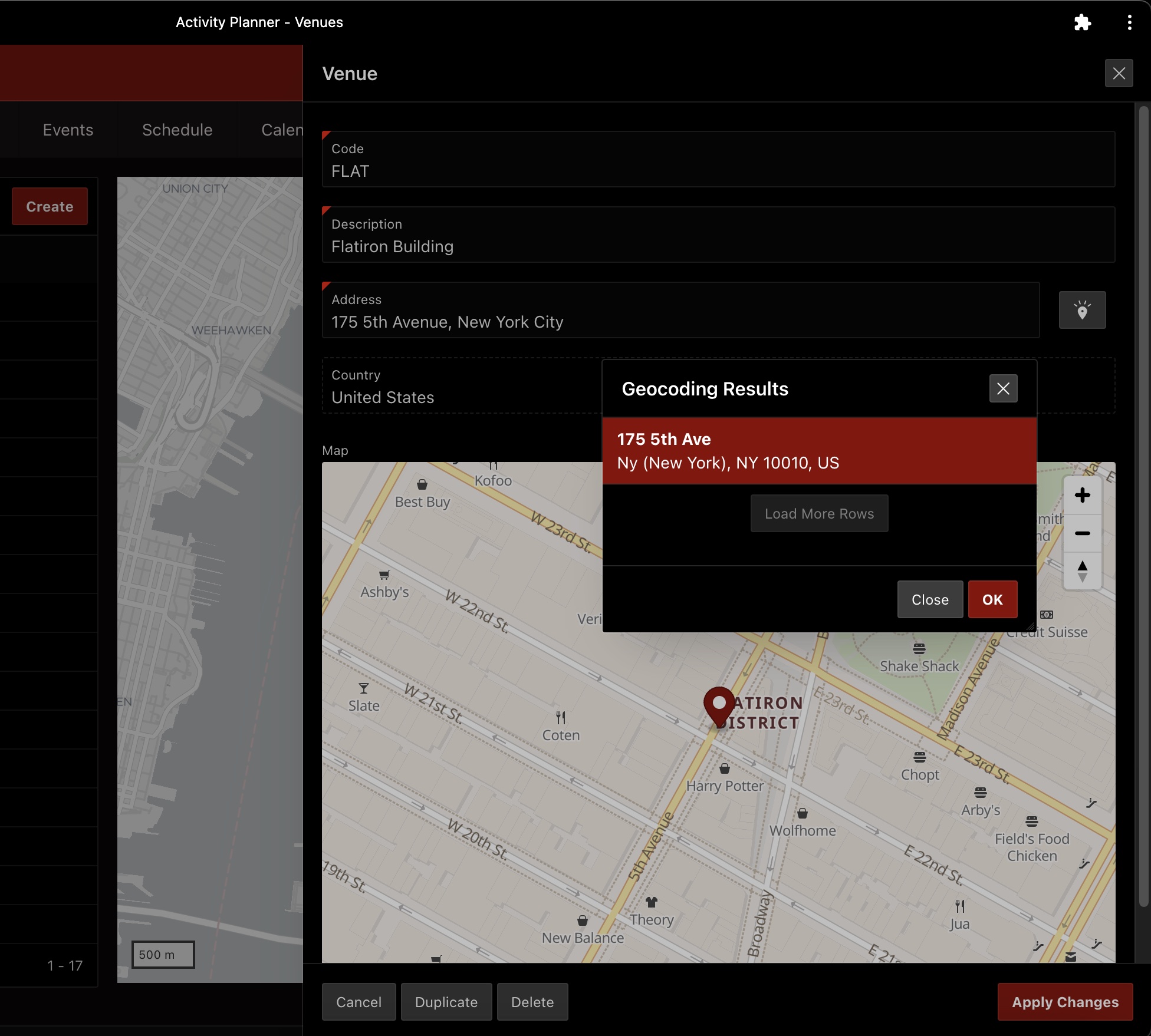
The new APEX 21.2 Geocoded Address page item makes it easy to translate user-entered address information into a point you (or your user) can see on a map. After the user-entered address information has been geocoded and the user has confirmed which matching address is correct, the value of the Geocoded Address page item is the text of a GeoJSON document representing the point on the map for that address.

Your application can decide whether the end-user will provide their address input in one of two ways:

  • A single “unstructured” page item containing street, city, and postal code info, or
  • Separate “structured” page items for street, city, and postal code

In either case, the country can be fixed by your application, or can be a value from a Pn_COUNTRY page item into which your user enters (or chooses) a country.

For example, entering the address in a single field might look like the screenshot below this for your end-users, separating the street, postal code, and city by a comma as they enter the address information. Of course, in your application the latitude and longitude fields will likely be configured to be hidden and be related to corresponding columns in the underlying table. Here in the sample app I’ve built, they are just transient page items to show off the geocoding result.

By default, submitting the form automatically triggers the geocoding, but you can also configure the geocoded address page item to be triggered by a Dynamic Action. After configuring this page item property, to complete the functionality you then need to add a dynamic action event handler — for example, a Click event handler for a button — that includes an action step of type Trigger Geocoding.

The geocoded address page item includes a map display of the point that the user has confirmed. If your underlying table has a column of type SDO_GEOMETRY then the GeoJSON value of the geocoded address will effortlessly be saved by the default APEX DML process for the form region. So, these defaults provide a no-code experience that caters to the most common situation.

However, what happens if you are working with a data model that requires storing the longitude and latitude of the point in separate LONGITUDE and LATITUDE columns? And what if you don’t want to immediately display the point on the map, but only capture the numerical coordinates. Then read on to discover how to accomplish these two tweaks to the default behavior.

We can accomplish both tasks in a completely declarative way, but we’ll take the second part first since it’s the simpler of the two. To hide the map, there are two steps:

  1. Set the application-level component settings for the Geocoded Address page item to disable the Map Preview
  2. Set the AppearanceCSS Classes property on the item so that even the read-only display field is hidden.

The Geocoded Address component exposes some application-level configuration properties that you can set in the Shared ComponentsComponent SettingsGeocoded Address section of the APEX builder. In the screenshot below, you can see I’ve unchecked the Item checkbox in the Map Preview section. This ensures that not only will the map be visually hidden, but also that browser will avoid retrieving any map tile images. Also notice I’ve configured the Geocoder Match Mode to the value Relax All to give the most chance of matching the address on all pieces of information the user supplies. By clicking on the help icon next to this field, you can see the description of the different behavior the various values imply.

For the second step, just set the AppearanceCSS Classes property for the Geocoded Address page item to:

u-VisuallyHidden

See Universal Theme utility classes for more information on classes like this one and others.

Next let’s implement the assignment of the longitude and latitude values from the geocoded address. The value of the geocoded address page item will be the GeoJSON point information about the geocoded address. It will look something like this (with indenting added by me to improve readability):

{
  "type": "Point", 
  "coordinates": [
    -122.1173, 
      37.8923
  ]
}

This is the information that will be saved into the underlying SDO_GEOMETRY column if your table has that. However, here we’re considering the situation when the table has separate LONGITUDE and LATITUDE columns instead of an SDO_GEOMETRY column.

Luckily we won’t need to process this JSON document ourselves because APEX provides the dynamic action event Result Selection [Geocoded Address] that fires when the user confirms which of possibly-multiple matching addresses is the one they want to use. We can handle this event with a dynamic action event handler, whose action steps can assign the longitude and latitude without writing code.

When the event fires, its event object contains a data property that contains all of the information about the geocoded address. This information includes the latitude and longitude values that we need, along with a number of other interesting pieces of information like the following (discovered using the browser’s developer tools console):

data: {
  "country"         : "IT"
  "edgeId"          : 55331351
  "houseNumber"     : "123"
  "language"        : "ITA"
  "latitude"        : 45.40329
  "longitude"       : 11.87561
  "matchCode"       : 1
  "matchVector"     : "??010101010??000?"
  "matchVectorScore": 100
  "municipality"    : "Padova"
  "name"            : ""
  "percent"         : 0.17
  "postalCode"      : "35122"
  "region"          : "PADOVA"
  "sequence"        : 0
  "settlement"      : "Padova"
  "side"            : "R"
  "street"          : "Via Roma"
}

So, assigning the P1_LONGITUDE and P1_LATITUDE page items can be done by creating a dynamic action event handler for the Result Selection [Geocoded Address] event using two separate Set Value action steps configured as follows:

  • “True” Action Step 1
    • Action: Set Value
    • Settings > Set Type: JavaScript Expression
    • Settings > JavaScript Expression: this.data.longitude
    • Affected Elements > Selection Type: Items(s)
    • Affected Elements > Items(s): P1_LONGITUDE
    • Execution Options > Fire on Initialization: False
  • “True” Action Step 2
    • Action: Set Value
    • Settings > Set Type: JavaScript Expression
    • Settings > JavaScript Expression: this.data.latitude
    • Affected Elements > Selection Type: Items(s)
    • Affected Elements > Items(s): P1_LATITUDE
    • Execution Options > Fire on Initialization: False

The figure below shows the APEX Page Designer showing the properties of the second declarative dynamic action step for the structured Geocoded Address page item in the example app that is assigning the value of the latitude to the P1_LATITUDE page item.

Action step for structured Geocoded Address assigns latitude to P1_LATITUDE

Thanks to members of the APEX community on Twitter like @daust_de and @andremlde for suggesting several improvements that made this article better since my original published version.

You can download this sample application from here.

Enhancing Existing APEX App with PWA, Nav Bar Items & Smart Filters

I was excited to try three powerful new no-code-required APEX 21.2 features in my art tracker application, and I finally had an hour to spare after work this week to give it a go. This article documents my successful attempt to evolve the showcase page from my existing app to leverage the space-saving Smart Filters search region, leaving more room for the cards that visualize the main application content.

In the process I regained even more screen real estate by positioning items in the navigation bar using the new layout positions available in 21.2’s Universal Theme. And last but not least, I enabled users of my app to install it like a native desktop or mobile application for quick access from the home screen or dock and faster startup time. Read on if any (or all!) of these features sound like they might be a useful upgrade in your own APEX application.

The screenshot below shows the main page of my application before the enhancements. It employs a faceted search region and two select-list page items in a Left Column layout position to let users find the artworks they are looking for. They can also switch dynamically among several useful orderings and interactively change the display size of the images. These complement a Cards region showing the works of art they are tracking.

Main page of an APEX 21.1 art collection app using faceted search and cards region

Setting the Stage

While none of these three new features required writing any code, the simplest of all to enable was the installable Progressive Web App capability. I first needed to ensure my app was using Friendly URLs, as shown below in the application definition’s Properties tab. While I was here, I also changed the Compatibility Mode to 21.2, which is a prerequisite to refreshing its Universal Theme version to 21.2. As we’ll see shortly, this theme refresh allowed me to access the new, flexible layout positions in Page Designer.

Ensuring friendly URLs are used and setting compatibility mode to 21.2

Installable Native App in Two Clicks

With these two settings configured appropriately, I proceeded to enhance my application to allow installation on desktop or mobile devices. As shown below, on the Progressive Web App tab of the application definition, I just needed to switch on the Enable Progressive Web App toggle, as well as the Installable toggle. The former enables the device to cache key application resources for faster startup, while the latter lets users add the app to their home screen or dock to launch it like every other app on their computer, phone, or tablet.

Turning your app with friendly URLs into an installable native app in two clicks

Adding Existing Items to the Nav Bar

The new page item positions are made available by the 21.2 version of the Universal Theme. Since my existing application is using the theme’s 21.1 version, the new positions won’t show in Page Designer until I’ve refreshed the theme to version 21.2. Above, we set the application’s Compatibility Mode to 21.2. This is a required step to be able to refresh our theme to the latest 21.2 version that supports the new page item positions.

Refreshing the Theme

From my application’s Shared Components page, I clicked on Themes. My application only uses a single theme “Universal Theme” (number 42), so I clicked on its name to edit it. On the Edit Theme page, as shown below, clicking the (Refresh Theme) button gets the job done. If by chance I had forgotten to update the application compatibility mode to 21.2, I would have seen a helpful error message telling me to go do that first before attempting again to refresh the theme.

Refreshing Universal Theme to latest 21.2 version to see new component positions

Seeing the New Page Positions in Page Designer

After updating the Universal Theme, editing the page in Page Designer shows the new positions. The one I was specifically interested in is Before Navigation Bar. This will allow me to position my sort control, size control, and new smart filter search field into the previously unused space in that bar. If you don’t see the Before Navigation Bar position (or any of the other new ones) you might have hidden the empty positions. If so, then as shown below, right-click on the layout panel and ensure that Hide Empty Positions is unchecked.

Existing art collection page in Page Designer before starting the changes

Moving Existing Items/Regions into New Positions

I had previously grouped the two select lists that control the dynamic sorting and card image size into a static content region called Sort. I could have simply set the Layout Position property of this Sort region to Before Navigation Bar, but I wanted to see how individual items could be placed into the new positions without belonging to a region, so instead I did the following for both the P18_ORDER_BY and P18_ZOOM page items:

  • Set the Layout Parent Region property to No Parent.
  • Set the Layout Position property to Before Navigation Bar

Changing Faceted Search to Smart Filters

My existing page was using the Left Side Column template, and the existing faceted search region (named Filter) resided in the template’s Left Column position. So I started by selecting the Filter faceted search region and changing its Layout Position property to Before Navigation Bar.

After doing this, I no longer needed the Left Side Column page template, so I set the page template to Theme Default to free up the space currently taken up by the left column, and deleted the now-empty Sort static content region. After, right-clicking on the layout pane to select Hide Empty Positions, the in-progress page looked like what you see below.

In-progress work after moving items and Filter region to Before Navigation Bar position

Next, I needed to change the region type of the Filter region from Faceted Search to Smart Filters. However, before doing this, for each facet I made a note of the following three elements of its definition:

  • Facet name (e.g. P18_ARTWORK_TYPE)
  • List of Values name (e.g. TYPE_LOV)
  • Icon name (e.g. fa-shapes)

This step simplified my recreating the same filters under the Smart Filter region. At the moment APEX does not automatically convert the existing facets into filters when the region type changes from Faceted Search to Smart Filters. However, with the information noted down above regarding the facet names, LOV names, and icon names, setting up the new filters was just a few additional clicks. So, in practice this missing automatic conversion was not a big deal.

After changing the Filter region’s type from Faceted Search to Smart Filters, an initial filter named P18_SEARCH got created for me. This is the mandatory search filter that will search on row text by default. Next I proceeded to recreate the five additional filters using the same names, corresponding List of Values, and icon names that the facets were using previously. I kept the default Checkbox Group type for each filter I created, and finally (based on a tip from my colleague Vincent) I set the CSS class on the Filter smart filter region to w100p so that it would stretch to fill up the space in the navigation bar. Then, I ran the page to test out the upgraded functionality.

As shown below, by default the Smart Filters region shows a suggestion “chip” for each filter category below the search bar with the most popular value and a record count for each filter type. [Note: the record counts have been replaced in the screenshot by (..)]

By default, the Smart Filter search region shows suggestion chips for each filter with counts

These suggestion chips simultaneously educate the end-user about the available filters as well as provide useful information about the most popular value for each category. Clicking on the label of a particular filter chip, the end-user can select specific value(s) they want to search for in that category. In contrast, clicking on the suggestion chip value, applies that most-popular value to the user’s search.

For my particular application, I preferred to further streamline the navigation bar by disabling these suggestions. To suppress the suggestion chips, I set the Maximum Suggestion Chips to the value zero (0) on the Attributes tab of the Filter region as shown below.

Disabling the Smart Filter suggestion chips for a region if desired.

Installing the App on Windows and iPad

After saving this Page Designer change and re-running the page, I saw the result below without the suggestion chips. Notice the new (Install App) button in the navigation bar. When I enabled the Progressive Web App feature above, the APEX builder added a new item into the Navigation Bar list which advertises the ability for the user to install the application on their device.

Enabling PWA with the Installable option adds a new (Install App) navigation bar button

Clicking on the (Install App) button in Chrome or Edge desktop browser let me install the application in one click on my desktop. I tried the same thing on my iPad and there the app can also be installed using the native iOS gesture of clicking on the share icon and choosing “Add to Home Screen” as shown below.

Adding your installable APEX application to the iPad’s home screen

This allowed me to long-press on the home screen icon for the application to enter “wiggle mode” so I could drag it into to my iPad’s dock like this:

Native app icon for an APEX application in the iPad dock

Clicking this new iPad dock icon launched the app into a full screen experience indistinguishable from other native apps on my iPad as shown below. Also notice that the (Install App) navigation bar button no longer displays, so APEX has configured the new navigation bar list entry to be conditionally displayed only when it makes sense. A nice touch!

Full screen iPad app user experience looks like every native app

Trying the Smart Filters User Experience

Back on my Windows desktop machine, I repeated this same experience of launching the application from the dock and noticed it now displayed in its own window with no browser address bar as shown below. Clicking into the Smart Filters search field, the user sees which filter categories are available and can click one of them to choose specific values to search for in that category…

Filter categories suggest the smart ways the user can narrow their search

Alternatively, the user can just start typing some text to search for. As shown below, after typing the two characters gr into the search field, the Smart Filters region shows matches in any appropriate categories. It’s showing some artists (e.g. Gregory Mason, Rich Pellegrino), an artwork type (Photography), and some sources (i.e. stores) like Ross Art Group and others, all which contain a “gr” in their name. If desired, clicking on one of these filter category matches will apply that filter to the search for the respective category.

Filter search matches show in the drop down as the user types

The user can ignore the filter category suggestions and just keep typing, for example, to enter the search term grand and upon pressing [Enter] they’ll see the artworks that contain grand in their row text (title plus other card text) as shown below.

Resulting show all types of artwork with “grand” in their title

Clicking again into the search field, suppose the user clicked on the Type filter category and selected Painting. That would result in the situation shown below where the results have been narrowed to only show paintings with “grand” in their title.

Results filtered to show only paintings with “grand” in the title

Clicking back on the “Type: Painting” filter chip in the search bar, the user can select other types of artwork to also include as shown below. The set of choices available is automatically filtered to reflect the narrowed search results so other types of artwork like “Animation Cel” are not in the list since no animation cel in the collection contains the word “grand” in the title or descriptive text.

Adding additional types of artwork to the search

After further narrowing the results by Decade and Source, the result looks like what you see below. Clicking back into the search field only shows those filter categories that are not already involved in the filter.

After applying multiple filters, only unused filter types show in the dropdown

I was very satisfied with the functionality and additional screen space I gained in my application by uptaking these new features. In short order, without having to write any code, I evolved my application to give users more room to see the primary subject of the application (the artwork cards!) while gaining a compact searching interface every bit as powerful and smart as the faceted search I was using before.
What’s more, enabling the installable Progressive Web App (PWA) feature let my users have a more native desktop and mobile experience that looks like all the other apps on their machine when they’re using my app.
Of course, in many use cases users may appreciate a more “AirBnB”- or “Amazon”-style search experience with the faceted search items always visible, but the new Smart Filters region gives developers a new option to consider when users may appreciate the powerful search capability to be more compact so other page content can be the star of the “show”.

I encourage you all to give these three new features a try!

P.S. In the process of doing the enhancements above, I also simplified the P18_ORDER_BY and P18_ZOOM select list items to have no visible label and fiddled with CSS styling to get these two items to be positioned and sized exactly how I wanted them in the navigation bar. But as I’m not a CSS expert, I didn’t want to offer any advice on what I did to achieve the final result since I’m not certain yet that it’s the best way. Once I have a chance to check with colleagues with more CSS expertise, I’ll either write a new blog article about that or update this article with more specific advice.