An Oracle colleague asked how to create an editable Interactive Grid against an APEX collection. I share the solution here along with a few observations I learned while creating it.
Client Side Grid Model
An interactive grid manages an in-memory record set in the browser. This is called the model. An editable grid’s model also tracks rows the end user has added, modified, and deleted. When the user submits the page or clicks the grid toolbar’s (Save) button, the changes in the model are sent to the server for processing by the Interactive Grid – Automatic DML page process.
The client-side model uniquely identifies rows using the values of the region columns marked as Primary Key and assumes those values won’t change. For rows the user creates, it generates a temporary unique key.
Grid Primary Key Cannot Change
When the grid saves a new row, the grid-assigned temporary key gets replaced by the database-assigned key. That’s the only key-change situation the grid allows.
I had begun by using the APEX_COLLECTIONS view’s SEQ_ID as the grid’s primary key column, thinking it was a safe choice for an unchanging unique key. This wrong assumption was the gotcha I encountered when pairing the grid with an APEX collection. I learned that it’s definitely unique, but it’s not necessarily unchanging. In certain situations, the collection’s sequence ID can get reused or changed.
The more obvious way this can happen is if the developer calls any of the APEX_COLLECTION package’s procedures that affect the ordering of the collection like: SORT_MEMBERS, MOVE_MEMBER_UP, MOVE_MEMBER_DOWN, or RESEQUENCE_COLLECTION.
But what I ran into was something more subtle. Assume we use a collection for a simple shopping cart with columns:
C001 as ITEM_CODE
N001 as QUANTITY, and
D001 as NEED_BY_DATE
I ran into trouble with the following scenario:
Add “Banana” to the shopping cart grid
Click (Save) on the grid toolbar to persist that changes in an AJAX request
Delete “Banana” from the grid
Add “Cherry” to the shopping cart grid
Click (Save) on the grid toolbar again
At this point, I received an error in the JavaScript console:
Uncaught TypeError: Cannot read properties of null (reading 'serverOffset')
at Object._resequenceServerOffset (modelViewBase.min.js?v=24.2.2:4:40633)
at Object._clearChanges (modelViewBase.min.js?v=24.2.2:4:39956)
at modelViewBase.min.js?v=24.2.2:4:13563
How Collection Assigns SEQ_ID
The APEX_COLLECTION package assigns a unique sequence ID to each member as you add it. It uses the straightforward approach of using one greater than the maximum sequence ID currently in the collection, or one (1) if the collection is empty.
In the above scenario, my “Banana” row got assigned SEQ_ID = 1. Then when I deleted “Banana” and inserted “Cherry,” at save time APEX Grid Automatic DML page process performs deletes first. This removed “Banana” from the collection, leaving no members. Then the insert of “Cherry” was performed. At that time, since there were no members in the collection, “Cherry” was a assigned a sequence of one (1).
When the grid’s AJAX save request returned, it needs to consolidate the rows in its client-side model with the new data returned from the server. At that time, its in-memory row set it still has “Banana” with primary key value 1 (marked as deleted). But in the new data returned in the AJAX response, it finds a new row “Cherry” also with primary key value 1 marked as a new row. At this point the model gets confused because it assumes the primary keys never change unless it’s the grid-assigned temporary key changing to the database-assigned key value during insert.
Using a SYS_GUID Instead
The solution is to generate a unique key value and store that into the collection in one of the generic columns. Here we’ll use C002 to store a value we’ll assign using the SYS_GUID() function. By then configuring the grid to use this unchanging unique value, the above use case works fine.
Shopping Cart Package API
I created the following PL/SQL package API to encapsulate my use of the APEX Collections API behind a more meaningful set of function and procedure names related to adding items to a shopping cart:
The shopping cart API above hides the details of working with the APEX_COLLECTION package from the rest of my application pages. A final touch was creating a database view to hide references to the APEX_COLLECTIONS generic view from my pages as well. I created the following view:
create or replace view shopping_cart_v as
select c001 as item_code,
c002 as id,
n001 as quantity,
d001 as need_by_date
from apex_collections
where collection_name = 'SHOPPING_CART'
The Solution Sample App
This let me create a grid based on the SHOPPING_CART_V view and configure the grid’s DML page process to have custom PL/SQL-based save-time logic based on the SHOPPING_CART_API package. The Grid DML page process settings appear below. Notice I’ve disabled row locking and lost update protection. Since the collection data is private to the current user session, there’s no chance another user can lock or change a row.
The complete code for the PL/SQL Code to Insert/Update/Delete looks like this:
Since APEX treats all page items and grid columns as strings, I use the GET_NUMBER and GET_TIMESTAMP functions in the APEX_SESSION_STATE package to get a correctly typed number and date value, respectively. These functions automatically take into account any format mask configured on the item or column if present.
Declaratively Wiring Button to Grid Action
The demo includes two pages. Page 1 has a grid with the toolbar turned off and footer turned off, forcing the save to happen using a normal page submit (Save) button. Since the (Add Item) button is part of the grid toolbar, if the toolbar is hidden the end user has no way to add a row. So I wanted to put an (Add Item) button on the page that let users add a new row to the grid.
My colleague John Snyders taught me a declarative technique for doing this by:
Assigning the grid a static ID like shoppingcart
Setting the Action of the button to Defined by Dynamic Action, and
Configuring the button’s Custom Attributes property to be data-action="[shoppingcart]selection-add-row"
This instantly made my button perform the grid’s native add row action and let me position the button anywhere on my page instead of having to enable the grid toolbar just to have the (Add Item) button.
One Final Quandry Resolved
After configuring the (Add Item) button, I was puzzled when I noticed my button label “Add Item” got changed at runtime to “Add Row“. It turns out when you declaratively “wire” a button to an action, then on page load the button label takes on the action label automatically. The grid lets you configure the label of the (Add Row) toolbar button, however that property value is only visible and editable and persisted if the grid toolbar is on. So, with no developer-overridden action label saved for the “Add Row” operation in the grid region metadata, it reverts to the default label of “Add Row”.
I solved this by setting the label of the selection-add-row action to “Add Item” in my grid region’s JavaScript initialization function using the following tiny bit of code:
I later learned I could do avoid writing the line of JavaScript that sets the action label by adding an additional custom attribute data-no-update="true" to my (Add Item) button. John pointed me to the Buttons section of the grid JavaScript docs that mentions this tip in a sentence that says, “If you don’t want the label, title, or icon to be updated add [this] attribute…”
Processing the Shopping Cart Contents
The sample app does not do this, but just for completeness know that your app can process the contents of the shopping cart using a PL/SQL cursor for loop. This use case offers another compelling reason to create a view to hide direct access to the APEX_COLLECTIONS view. It makes your business logic easier to read as well. Such a loop in this shopping cart example would look like:
for j in (select item_code, quantity, need_by_date
You can download the sample app from here to install in APEX 24.2 or later. It includes Supporting Objects code for the SHOPPING_CART_API package you can study further. Enjoy!
To commemorate Joel Kallman Day, I dive into four interesting APEX ideas related to dynamic behavior that my dev team colleagues John Snyders and Stefan Dobre taught me recently. We’ll explore how to:
Declaratively compute a dynamic default for a cascading child list
Conditionally hide or show a page item based on a SQL query lookup
Interactively validate user input to show invalid fields before submitting
Easily set several features of a grid and refresh it keeping selected rows.
Download the sample to follow along in APEX 24.1, or read first and download later. Let’s get started.
Note: To see any figure in its original size, right-click on it and open it in a new browser tab.
Configuring Cascading Lists
Cascading lists are a pair of LOV-driven page items where the value of a “parent” list influences the choices available in a “child” list. For example, as shown below, when choosing an automobile the end user first picks a car brand (e.g. Ford, Toyota, Tesla) then chooses a car model from the selected brand.
Example of cascading lists to first choose an automobile brand, then a model from that brand
In Oracle APEX, it’s simple to configure cascading lists. Just decide which page item type works best for your use case – like Select List or Popup LOV, among others – and then set the Parent Item name on the child list as shown below.
Setting the Parent Item property of the P5_MODEL_SELECTLIST child cascading list
Your list of values SQL query for the child list can reference the value of the parent list as a bind variable. For example, the figure below shows a simple data model for car makes and models.
Data Model for Cascading Lists to choose brand (or “make”) and model of an automobile
If the parent page item is P5_MAKE_SELECTLIST and the child list is P5_MODEL_SELECTLIST then the child’s LOV SQL Query might look like the following to retrieve the model_name and id for cars whose auto_make_id is the one selected in the parent list:
select model_name, id
from eba_demo_auto_model
where auto_make_id = :P5_MAKE_SELECTLIST
order by model_name
APEX automatically includes the parent item’s current value in the request it sends to the APEX server to refresh the child page item’s list of values. It’s not the case in this simple example, but if your child list depends on multiple parent items’ values, you can provide a comma-separated list of multiple page item names in the Parent Item(s) property and all of their values get sent to the server. In this case, the child list would be refreshed each time any of the parent page item’s values changes.
If necessary, you can add other page item names into the Items to Submit property in the Cascading List of Values section of the property editor. You’d need to do that if your child list’s LOV SQL query also references other page item values as bind variables. The difference in listing them as other Page Items to Submit instead of as Parent Items is that APEX will not proactively refresh the child list when these other items’ value changes. Listing them as Page Items to Submit just ensures their latest value gets sent to the server when APEX does refresh the child list.
Declarative Default for Cascading Child List
By default, when an end user changes the value of a parent list, APEX sets the child list’s value to null. This compels the user to pick a relevant choice from the refreshed child list. However, what if you want to default the child list to a particular value after the list is refreshed?
For example, after the user selects a car brand, you might want to default the car model select list to the lowest priced car. This is easy. Just use the child list’s Default property to configure a query or expression that returns the desired value. It will typically reference the value of the parent field, and possibly other page items as bind variables. To default the child list P5_MODEL_SELECTLIST to the least expensive model for the current brand, you can set the Default > Type to SQL Query and use a select statement like:
select id
from eba_demo_auto_model
where auto_make_id = :P5_MAKE_SELECTLIST
and retail_price =
(select min(retail_price)
from eba_demo_auto_model
where auto_make_id = :P5_MAKE_SELECTLIST)
Now, whenever you choose a different car brand, the child list gets defaulted to the model with the lowest price. What makes this magic work? The APEX page automatically performs an behind-the-scenes request to the APEX server to retrieve the default value for the new parent list value whenever the parent page item value changes. This request evaluates the SQL query or PL/SQL expression you’ve configured for the child list, in the presence of the latest value for the parent item(s). If your default value query depends on multiple page items, that’s a sign they should all be listed in the comma-separated Parent Item(s) property so APEX knows to refresh the child list when any of their values changes.
This kind of under-the-covers info request that doesn’t re-render the entire web page is known as an “AJAX” request. The acronym reflects initial implementations’ Asynchronous use of JavaScript to exchange XML. These days, the browser typically sends and receives JSON payloads instead.
Only Defaulting a Singleton Child
The original forum question motivating my research asked, “If the child list has only a single valid choice, can I default it automatically?” This developer wanted users normally to choose from the child list. However, if there was only one choice available, she wanted to save the end-user a few clicks. The P5_MAKE_SELECTLIST2 and buddy P5_MODEL_SELECTLIST2 in page 5 of the sample app illustrate how I solved this problem for her. I configured a Default value query involving the parent page item as above, but crafted the query to only return a value when there was a single valid choice (otherwise return no row). The query looks like this, using the group by and having clauses to only return a row if the count of available auto models is one (1).
select max(id)
from eba_demo_auto_model
where auto_make_id = :P5_MAKE_SELECTLIST2
group by auto_make_id
having count(*) = 1
You can try it out in the sample app. Among the sample car makes and models, the Rivianbrand is the only one with a single model in the EBA_DEMO_AUTO_MODEL table. If the user picks any other car brand, the child list refreshes and the user has to choose from the list. However, if they pick Rivian for the brand, the child list defaults to the R1T model.
Child lists defaults only if the refreshed child list contains a single entry
Lookup-Driven Conditional Display
Consider the use case below from page 12 of the sample app where an Insurance Amount page item in a car‑ordering form should display only if the retail price of the car model selected is over $25,000. As the user selects different car brands and models, the page should react to the change of P12_MODEL_ID by hiding or showing P12_INSURANCE_AMOUNT.
Insurance Amount page item displays only when model price exceeds $25,000
It’s tempting to reach for the Server-side Condition on P12_INSURANCE_AMOUNT to perform this model price lookup. However, recall that the APEX engine evaluates server-side conditions at initial page rendering time. Once the page is rendered, as the end user is changing field values, the server-side condition is not re-evaluated. So we need a different approach for dynamic, lookup-driven display that reacts to user input as it happens.
Performing the Lookup
The technique starts by adding a hidden page item P12_SHOW_INSURANCE_AMOUNT to the page. Then, as shown in the APEX Page Designer below, I created a dynamic action on the P12_MODEL_ID page item’s “Change” event to first perform the model price lookup. Then using the result of this lookup, two subsequent conditional dynamic action steps either Show or Hide the page item.
Using an Execute Server-side Code dynamic action step to perform a lookup
The initial action step of type Execute Server-side Code calls the show_insurance_for_model() procedure, passing in the value of P12_MODEL_ID. This procedure’s two OUT parameters return a Y or N into the P12_SHOW_INSURANCE_AMOUNT hidden page item, and also return a default insurance amount value into P12_INSURANCE_AMOUNT.
Notice two important details. First, the Page Items to Submit and Page Items to Return are configured to mention the names of the page items referenced as bind variables in the PL/SQL block. Second, since the P12_SHOW_INSURANCE_AMOUNT is a hidden field being changed dynamically in the browser, we need to set its Value Protected property to OFF to avoid a checksum validation error when the user submits the page.
The lookup code for the show_insurance_for_model() procedure in the eba_demo_jkday package is below. It retrieves a row in EBA_DEMO_AUTO_MODEL using the p_model_id passed in. In the process, its case statement returns Y or N depending on whether the auto model’s retail_price column value exceeds 25000. It also computes a default value for the insurance as 2% of the retail price. It fetches these values into the p_display and p_default_insuranceOUT parameters, respectively.
procedure show_insurance_for_model(
p_model_id in number,
p_display out varchar2,
p_default_insurance out number)
is
begin
-- Default to not displaying insurance
p_display := 'N';
if p_model_id is not null then
-- Return 'Y' if model price over 25000
select case
when retail_price > 25000
then 'Y'
else 'N'
end,
round(retail_price * 0.02)
into p_display,
p_default_insurance
from eba_demo_auto_model
where id = p_model_id;
end if;
exception
when no_data_found then
null;
end show_insurance_for_model;
Using Lookup Result to Hide or Show
Once the Execute Server-side Code action step completes, the P12_SHOW_INSURANCE_AMOUNT hidden page item contains either Y if the Insurance Amount field should show, or N if it should be hidden. We can configure an appropriate Client-side Condition that references the value of this hidden page item on each of the two following action steps. On the Show step affecting page item P12_INSURANCE_AMOUNT we configure the client condition of P12_SHOW_INSURANCE_AMOUNT equals Y. On the Hide step we use a client condition of P12_SHOW_INSURANCE_AMOUNT equals N. If an action step’s client condition evaluates to true, then it runs. Otherwise, it’s skipped. The result is that P12_INSURANCE_AMOUNT will be shown or hidden now, based on the selected model’s retail price.
If the page is used for editing existing rows, we must consider that case, too. First, we ensure the Show Insurance for Model? dynamic action step’s Fire on Initialization property is OFF. This avoids its performing an additional AJAX call to the APEX server when the page is initially rendered. We complement this with an Invoke API page process in the Pre-Rendering section of the component tree to call our show_insurance_for_model() procedure during page load as shown below.
Screenshot
When loading an existing row, we don’t want to use the OUT parameter value returned in the p_default_insurance parameter since it would override the existing value of the insurance amount queried from the database. So, as shown below we configure the Invoke API parameter to ignore the return value.
Ignoring the value of an OUT parameter when using an Invoke API page process
In contrast to the Fire on Initialization property of the Execute Server-side Code action step, we set this property to ON for the hide and show steps. This lets them hide or show the Insurance Amount field during page load based on the value retrieved by the pre-rendering Invoke API page process.
With these few configurations in place, the Insurance Amount field displays when the car model’s price is over $25,000 in both create and edit use cases.
Setting Up Validations in a Form Page
You can define validations in a page to ensure the data users enter is correct. The APEX engine evaluates these rules when the page is submitted. Sometimes, it’s useful to highlight data entry errors more proactively. This lets users see and correct problems even before submitting the page. We’ll study next how to use a dynamic action to show interactive validations that complement those enforced on page submit.
To share logic between submit-time validations and the the interactive ones we’ll configure below, we put the validation code in a PL/SQL package. In the sample app, the eba_demo_jkday package has an is_even() function. It returns true if the number passed in is even, and false otherwise. It’s a trivial example, but it represents any kind of validation function that accepts one or more parameters and returns a boolean result: true for valid, and false for invalid.
In page 6 of the sample app, we ask a user to enter two even numbers whose sum we will compute and display when they click the (Submit) button. We first define validations on the P6_EVEN_VALUE1 and P6_EVEN_VALUE2 page items below.
Users need to enter two even numbers to calculate their sum
Using an Expression type validation we simply call the is_even() function that returns a boolean, passing in the value of the page item to validate like this:
eba_demo_jkday.is_even(:P6_EVEN_VALUE1)
If it returns true the validation passes. If it returns false instead, APEX displays a corresponding error message to the user.
Speaking of error message, as shown below next we define a translatable text message named VALUE_MUST_BE_EVEN under Shared Components > Text Messages…
Creating a translatable text message to use for the validation error message
Finally, for the validation Error Message we use the special text substitution notation to reference the translatable text message by its message name. We enter &APP_TEXT$VALUE_MUST_BE_EVEN. – including the trailing “dot” – and configure the error message to display inline with the field.
After doing this for both page items, as shown below we get the expected validation messages when entering odd numbers into both fields and clicking on the (Submit) button.
User sees inline validation error messages upon clicking (Submit)
Interactive Validation in Form Pages
To alert a user more proactively to incorrect data, a dynamic action on a field’s value change is the key. As you might expect, since we want to call our is_even() package function, the dynamic action will use an Execute Server-side Code action step, but the first two ways I tried didn’t work as I predicted they might. Neither raising an exception, nor calling the apex_error.add_error() from this server-side step gave the result I needed.
My colleague Stefan encouraged me to use a technique like we used above for the lookup-driven display logic. We’ll return the result of the validation into a hidden page item, then reference it for conditional behavior in a client-side condition. My hidden page item here is P6_ERROR_MESSAGE. I return null into this hidden item when the data is valid, or return the error message text to show the user if the data fails validation. My dynamic action step code looks like this:
:P6_ERROR_MESSAGE :=
case
when not eba_demo_jkday.is_even(:P6_EVEN_VALUE1)
then apex_lang.message('VALUE_MUST_BE_EVEN')
end;
If the call to is_even() returns false then P6_ERROR_MESSAGE is set to the text of the VALUE_MUST_BE_EVEN message. If is_even() returns true, then the case statement does not match any when condition and results in assigning null to the page item. We remember to configure the Page Items to Submit and Page Items to Return so APEX sends “over” the value of P6_EVEN_VALUE1 and brings “back” the value of P6_ERROR_MESSAGE. As above, since we’re dynamically changing the value of a hidden field, we set the Value Protected property of P6_ERROR_MESSAGE to OFF.
Next, I use an Execute Javascript action step to clear the errors in the client form for the page item being validated with the one-liner:
apex.message.clearErrors('P6_EVEN_VALUE1');
Then finally, a third JavaScript action step shows the inline error on the field:
apex.message.showErrors( [
{
type: "error",
location: [ "inline" ],
pageItem: "P6_EVEN_VALUE1",
message: $v('P6_ERROR_MESSAGE'),
unsafe: false
}
] );
To ensure this gets skipped if P6_ERROR_MESSAGE is null, I added a Client-side Condition to this action step of Type “Item is not null”, using P6_ERROR_MESSAGE as the item name.
After repeating this technique also for the P6_EVEN_VALUE2 field, the user now sees the interactive validation error messages as soon as they leave the field as shown in the short video below.
Grid Configuration & Refresh Techniques
Another forum question I recently worked on asked, “Can I refresh just a single row in an Interactive Grid on return from a modal edit dialog? When I refresh the whole grid the user’s selected rows are lost.” I heard two intertwined questions. The first was how to refresh just a single row in the grid. The second was how to preserve user row selection across a grid refresh. By consulting with my colleague John Snyders, I learned several new things about APEX grids while researching a solution. The sample app shows off all the tips he taught me:
Hiding the grid footer when not needed
Letting users select multiple rows in the grid
Keeping selected rows across page-by-page grid pagination
Automatically maintaining primary keys of selected rows in a hidden page item
Refreshing just a single edited row in the grid after closing a modal dialog
Restoring the selected rows after a grid refresh
John explained the minimal JavaScript code needed to enable these features. Four of them only require setting a property in the grid’s JavaScript Initialization Function:
footer: false – to hide the footer
selectionStateItem: "P2_SELECTED_EMPNOS" – to track selected primary keys
multiple: true – to enable multiple row selection, and
persistSelection: true – to keep selected rows across pagination
You can add one or more of these properties to a small initialization function like the one below, adding whichever ones you need separated by commas. You would define this on the Attributes tab of the interactive grid region. For example, to enable a selection state item in a grid with multi-row selection, the function would look like this:
function( config ) {
config.defaultGridViewOptions = {
selectionStateItem: "P2_SELECTED_EMPNO",
multiple: true
};
return config;
}
Refreshing a single row in the grid and restoring the selected rows after a refresh required a few more lines of code, but even a JavaScript novice like me could understand what it was doing. I’ll explain some of that code below.
Capturing Code in a Component
I wanted to capture John’s coaching in a component. After initially writing the helper code in a static application JavaScript file, I asked colleague Stefan Dobre to teach me how to turn my code into something easy to reuse. He gave me back a working dynamic action plug-in that showed me how a slightly modified version of my original JavaScript code could reference custom attribute values that the plug-in defined.
Even as a JavaScript newbie, I was able to evolve Stefan’s solid starting point to present exactly the custom attributes I wanted. I also happily included Stefan’s suggested code improvements. The simple plug-in exposes the features John taught me in a way that others can use declaratively.
I ended up with sample app’s Interactive Grid Utils plug-in. It supports the two Action values shown below: Set OptionsandRefresh. The Set Options action shows four declarative settings to configure the features mentioned above, without having to write the initialization function to enable them. You would typically use it as a step in a Page Load dynamic action.
Declarative properties developers can configure on the Interactive Grid Utils plug-in
The Refresh action presents a JavaScript expression to provide the primary key value of the grid record to refresh. If the record corresponding to the primary key exists in the grid, just that one row of the grid is refreshed. If a refreshed row was deleted, it gets removed from the grid. If the primary key value is null or cannot be found in the grid – as would happen after inserting a new row – then the whole grid is refreshed and the previously selected rows are restored after the refresh.
In either case, when using the plug-in you associate it with a particular Interactive Grid region by setting two properties in the dynamic action’s Affected Elements section in the property editor. Just set Selection Type to Region and Region to the desired Interactive Grid’s region name.
Binding Selected Primary Keys in a Query
The Employees (Multi-Select) page (4) in the sample has a grid of employees and uses the plug-in above in a Page Load dynamic action to configure P4_SELECTED_EMPNOS as the selection state item and to allow multiple selected rows. Using Command-click on Mac or Ctrl‑click on Windows, you can select multiple employees. As the user changes the grid selection, the P4_SELECTED_EMPNOS automatically reflects the colon-delimited primary keys of the selected grid rows. To avoid the automatic selection of the first row in the grid, I set the Select First Row property of the Employees grid in the page to OFF on theAttributes tab.
This automatically-maintained list of primary key values is useful to use as a bind variable in a query. For example, the Selected Grid Primary Keys in Words classic report region below the grid has the following select statement referencing :P4_SELECTED_EMPNOS Notice how it uses the apex_string.split() function in an EMPNO IN subselect to retrieve employees whose EMPNO appears among the colon-separated values.
select empno,
ename,
to_char(to_date(empno, 'J'), 'JSP') AS empno_in_words
from eba_demo_employees
where empno in (select column_value
from apex_string.split(
:P4_SELECTED_EMPNOS,':'))
You can refresh the report based on this query to show information about the selected grid rows by clicking the (Refresh Selected Rows in Words) button. The screenshot below shows the result after selecting employees FORD and MARTIN and clicking that button.
Using grid selection primary keys page item in a query on the same page
Passing Selected Primary Keys as Parameter
The automatically-maintained list of primary key values is also useful to pass in a parameter to another page. Notice the (Process Selected Employees) button in the figure above. I configured it to submit the page so the P4_SELECTED_EMPNOS selection state item value becomes part of the APEX session state. Then I added the conditional branch shown below – with an appropriate When Button Pressed Server-side Condition – to pass the P4_SELECTED_EMPNOS parameter to page 10.
Notice in the Link Builder – Target dialog below that I’ve escaped the substitution string &P4_SELECTED_EMPNO. by surrounding it with backslashes. By using this escaped substitution \&P4_SELECTED_EMPNO.\ we signal the APEX engine to pass the value containing colons verbatim to the target page. Failing to remember this backslash escaping would result in passing just the first primary key value, since the APEX engine normally treats colons as value separators.
Escaping the value of P4_SELECTED_EMPNOS with backslashes since it can contain colons!
By properly backslash-escaping the substitution string in the link builder dialog, we ensure that when multiple rows are selected in the grid the corresponding colon-delimited list of primary keys is passed correctly to the target page as shown below.
Multiple colon-separated empno values arrive intact when backslash-escaping page item value
Surgically Refreshing an Edited Row
The same page in the sample uses the Interactive Grid Utils plug-in as a step in a“Dialog Closed” dynamic action. To handle the event correctly whether the dialog is opened by the (Create) button or by an edit link in the grid, I use the Selection Type of jQuery Selector and the body selector. The HTML body element represents the whole page content, so it naturally contains both the create button and the interactive grid region.
The Close Dialog page process in the modal employee form page (3) configures its Items to Return property as P3_EMPNO to return the primary key of the row that was just inserted, updated, or deleted. Accordingly, I configured the plug‑in to use its Refresh action and provided the JavaScript expression of this.data.P3_EMPNO to get the primary key of the row to refresh.
You can experiment that editing a row in the grid and saving the changes just refreshes the edited row, maintaining the row selection. If you delete an employee, it’s removed from the grid, and if you add a new employee the grid does a full refresh. In all of these cases the row selections are preserved.
Two other pages in the demo use the plug-in similarly, but with slightly different grid options. The Employees (Single Select) page (2) uses a single-select grid and hides the grid footer. The Employees (Page-by-Page, Multi Select) page (9) uses a page-by-page pagination on the grid, and uses the plug-in to keep the selected row across pages and allow multi-row selection.
Peeking at the Plug-in Definition
Taking a peek at the plug-in, we can see in the figure below that it defines custom attributes for the declarative settings developers can configure in the Page Designer property editor. There is an Action property, and then all of the others depend on the value of the Action property. This lets the property editor correctly display properties only when relevant. Notice that each custom property is assigned to an attribute number, from 1 to 6 in this case.
Defining custom attributes of the Interactive Grid Utils dynamic action plug-in
On the Source tab shown below, you can see the plug-in’s PL/SQL render() function. The APEX engine passes it key information at runtime in the p_dynamic_action argument. It returns the text of a JavaScript function that retrieves the values of the six custom attributes and passes them as the properties of a JSON object in the call to the interactiveGridUtils.run() function. The APEX engine includes the text of this function in the rendered page that uses the plug-in so the browser can execute it when appropriate.
The render() call returns text of function passing custom attributes to main JavaScript code
On the Files tab shown below, you can see the script.js file that contains the main JavaScript code for the plug-in. It defines the interactiveGridUtils object whose run() function is invoked in the rendering function above. Note the script.js is accompanied by a Reference value of #PLUGIN_FILES#script#MIN#.js This is the expression I copied and pasted into the JavaScript section on the File URLs to Load tab. This ensures the plug-in includes the code in the script.js file at runtime.
The script.js file containing the plug-in’s main JavaScript code lives in the Files tab
The JavaScript code in the script.js file has the following pseudo-code flow:
Retrieve the static id of the region from the Affected Elements
Lookup the grid region to work with using that static id.
Use region object to get grid’s jQuery view and model containing its data.
Assign custom attribute values passed in the data parameter to local variables
Depending on Action value, either set grid options, or perform a row refresh.
The row refresh logic uses model.getRecord() to get the row in the grid by primary key. If it exists, it calls model.fetchRecords() to refresh the row. Otherwise, if the row doesn’t exist or no primary key was provided, it calls the refreshAndRestoreSelection() function. That function gets the list of selected rows, configures a one-time gridpagechange event handler to restore the selected rows, and finally calls region.refresh() to refresh the region and trigger the gridpagechange event in the process.
Trying Out the Sample
I encourage you to download the sample and try it out in APEX 24.1. If you’re not yet using APEX 24.1, you can still explore the sample app in a free workspace at oracleapex.com It’s always running the latest APEX version to experiment with. That said, the techniques explained here are applicable to any recent version of APEX you might be using. I had fun learning these techniques. I hope at least one of them was new to you, too.
Thanks again to colleagues John Snyders and Stefan Dobre for the continued mentorship and words of wisdom. After three years on the APEX team I’m still learning from a firehose – many, many new things every day – and it’s an exciting, energizing feeling!
Building an app to solve a personal need is a great learning opportunity. Sometimes I plan multi-day trips and must decide among overlapping events. The annual animation festival in Annecy, France, is one example. Hundreds of talks and screenings span various venues in a lovely little lakeside locale. Another is a periodic pilgrimage to New York City to see as many musicals and museums as I can fit in a week. An APEX app helps me plan my trip activities. This year I celebrate Joel Kallman Day by sharing my app and explaining the smorgasbord of APEX tricks I learned by building it.
(Technical Note: to see a larger version of any figure, right click on it and choose Open Image in New Tab from the context menu…)
Recurring Trips with Overlapping Events
Both the Annecy Festival and my New York City trips happen periodically during a particular year over a series of days, so a trip name and year represent each edition of a trip (e.g. New York City, 2023). Each edition has a start and end day and consists of events to attend that may repeat multiple times during the week. These different event runs might be in distinct venues, like a movie that shows in different cinemas around Annecy. In contrast, all the event runs might be in the same Broadway theatre. In the case of the Annecy Festival, films can be from a particular country, in an original language, and have subtitles in another language, so as shown below my data model also includes countries and languages.
Data model for Activity Planner application
Gantt Chart Showing Per-Day Show Runs
To easily see the overlapping events on each day of the trip, I use a day selector and Gantt chart as shown in the figure below. The query for the Gantt chart region includes columns DAY_START and DAY_END whose values come from combining the selected day with user preferences for day start time and day end time. The query also includes STARTS_AT and ENDS_AT datetime values for each event run that falls on the selected day. It concatenates the name of the event and the name of the venue into a NAME column that’s used as the task name. To suppress the display of task name along the left edge of each row, I selected the Attributes tab of the chart region, and set Show Row Axis to OFF.
Gantt Chart showing many overlapping event runs on Wednesday, September 20th
Day Selector’s Data-Driven Date Range
The EVENT_DAYSShared Components List of Values (LOV) driving the day selector was an interesting query to write. In the EBA_DEMO_ANN_EDITIONS table for a trip edition we have a START_DATE and END_DATE for the consecutive sequence of days over which the trip edition takes place. I needed a query that returned all of the dates in order starting with the start date and ending with the end date for the current trip edition. The application item CURRENT_EDITION holds its ID value. The query ended up looking like this:
SELECT
to_char(FIRST_DAY + LEVEL - 1,'fmDy DD Mon') AS DAY_NAME_IN_PERIOD,
LEVEL AS DAY_NUMBER
FROM (SELECT FIRST_DAY, LAST_DAY
FROM EBA_DEMO_ANN_EDITIONS
WHERE ID = :CURRENT_EDITION)
CONNECT BY
FIRST_DAY + LEVEL - 1 <= LAST_DAY
ORDER BY
DAY_NUMBER ASC
This query drives the day selector below with an ordered list of formatted day names between start date and end date for the current trip edition:
Day selector for the current trip edition on the Schedule page
Stretching Chart to Fill the Viewport
I could have hard-coded the height of the Gantt chart region on the Attributes tab of the property editor, but that didn’t meet my needs. In the weeks leading up to a trip, I use the app on different desktop computers with differently-sized monitors as well as on my iPad, so I explored how the Gantt chart could stretch to use whatever vertical space is available.
After many failed experiments, I landed on the following technique. It uses the CSS calc() function to compute the value of the height property. First, I defined a CSS class on the page called vertical-stretch and assigned this class to the Gantt chart region. Then I defined the class in the page-level CSS > Inline settings using the syntax:
.vertical-stretch {
height: calc(100vh - 17rem);
}
The calculation references the full (100%) viewport height by using 100vh and subtracts from that the height of the rest of the elements on the page above the Gantt chart. Using CSS rem units that represent the height (i.e. font-size) of the root element on the page, through trial and error I discovered 17rem closely matched the space used by the other content on the page. Applying the vertical-stretch CSS class to the Gantt chart region means, “Your height is the viewport space remaining after accounting for the vertical space occupied by the elements above the Gantt chart”. This approach made the app look exactly how I wanted on every monitor size and iPad where I use it.
When resizing the window interactively, the chart also reacts as expected as shown in this short video:
Editing Events by Clicking on a Bar
The Event page (7) in the app lets the user create, edit, or delete an event and all its related event runs. When looking at a particular day’s events in the Gantt chart on the Schedule page (14), I wanted clicking on any bar to open the event related to that particular event run. So I set out to find how to obtain the event run ID related to each bar in the Gantt chart. I started by configuring the Gantt chart’s Task Id property to get its value from the event run ID column in the region’s query.
Next, I hoped to find the value of this task ID somewhere in the HTML markup in the page. By right-clicking on a Gantt bar rectangle and choosing Inspect Element, the browser developer tools showed me that each bar was a Scalable Vector Graphics (SVG) group element <g> containing two <path> elements and a <text> element like this:
<!-- Example SVG group of shapes for Task Id 162 "bar" -->
The <path> element containing the class="oj-gantt-task" looked like the right element to target for a click handler. So I defined a dynamic action to react to the Click event on the CSS class oj-gantt-task using the jQuery Selector with a dot before the class name as shown below:
Configuring a dynamic action on the Click event of the element with CSS class oj-gantt-task
I also noticed the Gantt Chart Task Id value was part of the value of the id attribute on the <path> element’s containing parent <g> element. For example, for an event run with ID = 162, the id attribute of the <g> parent element for the clicked-on bar had a value like “_dvtActiveElement43100180_162“. I learned from my colleagues that the dynamic action event handler can access the triggering <path> element using the expression this.triggeringElement. So, my dynamic action event handler passes the triggering element to an eventRunIdForClickedGanttBar() helper function in my page. It returns the Task Id value by parsing it out of the parent element’s id attribute like this:
The calling dynamic action event handler looks like this. It sets the value of a hidden page item P14_SELECTED_EVENT_RUN_ID to hold the event run ID that was clicked on, sets the Request to EDIT_EVENT_RUN, and submits the page.
In the page’s Processing tab, an After Processing branch redirects to the Event page (7) when the Request = EDIT_EVENT_RUN, passing along this hidden page item value for the target page’s P7_EVENT_RUN_ID page item value. It also passes its own page number 14 as the value of the P7_CALLING_PAGE_ID page item. In contrast, when the Home page (1) calls the Event page to edit an event, its link passes in the value 1 for this page item.
Passing the event run ID for the clicked-on Gantt bar to the Event page
The Event page uses the P7_CALLING_PAGE_ID item value to conditionally return to the right calling page when the user cancels or applies their changes in the Event page. The target Event page has a Pre-Rendering page process Get Event from Event Run Id that looks up the parent event ID to edit based on the “child” row’s event run ID passed in.
Saving Time During Event Data Entry
Each event has a duration in minutes, and each event run has a start time and end time. Using two dynamic actions on the Event page shown below, I speed up data entry by computing the duration if it’s null when a pair of Starts At and Ends At times are entered for an event run. In addition, once the duration is set, any other event runs entered benefit from another dynamic action that automatically computes the Ends At time once the user enters a Starts At and tabs out. This feature makes it very quick to enter all the dates and times a particular musical like “& Juliet” is offered during a trip edition.
Event page editing the Broadway musical & Juliet and its event runs
The page contains the following two helper functions in its JavaScript Function and Global Variable Declaration section the the property editor:
function addMinutesToTime(time, minutes) {
return apex.date.format(
apex.date.add(
new Date("2023-01-01 "+time),
parseInt(minutes),
apex.date.UNIT.MINUTE),
"HH24:MI");
}
function minutesBetween(time1, time2) {
var date1 = apex.date.parse(time1, "HH24:MI");
var date2 = apex.date.parse(time2, "HH24:MI");
var diff = Math.abs(date2.getTime() - date1.getTime());
return Math.floor((diff / 1000) / 60);
}
Then, the dynamic action on the interactive grid’s ENDS_AT column has a Set Value action step that executes JavaScript to call minutesBetween() to compute the duration of the event:
minutesBetween($v('STARTS_AT'), $v('ENDS_AT'))
It only runs if the duration is currently null and both the STARTS_AT and ENDS_AT columns in the current row have a value using the client-side condition boolean expression:
$v('STARTS_AT') !== '' &&
$v('ENDS_AT') !== '' &&
$v('P7_DURATION_MIN') === ''
Similarly, the dynamic action on the grid’s STARTS_AT column has a a Set Value action step that executes JavaScript to call addMinutesToTime() to compute the ENDS_AT time, based on the duration of the event:
addMinutesToTime($v('STARTS_AT'),
$v('P7_DURATION_MIN'))
It only runs if the duration is not null, the STARTS_AT has a value, and the ENDS_AT is null using the client-side condition boolean expression:
$v('STARTS_AT') !== '' &&
$v('P7_DURATION_MIN') !== '' &&
$v('ENDS_AT') === ''
Marking Event Runs as Starred/Ticketed
When reviewing a large list of events, there’s a good chance that you’re not interested in all of them. The app lets the user “star” a particular event run to mark it as a “favorite”. This results in setting the STARRED column value to “Y“. In addition, some trips involve a booking or ticketing process to confirm a seat for a particular event run. The app lets the user indicate they’ve confirmed their place by setting a Tickets switch to ON. In the figure below, I’m starring both Wednesday, September 20th performances of musical “& Juliet” and marking the 14:00 showing as ticketed.
Marking a particular event run as both Starred and Ticketed
Conditionally Coloring Selected Bars
It can be useful to conditionally color the Gantt chart bars based on application-specific criteria. In my app, I want “starred” events to show with one color that makes them distinct, while “ticketed” events show with another unique color. This was easy to accomplish. I first included the following SELECT list expression in the query for the Gantt chart region in the Schedule page (14):
case
when r.tickets = 'Y then 'tickets'
when r.event_starred = 'Y'
or r.event_run_starred = 'Y' then 'starred'
end as css_classes
Then I set the Task CSS Classes property of the Gantt chart to &CSS_CLASSES. The final step was adding the following simple CSS class definitions to the page’s CSS > Inline section in the property editor:
.tickets {
fill: blue;
}
.starred {
fill: yellow;
}
After the user applies changes on the Event page, it conditionally branches back to the calling page. Since the Schedule page passed its page number 14 into the P7_CALLING_PAGE_ID page item, the user returns to the Schedule page. As shown below, we immediately see conditionally colored event run bars reflected in the Gantt chart. As dictated by the above CSS classes, the bar for the ticketed event run is now blue while the bar for the starred one is now yellow.
Gantt bar for starred showing appears in yellow, while ticketed showing is blue
Narrowing Focus: Hiding Clashing Events
When you have identified your starred event runs, it can be useful to narrow your focus to only see your favorites. This can help you decide which particular event runs to book or buy tickets for. The Schedule page has a switch at the top labeled Hide Starred Session Clashes. When this is switched on, as shown below the Gantt chart suppresses all other event runs that would overlap with any of your favorites. Very useful, since you can’t be in two places at once!
Hiding event runs that clash with your favorites to focus your attention
This feature is implemented directly in the SQL query for the Gantt chart region using an appropriate WHERE clause predicate. It uses the switch page item as a bind variable and uses a NOT EXISTS(…) clause to include any unstarred events that do not have clashes with any starred ones.
and (:p14_hide_starred_session_clashes = 'N'
or
(:p14_hide_starred_session_clashes = 'Y' and
((r.event_starred='Y' or r.event_run_starred='Y')
or
(r.event_starred='N'
and not exists (
select 1
from eba_demo_ann_event_runs_v starred_run
where (
starred_run.event_starred='Y' or
starred_run.event_run_starred='Y')
and ((
/* starts before and ends after current */
starred_run.starts_at < r.starts_at and
starred_run.ends_at > r.ends_at)
or (
/* starts after and ends before current */
starred_run.starts_at > r.starts_at and
starred_run.starts_at < r.ends_at)
or (
/* ends after current starts & before current ends */
r.starts_at <= starred_run.ends_at and
starred_run.ends_at <= r.ends_at)
or (
/* starts after current & before current ends */
r.starts_at <= starred_run.starts_at and
starred_run.starts_at <= r.ends_at)))))))
Focusing Further: After Getting Tickets
After you booked your seat or bought your ticket for one particular showing, you no longer need to see all of the other available opportunities to see the same event. The Schedule page has a second switch at the top labeled Hide Already Ticketed Events. As shown below, the Tuesday 19th September showing of “& Juliet” does not appear since above we already marked the Wednesday 2pm showing as being ticketed.
Hiding other showings of an event you have already bought tickets for
Again, this feature is implemented with a different SQL WHERE clause predicate using this other switch page item as a bind variable. When the variable is set to “Y” it uses an event_id not in (…) with a subselect to exclude event runs for ticketed events from days other than the currently selected day (:p14_day).
and (nvl(:p14_hide_ticketed_from_other_days,'N') = 'N'
or (
nvl(:p14_hide_ticketed_from_other_days,'N') = 'Y'
and
event_id not in (
select distinct event_id
from eba_demo_ann_event_runs_v
where tickets='Y'
and event_day != :p14_day)
)
)
Since the Gantt chart query references three different page items as bind variables, we have to ensure that its Page Items to Submit property mentions all their names so that their values are sent to the server whenever the region refreshes its query results. The figure below shows the three page item names in a comma-separated list.
Always ensure Page Items to Submit includes names of any page items used as bind variables
Geocoded Date in the Venues Page
As shown below, the Venues page uses the techniques explained in my article Refitting Filtered Map Points to provide a filterable list of venues with an automatically-synchronized map that zooms and recenters to show the locations of the filtered venue list.
Filtering the list of venues to see the narrowed results on a map
The companion Venue page for creating and editing venues uses a Geocoded Map page item to simplify finding the longitude and latitude for a given address. In order to have the Geocoded Map page item show the appropriate pin on the map when editing an existing venue, we use the following expression in the region query to create an appropriate SDO_GEOMETRY value based on the v.longitude and v.latitude values stored in the table. Importantly, the Query Only property of the corresponding P11_GEOCODED_ADDRESS page item is set to ON so that the APEX engine doesn’t try to update any SDO_GEOMETRY column in the underlying EBA_DEMO_ANN_VENUES table that has LATITUDE and LONGITUDE instead.
/*
* if latitude/longitude have values, then
* return sdo_geometry structure representing
* the point (longitude,latitude)
*/
case
when v.longitude is not null
and v.latitude is not null then
sdo_geometry(2001,
4326,
sdo_point_type(
v.longitude,
v.latitude,
null),
null,
null)
end geocoded_address
Since we’re not asking APEX to save the SDO_GEOMETRY value directly to an underlying SDO_GEOMETRY column, when the user enters a new address and triggers the geocoding, we need to pick out the longitude and latitude so they get stored correctly in the respective, underlying columns of the same name. The P11_GEOCODED_ADDRESS page item has a dynamic action named When Address Confirmed that reacts to the Result Selection [Geocoded Address] event to trigger two Set Value dynamic action steps to set the P11_LONGITUDE and P11_LATITUDE page items with the values the geocoding service has returned. They reference the this.data.longitude and this.data.latitude JavaScript expressions to get the job done.
Geocoded Address page item lets APEX resolve longitude and latitude automatically
APEX’s geocoding service depends on knowing the country code of the address the user is typing in. The Venue page has a Pre-Rendering page process in the Before Header section named Default Trip Info for Current Edition. It contains the following PL/SQL block that looks up the trip ID and country code based on the value of the current edition the user is working with. Note that it only assigns the P11_TRIP_ID if the primary key P11_CODE is null (meaning that we’re creating a new venue):
for j in (select e.trip_id,t.country_code
from eba_demo_ann_editions e
left join eba_demo_ann_trips t on t.id = e.trip_id
where e.id = :CURRENT_EDITION) loop
if :P11_CODE is null then
:P11_TRIP_ID := j.trip_id;
end if;
:P11_CURRENT_TRIP_COUNTRY_CODE := j.country_code;
end loop;
Then, the Geocoded Address page item is configured to use the P11_CURRENT_TRIP_COUNTRY_CODE page item for geocoding country information. This ensures that when defining a venue for my Annecy trip it uses FR for France as the geocoding country and when creating one for my New York City trip, it uses US for the United States.
Configuring geocoded address country
Let’s suppose we defined another trip for “Annecy Festival” with the country of France configured, then defined a new edition of this trip for the year 2024, and then finally set this new “Annecy Festival 2024” as the current trip event to work with using the Settings page explained in the next section. Then as shown below, the geocoding of venue addresses would be done with France as the country.
Venue address geocoding uses current trip edition country code
Settings Page
The Settings page (8) lets the user change four user preferences: the current trip edition to view/edit, whether to show countries and languages information, and the start time and end time to use in the Schedule Gantt chart page. The page shown below uses conditional Before Header computations to set the values of the page’s items based on first trying to use user preferences, then conditionally falling-back to using the same-named application items. The application item names (which match the corresponding user preferences) are CURRENT_EDITION, SHOW_COUNTRIES_AND_LANGUAGES, DAY_START_TIME, and DAY_END_TIME. I admit that I wasn’t super excited about the way I had to capture the Day Start Time and Day End Time using four separate select lists, but this was the user experience I had in mind for the task. Maybe a future APEX release will offer a time picker page item for this purpose.
Setting four different user preferences that affect the Activity Planner app
To save the Settings page item changes back to the user preferences, the page has one page process in the Processing section for each user preference that each use the built-in User Preferences page process type to save the updated value to the corresponding same-named user preference. Another four Execute Code page processes in the same section set the preference values into the corresponding application items, since those are what get referenced in various SQL queries around the app.
Focusing Calendar on a Date Range
Once you’ve marked one or more event runs as ticketed, get a bird’s eye view of your trip on the Calendar page. This page focus the users attention on the current trip edition by ensuring the right start day is shown immediately. It sets the calendar to use the START_DATE of the current edition to be the current date displayed, and to start the week display with this date, too.
Calendar gives bird’s eye view of ticketed event runs during the current trip edition
Assuming the calendar region has a static ID of calendar, setting its initial display date requires just one line of JavaScript in the Execute when Page Loads section of the page properties that calls the gotoDate() function on the calendar widget:
apex.region("calendar")
.widget()
.data('fullCalendar')
.gotoDate($v('P12_START_DATE'))
With similar ease, after first computing the day of the week the START_DATE represents, we can set the first day of the calendar week in the calendar region’s Initialization JavaScript Function. The calendar expects its firstDay property to be a day number: 0=Sunday, 1=Monday, etc. I use a Pre-Rendering computation in the Before Header section to compute the value of a hidden P12_ZERO_BASED_FIRST_DAY using the following SQL query:
select to_number(to_char(first_day,'D'))-1
from eba_demo_ann_editions
where id = :CURRENT_EDITION
Setting the calendar’s firstDay property is essentially a one-line task. The code for the Initialization JavaScript Function on the Attributes tab of the property editor for the calendar region appears below. It assigns the value of the zero-based first day to the firstDay property of the pOptions object passed in.
It’s a personal preference of course, but as you can see in the previous screenshots, I like the “Top” style Navigation Menu layout since its options stay visible. I combine this style with the use of the After Logo position that lets me place additional context like the page name in the application navigation bar. This leaves more room for content on each page. For example, on the Calendar page I added a Page Title Static Content region with the following HTML Code:
This uses the same font as the logo text, and adds a hyphen separator and the name of the current page. As shown below, I set its Template to None and its Position to After Logo. This combo gives me a result that feels clean and spacious, and I’ve done the same thing on every non-modal page of the app.
Adding custom content like the page name to the After Logo position in the navigation bar
Grouping Event Runs by Event
The application’s Home page (1) has an Interactive Report showing a searchable list of all event runs for the current trip edition. To group the list of event runs by the event they belong to, I ran the page and used the Actions > Format > Control Break menu to add the Event break column as shown below.
Adding control break group to an Interactive Report to group event runs by event name
Next, to ensure the event runs sort in the most logical sequence for the end user, I used the Actions > Data > Sort menu to configure the report to first sort by Event then sort by Event Day Number as shown here.
Defining the sort order to show event runs in a logical day order
Finally, I saved the current state of the Interactive Report as the new default primary report for all users. As shown below, I used the Actions > Report > Save Report menu, choosing As Default Report Settings in the Save Report dialog, then ensured the Default Report Type was set to Primary in the Save Default Report dialog before clicking Apply.
Updating the primary default report to use current settings of the Interactive Report
Of course, the option to update the primary default report does not appear for end users. I was able to access it since I ran this page as a developer from the APEX Builder.
Formatting a URL as a Hyperlink
My colleague Jayson Hanes helped me figure out how to display an info icon on the Event page to open the event URL in a new browser tab. This should have been a simple task, but the first several approaches I tried didn’t work like I wanted. Luckily, Jayson gave me this helpful tip. The trick was to add a P7_URL_LINK page item of type Display Only to my page, set its Icon property to the fa-info-circle-o, then use the Advanced > Pre Text setting to add an enclosing, open tag for the hyperlink. It uses the substitution string &P7_URL!ATTR. in the value of the <a> tag’s href attribute. The special suffix !ATTR makes sure the value is escaped correctly to appear in an HTML attribute. I added a title attribute so the hyperlink would gain a “tooltip” when the end-user hovers over the info icon with their mouse.
<a href="&P7_URL!ATTR."
target="_blank"
title="Click to open this page in a new tab">
Then I used the corresponding Post Text setting on the page item to add the closing </a> tag. This produced exactly the desired effect I wanted as shown below. Thanks, Jayson!
Giving the end user an easy way to open the Event URL in a new browser tab
PWA: Instant Desktop/Tablet Use
I took most of the screenshots of the Activity Planner app in this article while running it as a Progressive Web App (PWA). This lets me launch the app directly from the dock of my Mac laptop whenever I need to use it. Combined with my enabling the Persistent Authentication feature at the APEX instance level, this produces a great user experience. I launch the planner app like any other app on my desktop or iPad and instantly continue my trip planning work.
Enabling an APEX app for PWA use takes just two clicks on the Shared Components > Progressive Web Page page in the APEX Builder. Just switch the Enable Progressive Web App switch to ON, as well as the Installable switch just below it. Enabling Persistent Authentication is an APEX instance administrator task in the Manager Instance > Security page.
Saving Quick SQL in Supporting Objects
The idea for this final tip was hatched after realizing every script in the Supporting Objects area of an APEX app could be made conditional. The feature uses the same options as a Server-side Condition elsewhere in the Builder. It offers a powerful way to control which scripts should run when. A simple corollary is that I can easily store the Quick SQL text for my application data model as a script with Condition = Never. This makes it easy to reference and maintain the QuickSQL as requirements change and enhancements get implemented, but ensures that APEX never tries to execute it.
Consistent Switch Value Labels in Grids
While doing final edits of this article I noticed that the Starred and Ticketsswitch columns in the Event page’s interactive grid would show values Yes and No for unmodified event run rows, but changed to show On and Off for rows I had edited. I resolved that by explicitly setting the On Label and Off Label properties for the Switch component settings in my app under Shared Components > Component Settings> Switch as shown below.
Explicitly setting the On and Off labels for Switch components
Planning Your Next Trip?
Just in case you might find my Activity Planner app useful, or even just educational to experiment with, you can download the app here. Its Supporting Objects scripts install the event run data for my most recent New York City trip, with none of the event runs starred or ticketed yet so you can experiment with those aspects yourself. Enjoy!
Broadway musical “& Juliet” cast members take their bows
When working with parent/child data, an app often needs to validate an aggregate condition about all of the child rows related to a parent row. For example, say each teammate assigned to an action item can have a role of “Lead” or “Member”. Some typical parent/child validations for an action item’s team members might require the team to…
have a Lead
only have one Lead, and
not contain any duplicate members.
Ideally, the app will refuse to save anything unless the pending changes to parent and child rows satisfy all 3 business rules. The app should show the user a message so they know what to fix before trying to save again.
Starting with APEX 23.1, aggregate validations are easy to implement using simple SQL statements. This article first explains how to do them, and then why a new feature in 23.1 makes them possible. It goes on to highlight a few other techniques I learned while building the sample app. At the end, I provide a download link to try it out for yourself.
Sample App Overview
The sample app uses the three tables shown below. One stores the Action Items, another the Staff Members, and the third holds the action item team list relating an action to the staff members collaborating to complete it.
Three tables involved in the “One Lead on a Team” sample application
The sample includes a page to maintain Staff Members and, as shown below, another page to maintain Action Items.
Page to maintain action items
You can see the page used to create, edit, or delete an Action Item below. It includes a “parent” Form region for the Action Item row and an editable Interactive Grid “child” region for the list of action team members.
Page to edit an action item and its related action team members
Ensuring Child Rows Get a Parent Id
When building an editable page including parent and child data, I first ensure any child row gets its parent id foreign key set correctly. My preferred technique is adding an Execute Code page process after the Process form Action one that saves the parent row and before the Save Interactive Grid Data one that stores the grid’s child rows. This approach works for both create and edit use cases.
This new Execute Code page process assigns the parent foreign key column with the one line of PL/SQL below. The :ACTION_ID bind variable references the ACTION_ID foreign key column in each grid row being created or modified, and :P5_ID is the ID of the parent Action Item row being created or edited.
-- Assign the parent foreign key to the team row from the grid
:ACTION_ID := :P5_ID;
As shown below, by setting the Editable Region property of the process to the Interactive Grid region Action Team, APEX runs it once for each created or modified child row in the grid region.
Ensuring child rows have their parent foreign key set correctly
If an APEX page has multiple child grids on an edit page with their parent row — perhaps each one on a different tab — just repeat this technique for each grid involved. Sequence all the foreign key assignment processes after the parent row save process and before any of the child grids’ save processes.
Adding Aggregate Validations
Next we can add the aggregate validations as additional Invoke API page processes following the page processes that save the data. The Enforce Exactly One Lead process shown below invokes the one_lead_per_action_team procedure in the eba_demo_action_validation package, passing the value of the P5_ID page item for the p_action_id parameter.
Adding the aggregate validation procedures using Invoke API page processes
The PL/SQL package containing the validation procedures has the specification shown below in the Object Browser.
eba_demo_action_validation package spec in the Object Browser
In the package body, the code for one_lead_per_action_team is below. It first checks the Action Item parent row is valid by using a zero-or-one-row for loop based on the primary key value in the p_action_id parameter. This is important since one of the operations the page can perform is to delete the action item. We want our validation code to work correctly — by consciously doing nothing — in that situation. If the loop’s SELECT returns a row, then the code inside the loop runs once. It counts how many Team child rows for the current Action Item have the role = 'LEAD' using a simple select count(*). If the l_lead_count does not equal one, then the validation check fails. We use a case statement to conditionally display the appropriate error message depending on whether the lead count is less than one or greater than one. If the lead count equals one, then by not reporting any error it lets the transaction commit successfully.
-- Ensure the action has exactly one Lead
procedure one_lead_per_action_team(
p_action_id in number)
is
l_lead_count number;
begin
-- Ensure the action id still exists since it might
-- have been deleted. If it exists, perform the check
-- on the children rows.
for j in (select id
from eba_demo_action
where id = p_action_id) loop
select count(*)
into l_lead_count
from eba_demo_team
where action_id = p_action_id
and role = 'LEAD';
if l_lead_count != 1 then
error( case
when l_lead_count < 1
then c_msg_team_must_have_lead
else c_msg_team_max_one_lead
end);
end if;
end loop;
end;
The simple, package-private error() helper procedure is below. It calls the add_error() procedure in the apex_error package with a display location of On Error Page using the appropriate package constant. This causes the APEX engine to rollback the transaction and display the error message to the user. It uses the apex_lang.message() function to return the translated error message based on the message key passed in. The net result is that no changes submitted from this parent/child page get saved to the database when this aggregate validation error occurs.
The no_duplicate_team_members procedure uses a similar technique, with a slightly different select statement. Its code is shown below. We count the number of team member rows, grouping by the user_id and only returning ones having a count greater than one. If at least one of such row is returned, then we have a duplicate team member name and we report the error as above using a different error message key constant.
-- Ensure the action has no duplicate team members
procedure no_duplicate_team_members(
p_action_id in number)
is
begin
-- Ensure the action id still exists since it might
-- have been deleted. If it exists, perform the check
-- on the children rows.
for j in (select id
from eba_demo_action
where id = p_action_id) loop
for k in (select user_id, count(*)
from eba_demo_team
where action_id = p_action_id
group by user_id
having count(*) > 1
fetch first row only) loop
error(c_msg_team_no_duplicates);
exit;
end loop;
end loop;
end;
Using Translatable Error Messages
Since the application might need to be translated into multiple languages, it’s best practice to define the error messages as Text Messages in the Shared Components area of the APEX builder. The figure below shows the three text messages I defined to support the error messages my aggregate validation code may display to end users.
Translatable text messages in Shared Components showing message key and base language text
The eba_demo_action_validation package body defines the following three constants to hold the message keys:
Since we want the aggregate validation to always take into account both parent and child data, we use the Action Item form region’s default CREATE and SAVE buttons that both submit the page. APEX automatically submits the data from all page regions when the user clicks one of these buttons. Accordingly, to avoid the user’s saving child grid row changes on their own, we hide the default (Save) button in the Interactive Grid’s toolbar. To perform this task, the figure below shows where to find the checkboxes on the Attributes tab of the property editor after selecting the Interactive Grid region. While I was there, to keep things simple, I turned off a number of the default toolbar controls.
Hiding Interactive Grid’s built-in (Save) toolbar button to use a page submit button instead
Taking the Sample For a Spin
If the end user tries to create or edit an action item and save without having designated a team Lead, then she’ll see the error message below.
Error message when user tries to save an action item with team containing no Lead
If she tries to create or edit an action item whose team contains more than one Lead, when she tries to save she’ll see this different error message:
Error message when user tries to save action item with team having multiple Leads
Finally, if the user inadvertently adds the same staff member twice to the action item team, she’ll see the error message:
Error message when user tries to save action item with team having duplicate members
Using the SQL Commands page in the APEX builder, you can have a quick peek at the eba_demo_action and eba_demo_team tables before and after to convince yourself that no data has been inserted or updated when these parent/child validations fail.
What Changed in 23.1 to Make This Easy?
APEX 23.1 introduced a new Session State Commits setting in the Session Management section of the app definition’s Security tab. For new apps, it defaults to the value End of Request which defers the database transaction commit to the end of the current submit page request. The figure below shows where this setting lives in the APEX App Builder.
Reading the help text for the Session State Commits application definition setting
This one change, combined with the Oracle database’s read consistency model, lets aggregate validations be implemented so easily. They can use simple SQL select statements to reason over the pending parent and child row changes that APEX has made in the current database transaction. Importantly, they can do so before the transaction gets committed. This means they are still in time to “veto” the transaction by adding an error to the APEX error stack.
In the remaining sections, I highlight some additional techniques I learned while building this sample app that I found interesting. They are not directly related to parent/child validation, but they made me smile when I learned how to do them so I wanted to share the knowledge…
Dynamic Grid Cell Defaulting
The Action Item page can guide end users to follow the “One Lead on a Team” rule by using dynamic defaulting. When the first team member row is added to the grid, it should default to being a Lead. In constrast, the role should default to Member for other rows added. I wanted to learn how this could be done on the client side, so I asked my colleagues for advice.
John Snyders taught me about the Interactive Grid’s ability to associate a dynamic defaultValue function with a column using its Column Initialization JavaScript Function property. After selecting the ROLE grid column whose default value I wanted to be dynamic, the figure below shows where I needed to add my code in the Page Designer.
Configuring a dynamic defaultValue function for the ROLE grid column in Page Designer
The few lines of JavaScript appear below. The initialization function receives an options object on which it sets the defaultGridColumnOptions property to configure a custom defaultValue function for the column. This one-line function calls getTotalRecords() on the interactive grid’s model object it receives and returns the literal string LEAD if the model’s row count is zero and MEMBER otherwise.
function( options ) {
options.defaultGridColumnOptions = {
// Setup a dynamic default value for the ROLE column
// to return LEAD when there aren't any rows yet, and
// MEMBER otherwise.
defaultValue: function(model) {
return model.getTotalRecords(true) == 0 ? "LEAD"
: "MEMBER";
}
};
return options;
}
NOTE: If you use this technique in your own applications to return a default value for a number column or date column, remember to return the value as a String from this function.
Setting Width of the IR Columns
While fine-tuning the sample, I noticed the link column of the Interactive Reports pages for Staff and Action Items was extra wide and didn’t look so great. The Staff page initially appeared like this:
Extra wide link column in Interactive Report on the Staff page
The Action Items page had three columns, but still the column widths looked less than ideal…
Extra wide link column and Lead columns in the Action Items page
I learned how to set the width of the interactive report link column across all Interactive Reports in the application, and added the following snippet of CSS to a global app.css file in the Static Application Files area of Shared Components.
th#a-IRR-header--linkCol,
td.a-IRR-linkCol
{
width: 6em;
text-align: center !important;
}
Colleagues taught me it was best practice to reference the desired column width using em CSS units instead of pixels. So above I’m setting the link column to be 6 characters wide relative to the base font size of a letter M. That way, if the user zooms their browser — increasing the base font size — then the column always remains wide enough to show six of those larger-sized characters.
After creating the app.css file, I copied its path and pasted it into the CSS > File URLs section of the application definition’s User Interface tab as shown below. At runtime, APEX replaces #APP_FILES# with the URL to access the static app files content, and replaces the #MIN# as appropriate to use the more compact “minified” version of the CSS style sheet when not running in debug mode.
Setting the path of a global app.css file that “lives” in Static Application Files
To set the width of the Lead column in the Action Items page, first I set the Static Id of the LEAD column to action-team-lead, then I added the following small amount of CSS to the page-level CSS > Inline property:
The result is that the link column is set across the app to 6 characters wide — affecting both the Staff and Actions Items page — and the Lead column is set to 10 characters wide. We can see below that the Staff page now looks more professional:
Staff page with 6-character-wide link column from application-wide app.css styling
Similarly, the Action Items page also looks more polished, with the same 6-character-wide link column, and a 10-character-wide Lead column. This leaves the most amount of horizontal space for the action item name:
Action Items page with 6-character-wide link column and 10-character-wide Lead column
Merging Seed Data from Static App JSON
The last interesting technique I used in the sample app is how I’m seeding the data for the 26 example Staff members. I’m aware of the APEX built-in Supporting Objects feature called Data Package. It lets developers choose a set of tables whose data they want to install when an APEX app is first imported into a target workspace. That feature is great, but I wanted to explore how to gain more control over seed data installation to more seamlessly handle the situation where new seed data rows could be added over time in later versions of the app.
First, I added a staff.json file with the following format into the Static Application Files area in Shared Components:
{
"staff": [
{"NAME": "Abigail"},
:
etc.
:
{"NAME": "Zelda"}
]
}
Then I added the following Supporting Objects installation script that uses a merge statement to insert any Staff names from the staff.json file that don’t yet exist into the eba_demo_staff table. Its using clause selects the contents of staff.json from the static application files view and uses json_table() to select the NAME column data out of that JSON file. With this technique, subsequent versions of the app could add new NAME entries to the staff.json file and they would be added to the eba_demo_staff table at application import time. If the seed data were more complicated and multi-columned, the merge statement could also use a when matched then clause — which wasn’t needed for this simple sample — to update the values of other seed data columns that might have changed since the last time they were inserted/updated.
merge into eba_demo_staff tgt
using (
with x as (
select aaf.blob_content
from apex_application_files aaf,
apex_applications aa
where aa.application_id =
coalesce(
apex_application_install.get_application_id,
to_number(v('APP_ID')))
and aaf.flow_id = aa.application_id
and aaf.filename = 'staff.json'
)
select y.name
from x,
json_table(x.blob_content, '$.staff[*]' columns
(
name varchar2(255) path '$.NAME'
)) y
) src
on (tgt.name = src.name)
when not matched then
insert (name)
values (src.name)
Trying the Sample App
You can download the sample app from here. Try creating a new action item and causing some of the validation messages to appear. Then try editing an existing action item and repeating the process to cause the aggregate validations to fail. Finally make sure you can delete an action item. I hope you find useful ways to incorporate this technique into the next APEX app you build.
Final Thoughts
Using appropriate SELECT statements and the technique outlined in this article, you can make quick work of other kinds of typical aggregate validation use cases like checking that the …
sum of a child row column does not exceed a limit
sum of percentages across child rows equals 100%
count of child rows is within an expected range
The validations can get even more complex like ensuring the changes to the line items of an order don’t put the customer’s total monthly orders above their credit limit. Let your imagination be your guide!


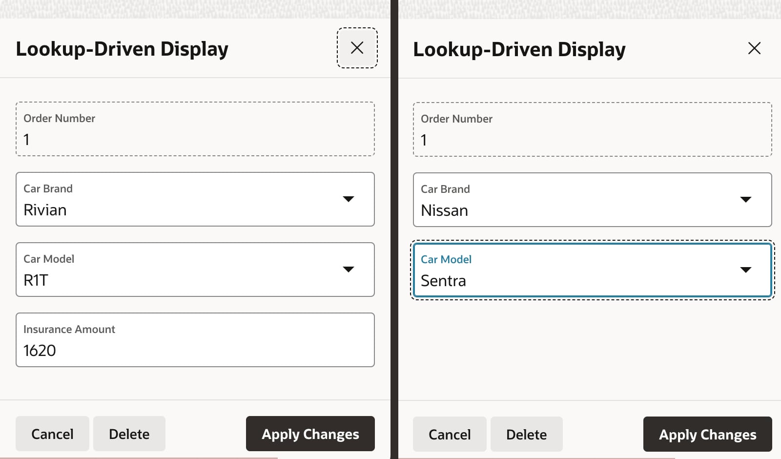


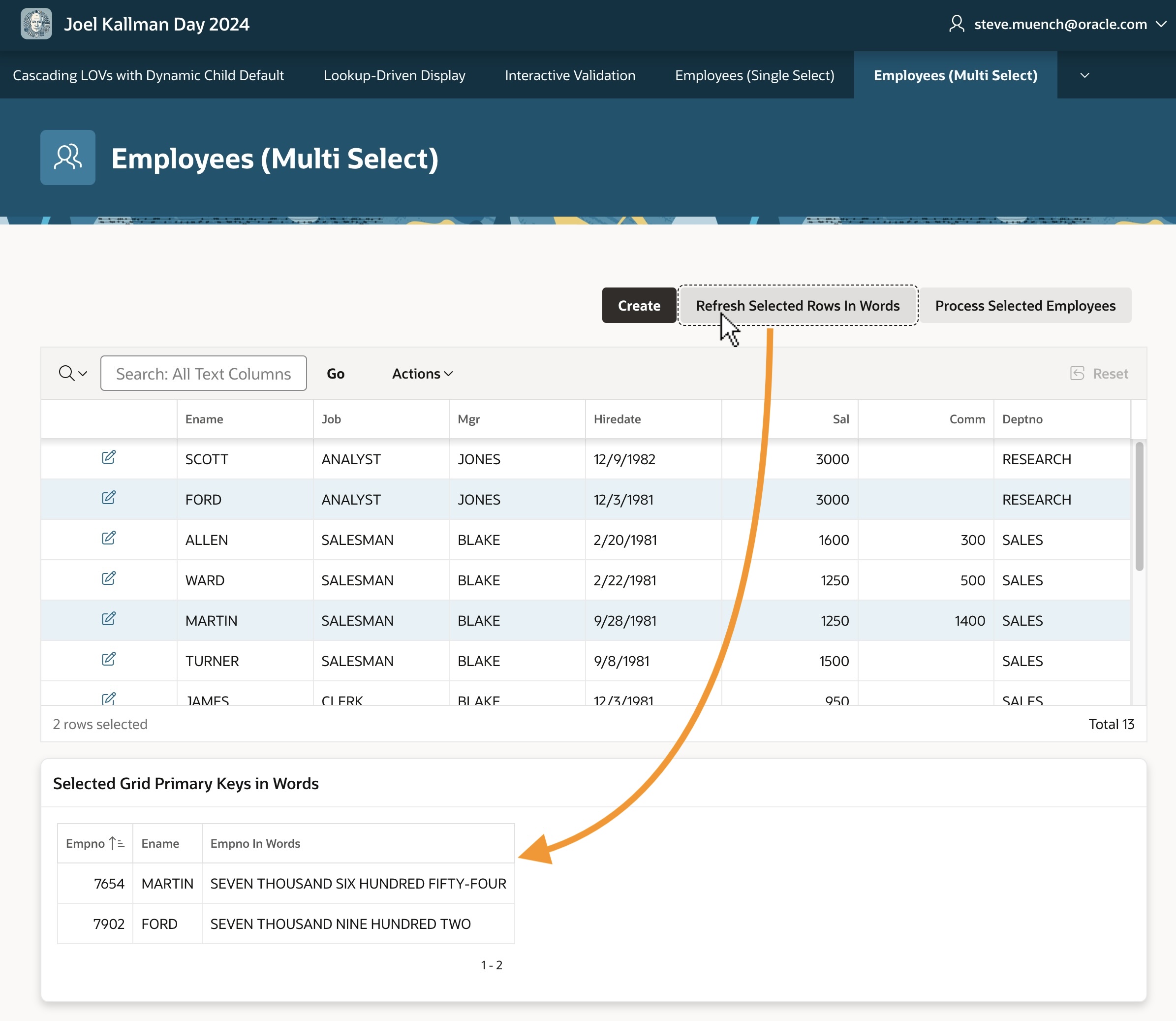
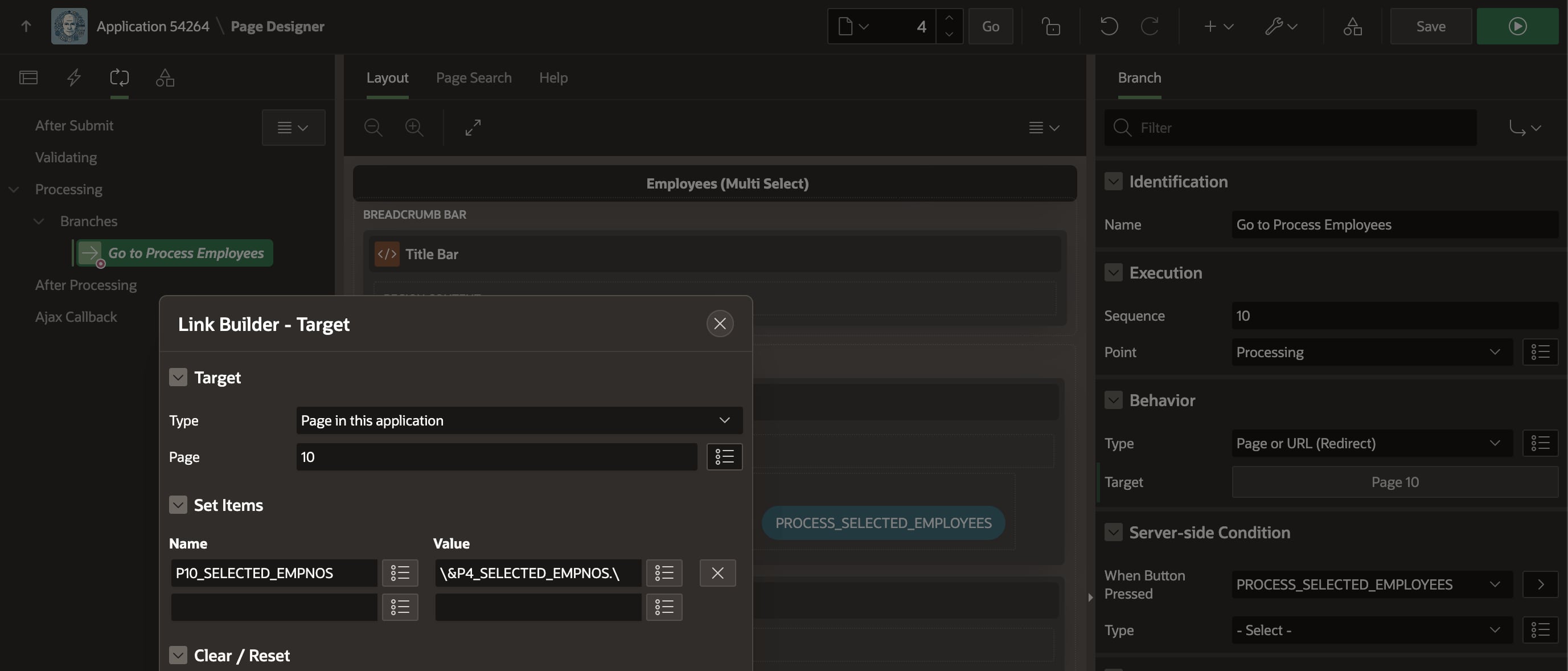

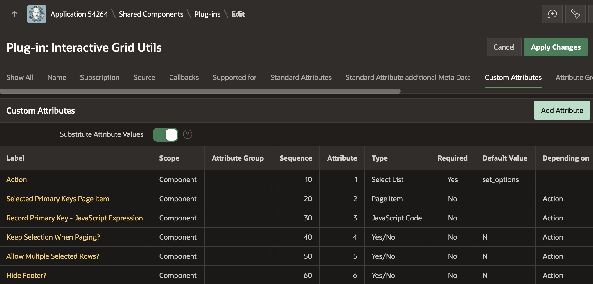
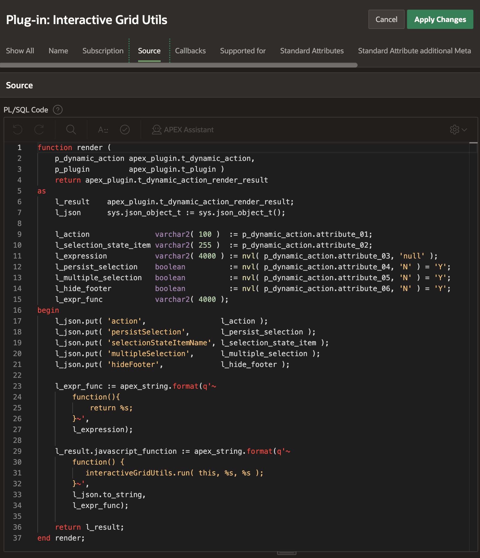

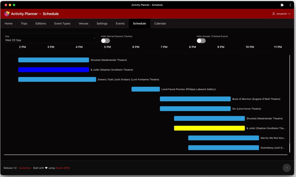
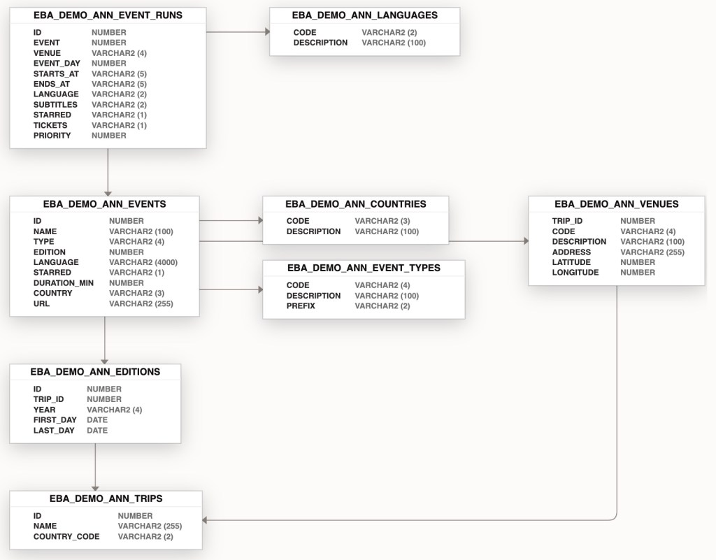
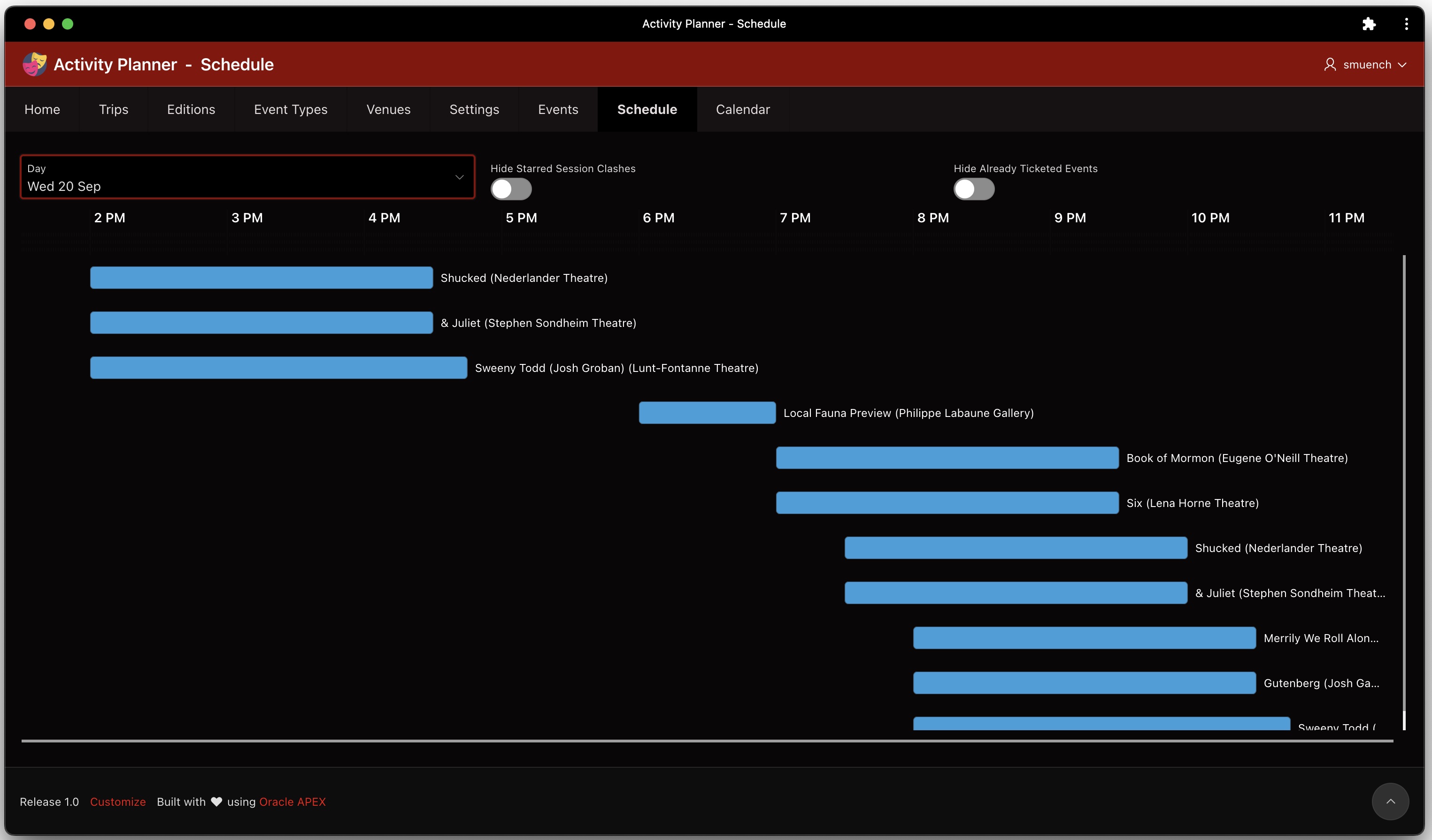


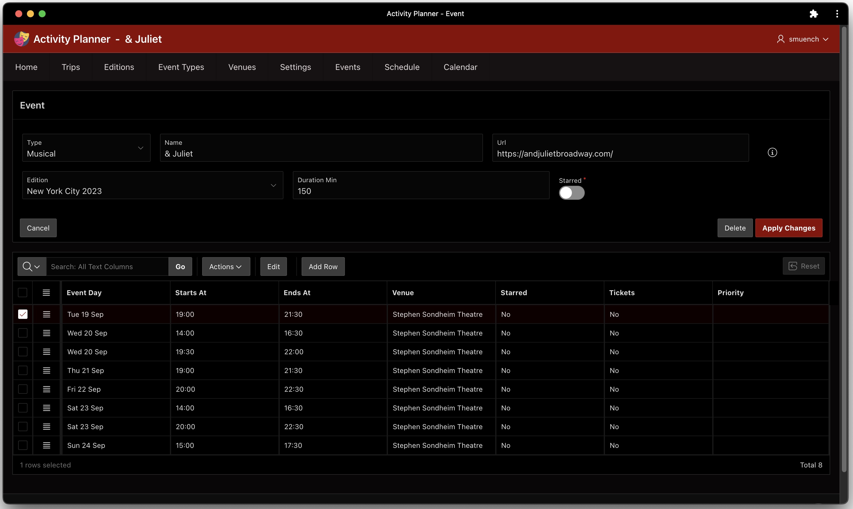


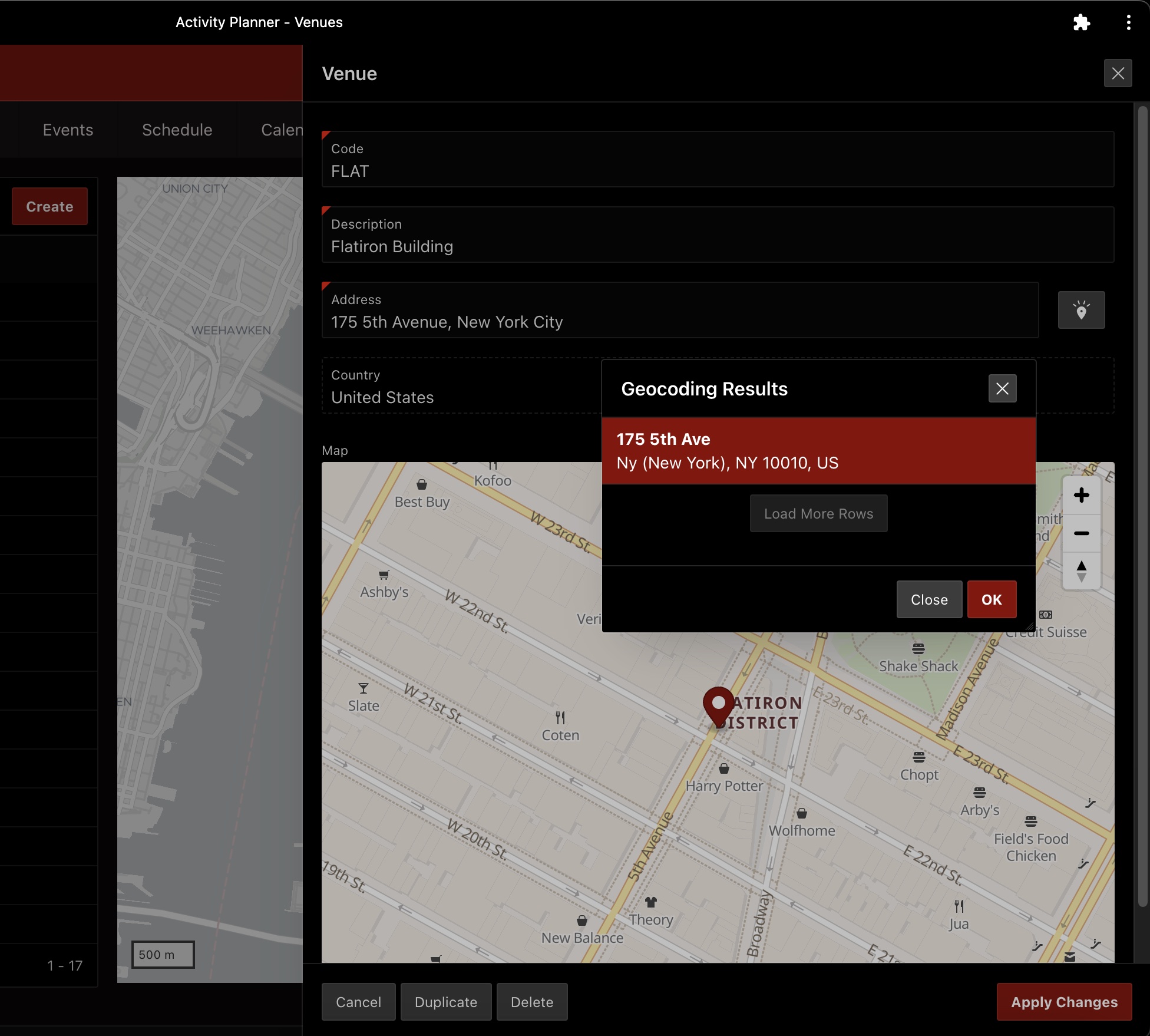

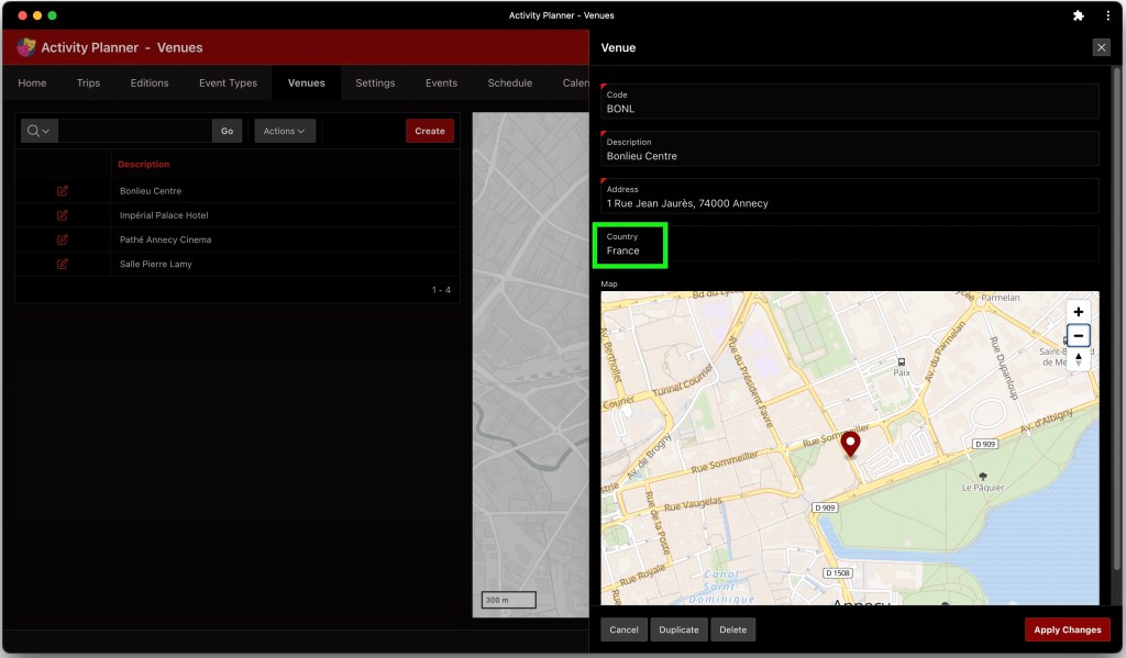


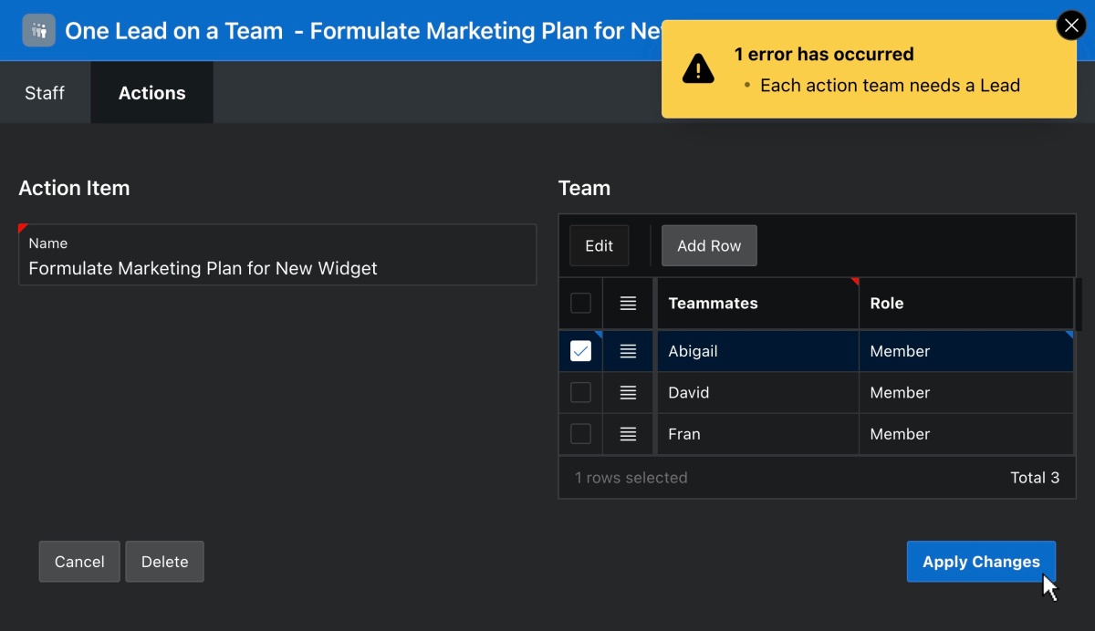
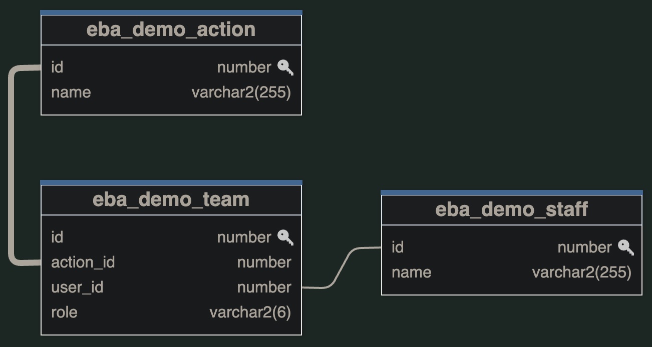


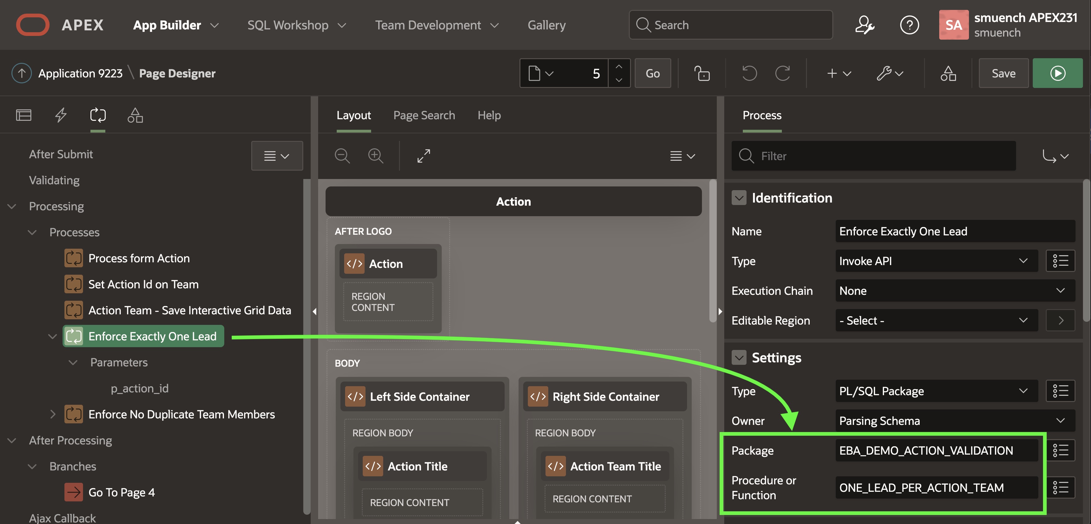


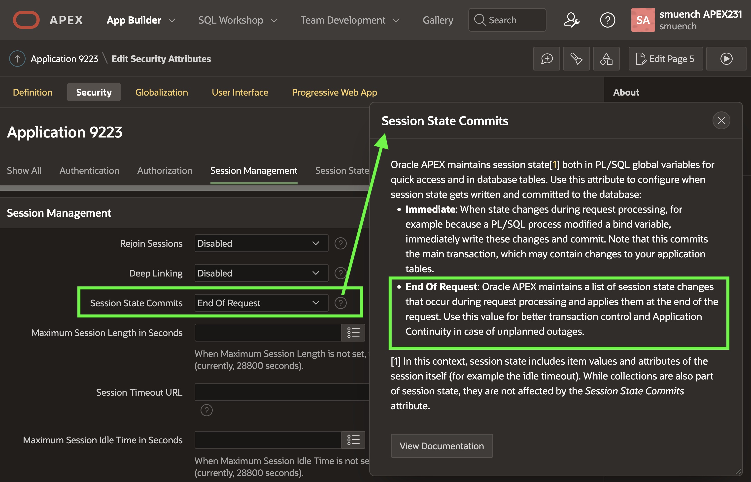

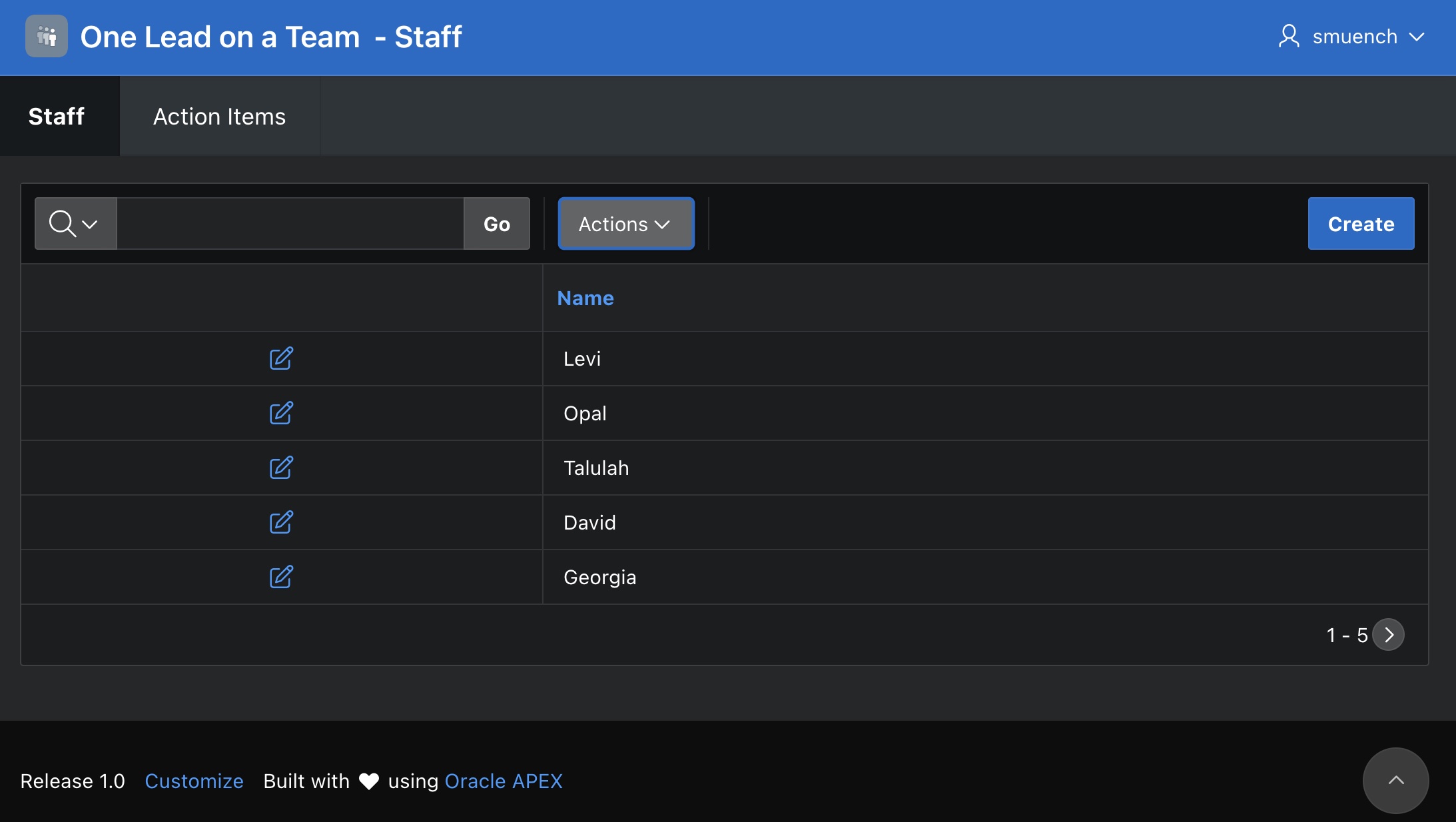


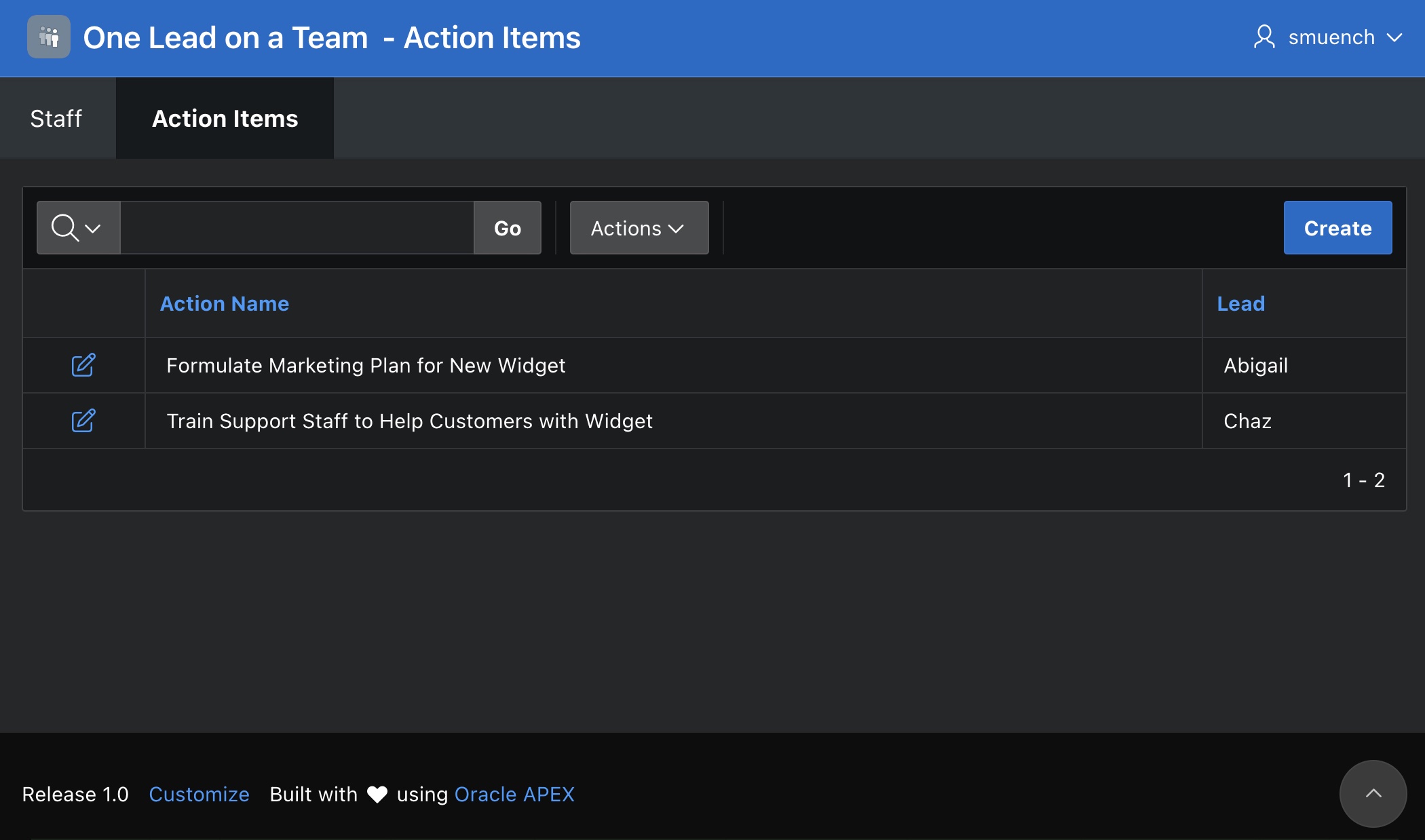
 Dive Into APEX