

To commemorate Joel Kallman Day, I dive into four interesting APEX ideas related to dynamic behavior that my dev team colleagues John Snyders and Stefan Dobre taught me recently. We’ll explore how to:
- Declaratively compute a dynamic default for a cascading child list
- Conditionally hide or show a page item based on a SQL query lookup
- Interactively validate user input to show invalid fields before submitting
- Easily set several features of a grid and refresh it keeping selected rows.
Download the sample to follow along in APEX 24.1, or read first and download later. Let’s get started.
Note: To see any figure in its original size, right-click on it and open it in a new browser tab.
Configuring Cascading Lists
Cascading lists are a pair of LOV-driven page items where the value of a “parent” list influences the choices available in a “child” list. For example, as shown below, when choosing an automobile the end user first picks a car brand (e.g. Ford, Toyota, Tesla) then chooses a car model from the selected brand.

In Oracle APEX, it’s simple to configure cascading lists. Just decide which page item type works best for your use case – like Select List or Popup LOV, among others – and then set the Parent Item name on the child list as shown below.

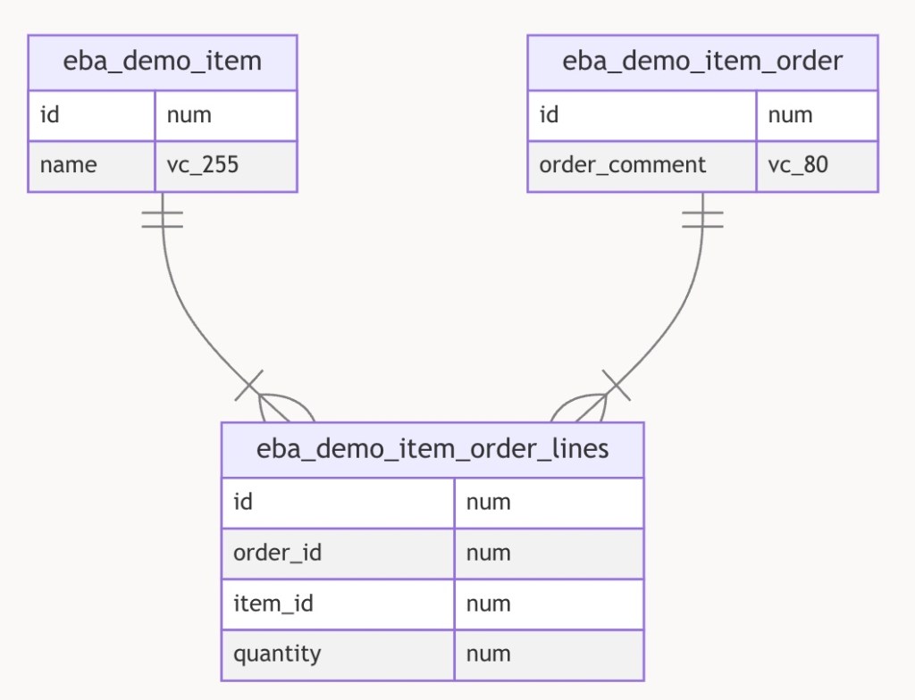
Your list of values SQL query for the child list can reference the value of the parent list as a bind variable. For example, the figure below shows a simple data model for car makes and models.

If the parent page item is P5_MAKE_SELECTLIST and the child list is P5_MODEL_SELECTLIST then the child’s LOV SQL Query might look like the following to retrieve the model_name and id for cars whose auto_make_id is the one selected in the parent list:
select model_name, idfrom eba_demo_auto_modelwhere auto_make_id = :P5_MAKE_SELECTLISTorder by model_name
APEX automatically includes the parent item’s current value in the request it sends to the APEX server to refresh the child page item’s list of values. It’s not the case in this simple example, but if your child list depends on multiple parent items’ values, you can provide a comma-separated list of multiple page item names in the Parent Item(s) property and all of their values get sent to the server. In this case, the child list would be refreshed each time any of the parent page item’s values changes.
If necessary, you can add other page item names into the Items to Submit property in the Cascading List of Values section of the property editor. You’d need to do that if your child list’s LOV SQL query also references other page item values as bind variables. The difference in listing them as other Page Items to Submit instead of as Parent Items is that APEX will not proactively refresh the child list when these other items’ value changes. Listing them as Page Items to Submit just ensures their latest value gets sent to the server when APEX does refresh the child list.
Declarative Default for Cascading Child List
By default, when an end user changes the value of a parent list, APEX sets the child list’s value to null. This compels the user to pick a relevant choice from the refreshed child list. However, what if you want to default the child list to a particular value after the list is refreshed?
For example, after the user selects a car brand, you might want to default the car model select list to the lowest priced car. This is easy. Just use the child list’s Default property to configure a query or expression that returns the desired value. It will typically reference the value of the parent field, and possibly other page items as bind variables. To default the child list P5_MODEL_SELECTLIST to the least expensive model for the current brand, you can set the Default > Type to SQL Query and use a select statement like:
select id from eba_demo_auto_model where auto_make_id = :P5_MAKE_SELECTLIST and retail_price = (select min(retail_price) from eba_demo_auto_model where auto_make_id = :P5_MAKE_SELECTLIST)
Now, whenever you choose a different car brand, the child list gets defaulted to the model with the lowest price. What makes this magic work? The APEX page automatically performs an behind-the-scenes request to the APEX server to retrieve the default value for the new parent list value whenever the parent page item value changes. This request evaluates the SQL query or PL/SQL expression you’ve configured for the child list, in the presence of the latest value for the parent item(s). If your default value query depends on multiple page items, that’s a sign they should all be listed in the comma-separated Parent Item(s) property so APEX knows to refresh the child list when any of their values changes.
This kind of under-the-covers info request that doesn’t re-render the entire web page is known as an “AJAX” request. The acronym reflects initial implementations’ Asynchronous use of JavaScript to exchange XML. These days, the browser typically sends and receives JSON payloads instead.
Only Defaulting a Singleton Child
The original forum question motivating my research asked, “If the child list has only a single valid choice, can I default it automatically?” This developer wanted users normally to choose from the child list. However, if there was only one choice available, she wanted to save the end-user a few clicks. The P5_MAKE_SELECTLIST2 and buddy P5_MODEL_SELECTLIST2 in page 5 of the sample app illustrate how I solved this problem for her. I configured a Default value query involving the parent page item as above, but crafted the query to only return a value when there was a single valid choice (otherwise return no row). The query looks like this, using the group by and having clauses to only return a row if the count of available auto models is one (1).
select max(id) from eba_demo_auto_model where auto_make_id = :P5_MAKE_SELECTLIST2group by auto_make_idhaving count(*) = 1
You can try it out in the sample app. Among the sample car makes and models, the Rivian brand is the only one with a single model in the EBA_DEMO_AUTO_MODEL table. If the user picks any other car brand, the child list refreshes and the user has to choose from the list. However, if they pick Rivian for the brand, the child list defaults to the R1T model.

Lookup-Driven Conditional Display
Consider the use case below from page 12 of the sample app where an Insurance Amount page item in a car‑ordering form should display only if the retail price of the car model selected is over $25,000. As the user selects different car brands and models, the page should react to the change of P12_MODEL_ID by hiding or showing P12_INSURANCE_AMOUNT.
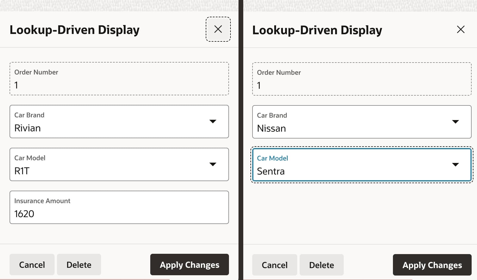
It’s tempting to reach for the Server-side Condition on P12_INSURANCE_AMOUNT to perform this model price lookup. However, recall that the APEX engine evaluates server-side conditions at initial page rendering time. Once the page is rendered, as the end user is changing field values, the server-side condition is not re-evaluated. So we need a different approach for dynamic, lookup-driven display that reacts to user input as it happens.
Performing the Lookup
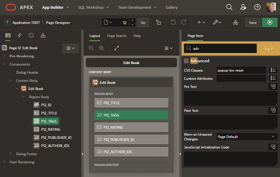
The technique starts by adding a hidden page item P12_SHOW_INSURANCE_AMOUNT to the page. Then, as shown in the APEX Page Designer below, I created a dynamic action on the P12_MODEL_ID page item’s “Change” event to first perform the model price lookup. Then using the result of this lookup, two subsequent conditional dynamic action steps either Show or Hide the page item.

The initial action step of type Execute Server-side Code calls the show_insurance_for_model() procedure, passing in the value of P12_MODEL_ID. This procedure’s two OUT parameters return a Y or N into the P12_SHOW_INSURANCE_AMOUNT hidden page item, and also return a default insurance amount value into P12_INSURANCE_AMOUNT.
Notice two important details. First, the Page Items to Submit and Page Items to Return are configured to mention the names of the page items referenced as bind variables in the PL/SQL block. Second, since the P12_SHOW_INSURANCE_AMOUNT is a hidden field being changed dynamically in the browser, we need to set its Value Protected property to OFF to avoid a checksum validation error when the user submits the page.
The lookup code for the show_insurance_for_model() procedure in the eba_demo_jkday package is below. It retrieves a row in EBA_DEMO_AUTO_MODEL using the p_model_id passed in. In the process, its case statement returns Y or N depending on whether the auto model’s retail_price column value exceeds 25000. It also computes a default value for the insurance as 2% of the retail price. It fetches these values into the p_display and p_default_insurance OUT parameters, respectively.
procedure show_insurance_for_model( p_model_id in number, p_display out varchar2, p_default_insurance out number)isbegin -- Default to not displaying insurance p_display := 'N'; if p_model_id is not null then -- Return 'Y' if model price over 25000 select case when retail_price > 25000 then 'Y' else 'N' end, round(retail_price * 0.02) into p_display, p_default_insurance from eba_demo_auto_model where id = p_model_id; end if;exception when no_data_found then null;end show_insurance_for_model;
Using Lookup Result to Hide or Show
Once the Execute Server-side Code action step completes, the P12_SHOW_INSURANCE_AMOUNT hidden page item contains either Y if the Insurance Amount field should show, or N if it should be hidden. We can configure an appropriate Client-side Condition that references the value of this hidden page item on each of the two following action steps. On the Show step affecting page item P12_INSURANCE_AMOUNT we configure the client condition of P12_SHOW_INSURANCE_AMOUNT equals Y. On the Hide step we use a client condition of P12_SHOW_INSURANCE_AMOUNT equals N. If an action step’s client condition evaluates to true, then it runs. Otherwise, it’s skipped. The result is that P12_INSURANCE_AMOUNT will be shown or hidden now, based on the selected model’s retail price.
If the page is used for editing existing rows, we must consider that case, too. First, we ensure the Show Insurance for Model? dynamic action step’s Fire on Initialization property is OFF. This avoids its performing an additional AJAX call to the APEX server when the page is initially rendered. We complement this with an Invoke API page process in the Pre-Rendering section of the component tree to call our show_insurance_for_model() procedure during page load as shown below.

When loading an existing row, we don’t want to use the OUT parameter value returned in the p_default_insurance parameter since it would override the existing value of the insurance amount queried from the database. So, as shown below we configure the Invoke API parameter to ignore the return value.

In contrast to the Fire on Initialization property of the Execute Server-side Code action step, we set this property to ON for the hide and show steps. This lets them hide or show the Insurance Amount field during page load based on the value retrieved by the pre-rendering Invoke API page process.
With these few configurations in place, the Insurance Amount field displays when the car model’s price is over $25,000 in both create and edit use cases.
Setting Up Validations in a Form Page
You can define validations in a page to ensure the data users enter is correct. The APEX engine evaluates these rules when the page is submitted. Sometimes, it’s useful to highlight data entry errors more proactively. This lets users see and correct problems even before submitting the page. We’ll study next how to use a dynamic action to show interactive validations that complement those enforced on page submit.
To share logic between submit-time validations and the the interactive ones we’ll configure below, we put the validation code in a PL/SQL package. In the sample app, the eba_demo_jkday package has an is_even() function. It returns true if the number passed in is even, and false otherwise. It’s a trivial example, but it represents any kind of validation function that accepts one or more parameters and returns a boolean result: true for valid, and false for invalid.
In page 6 of the sample app, we ask a user to enter two even numbers whose sum we will compute and display when they click the (Submit) button. We first define validations on the P6_EVEN_VALUE1 and P6_EVEN_VALUE2 page items below.

Using an Expression type validation we simply call the is_even() function that returns a boolean, passing in the value of the page item to validate like this:
eba_demo_jkday.is_even(:P6_EVEN_VALUE1)
If it returns true the validation passes. If it returns false instead, APEX displays a corresponding error message to the user.
Speaking of error message, as shown below next we define a translatable text message named VALUE_MUST_BE_EVEN under Shared Components > Text Messages…

Finally, for the validation Error Message we use the special text substitution notation to reference the translatable text message by its message name. We enter &APP_TEXT$VALUE_MUST_BE_EVEN. – including the trailing “dot” – and configure the error message to display inline with the field.
After doing this for both page items, as shown below we get the expected validation messages when entering odd numbers into both fields and clicking on the (Submit) button.

Interactive Validation in Form Pages
To alert a user more proactively to incorrect data, a dynamic action on a field’s value change is the key. As you might expect, since we want to call our is_even() package function, the dynamic action will use an Execute Server-side Code action step, but the first two ways I tried didn’t work as I predicted they might. Neither raising an exception, nor calling the apex_error.add_error() from this server-side step gave the result I needed.
My colleague Stefan encouraged me to use a technique like we used above for the lookup-driven display logic. We’ll return the result of the validation into a hidden page item, then reference it for conditional behavior in a client-side condition. My hidden page item here is P6_ERROR_MESSAGE. I return null into this hidden item when the data is valid, or return the error message text to show the user if the data fails validation. My dynamic action step code looks like this:
:P6_ERROR_MESSAGE := case when not eba_demo_jkday.is_even(:P6_EVEN_VALUE1) then apex_lang.message('VALUE_MUST_BE_EVEN') end;
If the call to is_even() returns false then P6_ERROR_MESSAGE is set to the text of the VALUE_MUST_BE_EVEN message. If is_even() returns true, then the case statement does not match any when condition and results in assigning null to the page item. We remember to configure the Page Items to Submit and Page Items to Return so APEX sends “over” the value of P6_EVEN_VALUE1 and brings “back” the value of P6_ERROR_MESSAGE. As above, since we’re dynamically changing the value of a hidden field, we set the Value Protected property of P6_ERROR_MESSAGE to OFF.
Next, I use an Execute Javascript action step to clear the errors in the client form for the page item being validated with the one-liner:
apex.message.clearErrors('P6_EVEN_VALUE1');
Then finally, a third JavaScript action step shows the inline error on the field:
apex.message.showErrors( [ { type: "error", location: [ "inline" ], pageItem: "P6_EVEN_VALUE1", message: $v('P6_ERROR_MESSAGE'), unsafe: false }] );
To ensure this gets skipped if P6_ERROR_MESSAGE is null, I added a Client-side Condition to this action step of Type “Item is not null”, using P6_ERROR_MESSAGE as the item name.
After repeating this technique also for the P6_EVEN_VALUE2 field, the user now sees the interactive validation error messages as soon as they leave the field as shown in the short video below.
Grid Configuration & Refresh Techniques
Another forum question I recently worked on asked, “Can I refresh just a single row in an Interactive Grid on return from a modal edit dialog? When I refresh the whole grid the user’s selected rows are lost.” I heard two intertwined questions. The first was how to refresh just a single row in the grid. The second was how to preserve user row selection across a grid refresh. By consulting with my colleague John Snyders, I learned several new things about APEX grids while researching a solution. The sample app shows off all the tips he taught me:
- Hiding the grid footer when not needed
- Letting users select multiple rows in the grid
- Keeping selected rows across page-by-page grid pagination
- Automatically maintaining primary keys of selected rows in a hidden page item
- Refreshing just a single edited row in the grid after closing a modal dialog
- Restoring the selected rows after a grid refresh
John explained the minimal JavaScript code needed to enable these features. Four of them only require setting a property in the grid’s JavaScript Initialization Function:
footer: false– to hide the footerselectionStateItem: "P2_SELECTED_EMPNOS"– to track selected primary keysmultiple: true– to enable multiple row selection, andpersistSelection: true– to keep selected rows across pagination
You can add one or more of these properties to a small initialization function like the one below, adding whichever ones you need separated by commas. You would define this on the Attributes tab of the interactive grid region. For example, to enable a selection state item in a grid with multi-row selection, the function would look like this:
function( config ) { config.defaultGridViewOptions = { selectionStateItem: "P2_SELECTED_EMPNO", multiple: true }; return config;}
Refreshing a single row in the grid and restoring the selected rows after a refresh required a few more lines of code, but even a JavaScript novice like me could understand what it was doing. I’ll explain some of that code below.
Capturing Code in a Component
I wanted to capture John’s coaching in a component. After initially writing the helper code in a static application JavaScript file, I asked colleague Stefan Dobre to teach me how to turn my code into something easy to reuse. He gave me back a working dynamic action plug-in that showed me how a slightly modified version of my original JavaScript code could reference custom attribute values that the plug-in defined.
Even as a JavaScript newbie, I was able to evolve Stefan’s solid starting point to present exactly the custom attributes I wanted. I also happily included Stefan’s suggested code improvements. The simple plug-in exposes the features John taught me in a way that others can use declaratively.
I ended up with sample app’s Interactive Grid Utils plug-in. It supports the two Action values shown below: Set Options and Refresh. The Set Options action shows four declarative settings to configure the features mentioned above, without having to write the initialization function to enable them. You would typically use it as a step in a Page Load dynamic action.

The Refresh action presents a JavaScript expression to provide the primary key value of the grid record to refresh. If the record corresponding to the primary key exists in the grid, just that one row of the grid is refreshed. If a refreshed row was deleted, it gets removed from the grid. If the primary key value is null or cannot be found in the grid – as would happen after inserting a new row – then the whole grid is refreshed and the previously selected rows are restored after the refresh.
In either case, when using the plug-in you associate it with a particular Interactive Grid region by setting two properties in the dynamic action’s Affected Elements section in the property editor. Just set Selection Type to Region and Region to the desired Interactive Grid’s region name.
Binding Selected Primary Keys in a Query
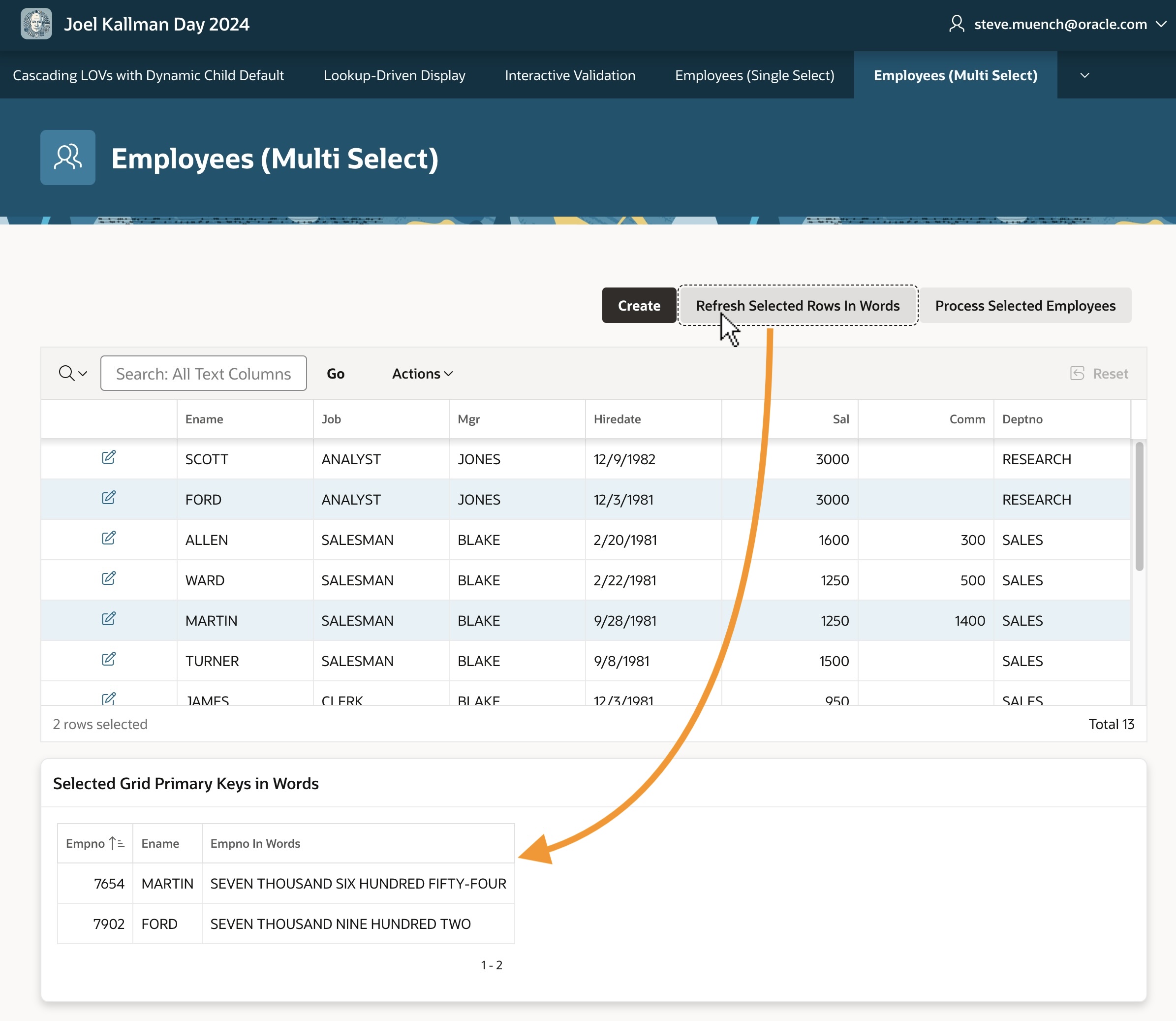
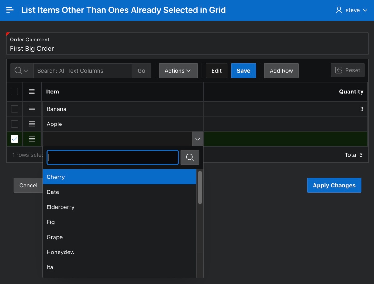
The Employees (Multi-Select) page (4) in the sample has a grid of employees and uses the plug-in above in a Page Load dynamic action to configure P4_SELECTED_EMPNOS as the selection state item and to allow multiple selected rows. Using Command-click on Mac or Ctrl‑click on Windows, you can select multiple employees. As the user changes the grid selection, the P4_SELECTED_EMPNOS automatically reflects the colon-delimited primary keys of the selected grid rows. To avoid the automatic selection of the first row in the grid, I set the Select First Row property of the Employees grid in the page to OFF on the Attributes tab.
This automatically-maintained list of primary key values is useful to use as a bind variable in a query. For example, the Selected Grid Primary Keys in Words classic report region below the grid has the following select statement referencing :P4_SELECTED_EMPNOS Notice how it uses the apex_string.split() function in an EMPNO IN subselect to retrieve employees whose EMPNO appears among the colon-separated values.
select empno, ename, to_char(to_date(empno, 'J'), 'JSP') AS empno_in_wordsfrom eba_demo_employeeswhere empno in (select column_value from apex_string.split( :P4_SELECTED_EMPNOS,':'))
You can refresh the report based on this query to show information about the selected grid rows by clicking the (Refresh Selected Rows in Words) button. The screenshot below shows the result after selecting employees FORD and MARTIN and clicking that button.
Passing Selected Primary Keys as Parameter
The automatically-maintained list of primary key values is also useful to pass in a parameter to another page. Notice the (Process Selected Employees) button in the figure above. I configured it to submit the page so the P4_SELECTED_EMPNOS selection state item value becomes part of the APEX session state. Then I added the conditional branch shown below – with an appropriate When Button Pressed Server-side Condition – to pass the P4_SELECTED_EMPNOS parameter to page 10.
Notice in the Link Builder – Target dialog below that I’ve escaped the substitution string &P4_SELECTED_EMPNO. by surrounding it with backslashes. By using this escaped substitution \&P4_SELECTED_EMPNO.\ we signal the APEX engine to pass the value containing colons verbatim to the target page. Failing to remember this backslash escaping would result in passing just the first primary key value, since the APEX engine normally treats colons as value separators.
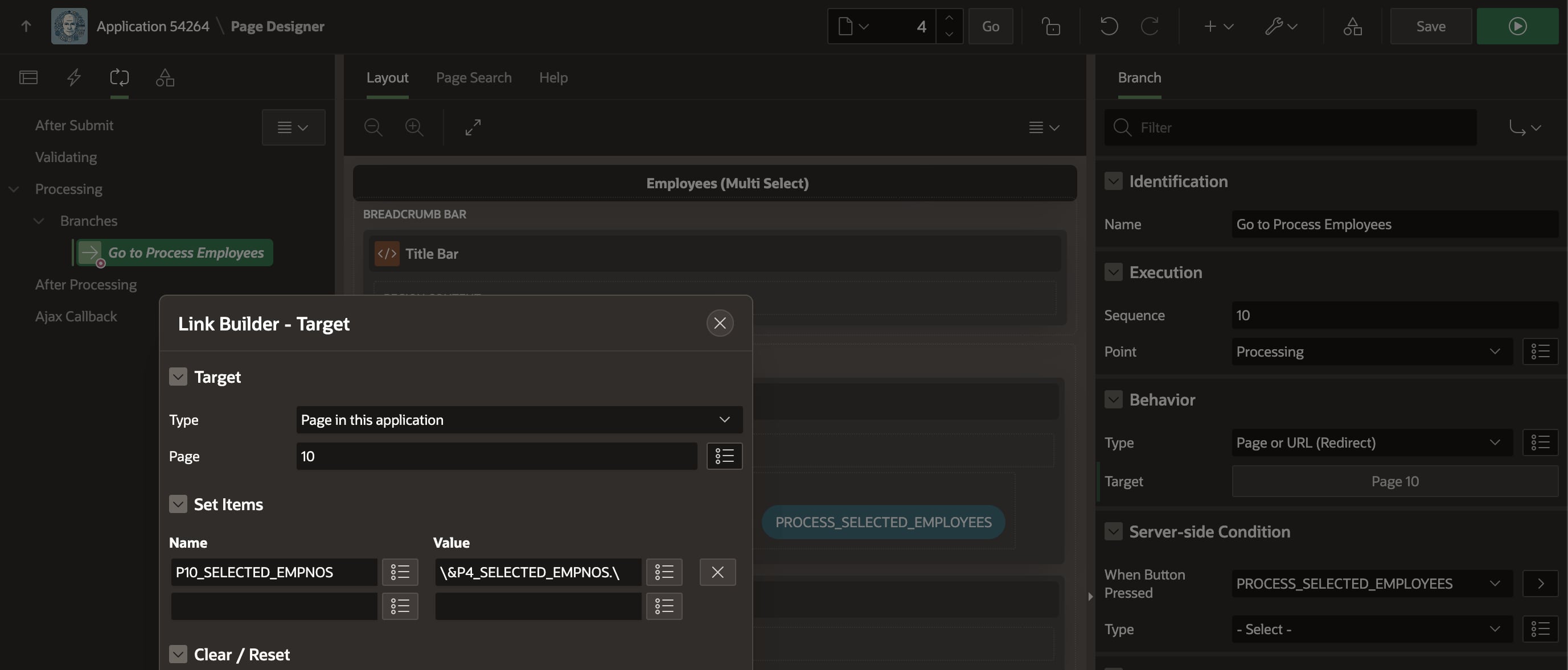
P4_SELECTED_EMPNOS with backslashes since it can contain colons!By properly backslash-escaping the substitution string in the link builder dialog, we ensure that when multiple rows are selected in the grid the corresponding colon-delimited list of primary keys is passed correctly to the target page as shown below.

Surgically Refreshing an Edited Row
The same page in the sample uses the Interactive Grid Utils plug-in as a step in a “Dialog Closed” dynamic action. To handle the event correctly whether the dialog is opened by the (Create) button or by an edit link in the grid, I use the Selection Type of jQuery Selector and the body selector. The HTML body element represents the whole page content, so it naturally contains both the create button and the interactive grid region.
The Close Dialog page process in the modal employee form page (3) configures its Items to Return property as P3_EMPNO to return the primary key of the row that was just inserted, updated, or deleted. Accordingly, I configured the plug‑in to use its Refresh action and provided the JavaScript expression of this.data.P3_EMPNO to get the primary key of the row to refresh.
You can experiment that editing a row in the grid and saving the changes just refreshes the edited row, maintaining the row selection. If you delete an employee, it’s removed from the grid, and if you add a new employee the grid does a full refresh. In all of these cases the row selections are preserved.
Two other pages in the demo use the plug-in similarly, but with slightly different grid options. The Employees (Single Select) page (2) uses a single-select grid and hides the grid footer. The Employees (Page-by-Page, Multi Select) page (9) uses a page-by-page pagination on the grid, and uses the plug-in to keep the selected row across pages and allow multi-row selection.
Peeking at the Plug-in Definition
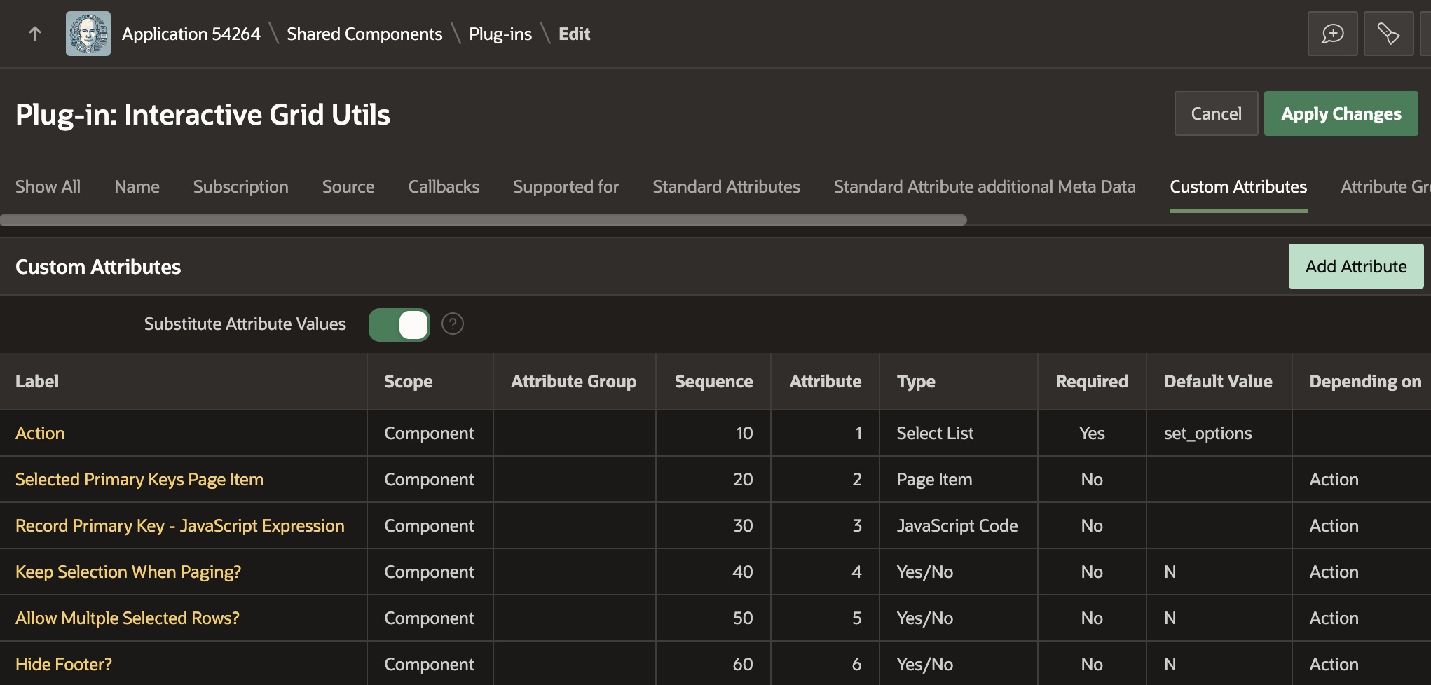
Taking a peek at the plug-in, we can see in the figure below that it defines custom attributes for the declarative settings developers can configure in the Page Designer property editor. There is an Action property, and then all of the others depend on the value of the Action property. This lets the property editor correctly display properties only when relevant. Notice that each custom property is assigned to an attribute number, from 1 to 6 in this case.
On the Source tab shown below, you can see the plug-in’s PL/SQL render() function. The APEX engine passes it key information at runtime in the p_dynamic_action argument. It returns the text of a JavaScript function that retrieves the values of the six custom attributes and passes them as the properties of a JSON object in the call to the interactiveGridUtils.run() function. The APEX engine includes the text of this function in the rendered page that uses the plug-in so the browser can execute it when appropriate.
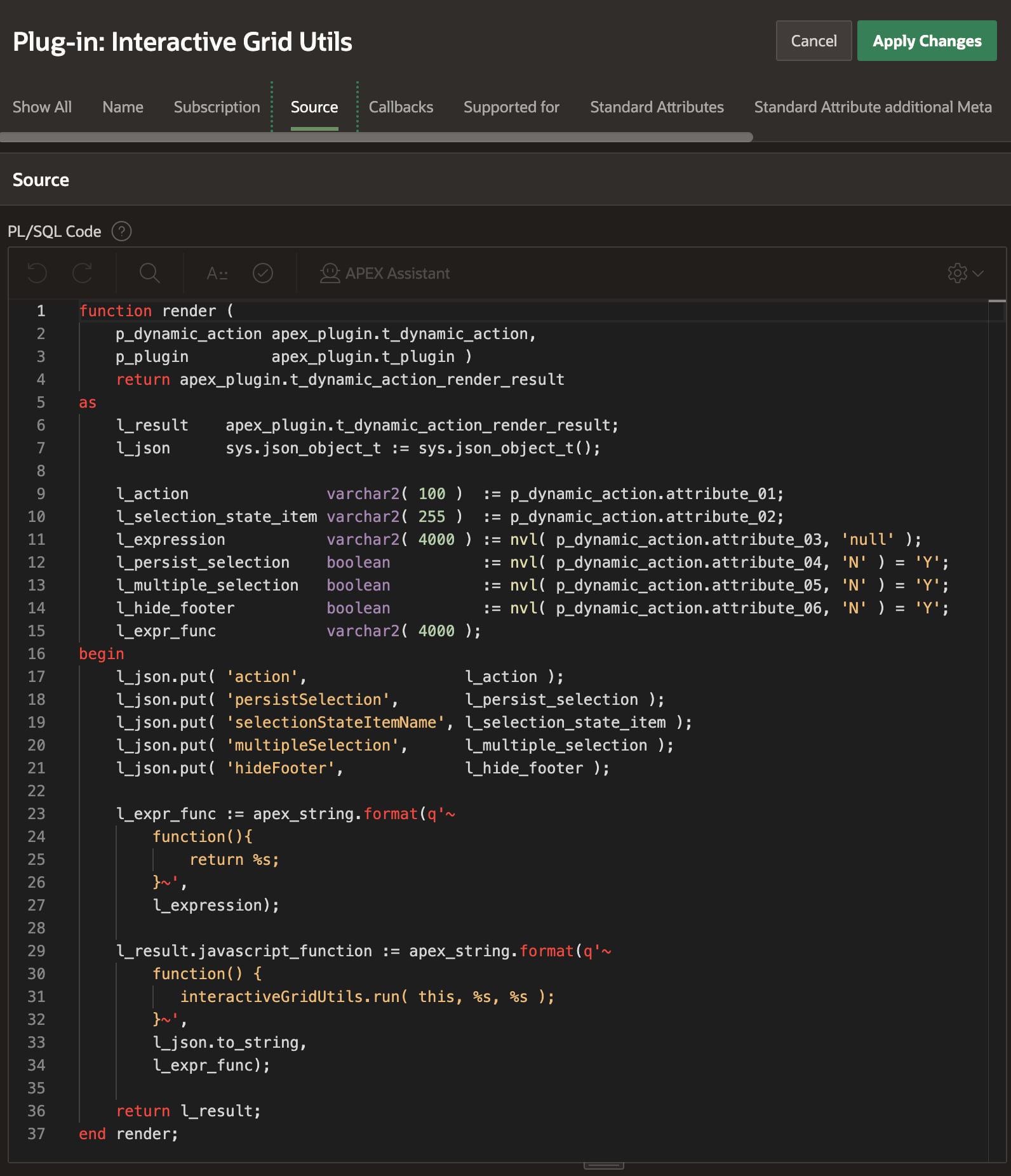
render() call returns text of function passing custom attributes to main JavaScript codeOn the Files tab shown below, you can see the script.js file that contains the main JavaScript code for the plug-in. It defines the interactiveGridUtils object whose run() function is invoked in the rendering function above. Note the script.js is accompanied by a Reference value of #PLUGIN_FILES#script#MIN#.js This is the expression I copied and pasted into the JavaScript section on the File URLs to Load tab. This ensures the plug-in includes the code in the script.js file at runtime.

script.js file containing the plug-in’s main JavaScript code lives in the Files tabThe JavaScript code in the script.js file has the following pseudo-code flow:
- Retrieve the static id of the region from the Affected Elements
- Lookup the grid region to work with using that static id.
- Use region object to get grid’s jQuery view and model containing its data.
- Assign custom attribute values passed in the
dataparameter to local variables - Depending on Action value, either set grid options, or perform a row refresh.
The row refresh logic uses model.getRecord() to get the row in the grid by primary key. If it exists, it calls model.fetchRecords() to refresh the row. Otherwise, if the row doesn’t exist or no primary key was provided, it calls the refreshAndRestoreSelection() function. That function gets the list of selected rows, configures a one-time gridpagechange event handler to restore the selected rows, and finally calls region.refresh() to refresh the region and trigger the gridpagechange event in the process.
Trying Out the Sample
I encourage you to download the sample and try it out in APEX 24.1. If you’re not yet using APEX 24.1, you can still explore the sample app in a free workspace at oracleapex.com It’s always running the latest APEX version to experiment with. That said, the techniques explained here are applicable to any recent version of APEX you might be using. I had fun learning these techniques. I hope at least one of them was new to you, too.
Thanks again to colleagues John Snyders and Stefan Dobre for the continued mentorship and words of wisdom. After three years on the APEX team I’m still learning from a firehose – many, many new things every day – and it’s an exciting, energizing feeling!


 Dive Into APEX