Planning with Gantt & Calendar #JoelKallmanDay

Overview

Building an app to solve a personal need is a great learning opportunity. Sometimes I plan multi-day trips and must decide among overlapping events. The annual animation festival in Annecy, France, is one example. Hundreds of talks and screenings span various venues in a lovely little lakeside locale. Another is a periodic pilgrimage to New York City to see as many musicals and museums as I can fit in a week. An APEX app helps me plan my trip activities. This year I celebrate Joel Kallman Day by sharing my app and explaining the smorgasbord of APEX tricks I learned by building it.

(Technical Note: to see a larger version of any figure, right click on it and choose Open Image in New Tab from the context menu…)

Recurring Trips with Overlapping Events

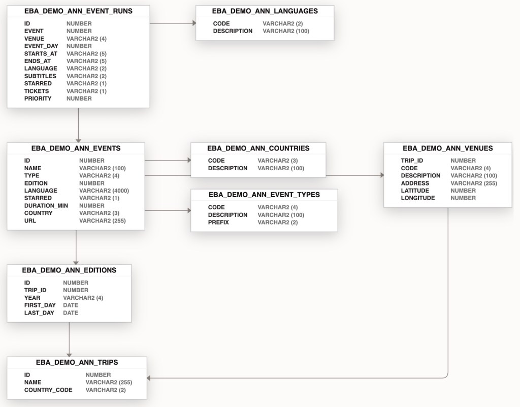
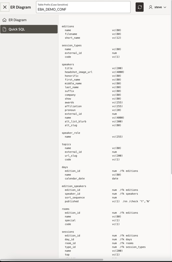
Both the Annecy Festival and my New York City trips happen periodically during a particular year over a series of days, so a trip name and year represent each edition of a trip (e.g. New York City, 2023). Each edition has a start and end day and consists of events to attend that may repeat multiple times during the week. These different event runs might be in distinct venues, like a movie that shows in different cinemas around Annecy. In contrast, all the event runs might be in the same Broadway theatre. In the case of the Annecy Festival, films can be from a particular country, in an original language, and have subtitles in another language, so as shown below my data model also includes countries and languages.

Data model for Activity Planner application

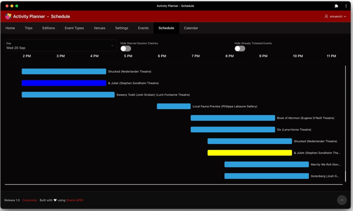
Gantt Chart Showing Per-Day Show Runs

To easily see the overlapping events on each day of the trip, I use a day selector and Gantt chart as shown in the figure below. The query for the Gantt chart region includes columns DAY_START and DAY_END whose values come from combining the selected day with user preferences for day start time and day end time. The query also includes STARTS_AT and ENDS_AT datetime values for each event run that falls on the selected day. It concatenates the name of the event and the name of the venue into a NAME column that’s used as the task name. To suppress the display of task name along the left edge of each row, I selected the Attributes tab of the chart region, and set Show Row Axis to OFF.

Gantt Chart showing many overlapping event runs on Wednesday, September 20th

Day Selector’s Data-Driven Date Range

The EVENT_DAYS Shared Components List of Values (LOV) driving the day selector was an interesting query to write. In the EBA_DEMO_ANN_EDITIONS table for a trip edition we have a START_DATE and END_DATE for the consecutive sequence of days over which the trip edition takes place. I needed a query that returned all of the dates in order starting with the start date and ending with the end date for the current trip edition. The application item CURRENT_EDITION holds its ID value. The query ended up looking like this:

SELECT
  to_char(FIRST_DAY + LEVEL - 1,'fmDy DD Mon') AS DAY_NAME_IN_PERIOD,
  LEVEL AS DAY_NUMBER
FROM (SELECT FIRST_DAY, LAST_DAY
        FROM EBA_DEMO_ANN_EDITIONS
       WHERE ID = :CURRENT_EDITION)
CONNECT BY
  FIRST_DAY + LEVEL - 1 <= LAST_DAY
ORDER BY
  DAY_NUMBER ASC

This query drives the day selector below with an ordered list of formatted day names between start date and end date for the current trip edition:

Day selector for the current trip edition on the Schedule page

Stretching Chart to Fill the Viewport

I could have hard-coded the height of the Gantt chart region on the Attributes tab of the property editor, but that didn’t meet my needs. In the weeks leading up to a trip, I use the app on different desktop computers with differently-sized monitors as well as on my iPad, so I explored how the Gantt chart could stretch to use whatever vertical space is available.

After many failed experiments, I landed on the following technique. It uses the CSS calc() function to compute the value of the height property. First, I defined a CSS class on the page called vertical-stretch and assigned this class to the Gantt chart region. Then I defined the class in the page-level CSS > Inline settings using the syntax:

.vertical-stretch {
   height: calc(100vh - 17rem);
}

The calculation references the full (100%) viewport height by using 100vh and subtracts from that the height of the rest of the elements on the page above the Gantt chart. Using CSS rem units that represent the height (i.e. font-size) of the root element on the page, through trial and error I discovered 17rem closely matched the space used by the other content on the page. Applying the vertical-stretch CSS class to the Gantt chart region means, “Your height is the viewport space remaining after accounting for the vertical space occupied by the elements above the Gantt chart”. This approach made the app look exactly how I wanted on every monitor size and iPad where I use it.

When resizing the window interactively, the chart also reacts as expected as shown in this short video:

Editing Events by Clicking on a Bar

The Event page (7) in the app lets the user create, edit, or delete an event and all its related event runs. When looking at a particular day’s events in the Gantt chart on the Schedule page (14), I wanted clicking on any bar to open the event related to that particular event run. So I set out to find how to obtain the event run ID related to each bar in the Gantt chart. I started by configuring the Gantt chart’s Task Id property to get its value from the event run ID column in the region’s query.

Next, I hoped to find the value of this task ID somewhere in the HTML markup in the page. By right-clicking on a Gantt bar rectangle and choosing Inspect Element, the browser developer tools showed me that each bar was a Scalable Vector Graphics (SVG) group element <g> containing two <path> elements and a <text> element like this:

<!-- Example SVG group of shapes for Task Id 162 "bar" -->
<g id="_dvtActiveElement43100180_162">
  <path d="..." class="oj-gantt-task-backdrop"></path>
  <path d="..." class="oj-gantt-task oj-gantt-task-bar"></path>
  <text         class="oj-gantt-task-label" ... >
    Local Fauna Preview (Philippe Labaune Gallery)
  </text>
</g>

The <path> element containing the class="oj-gantt-task" looked like the right element to target for a click handler. So I defined a dynamic action to react to the Click event on the CSS class oj-gantt-task using the jQuery Selector with a dot before the class name as shown below:

Configuring a dynamic action on the Click event of the element with CSS class oj-gantt-task

I also noticed the Gantt Chart Task Id value was part of the value of the id attribute on the <path> element’s containing parent <g> element. For example, for an event run with ID = 162, the id attribute of the <g> parent element for the clicked-on bar had a value like “_dvtActiveElement43100180_162“. I learned from my colleagues that the dynamic action event handler can access the triggering <path> element using the expression this.triggeringElement. So, my dynamic action event handler passes the triggering element to an eventRunIdForClickedGanttBar() helper function in my page. It returns the Task Id value by parsing it out of the parent element’s id attribute like this:

function eventRunIdForClickedGanttBar(p_this) {
  return extractNumberFromUnderscoreString($(p_this).parent()[0].id);
}

The calling dynamic action event handler looks like this. It sets the value of a hidden page item P14_SELECTED_EVENT_RUN_ID to hold the event run ID that was clicked on, sets the Request to EDIT_EVENT_RUN, and submits the page.

const lTaskId = eventRunIdForClickedGanttBar(this.triggeringElement);
// Set Task id to hidden page item, and submit
// the page with EDIT_TASK request
apex.page.submit({
    request: "EDIT_EVENT_RUN",
    set: {
        "P14_SELECTED_EVENT_RUN_ID": lTaskId
    }
});

In the page’s Processing tab, an After Processing branch redirects to the Event page (7) when the Request = EDIT_EVENT_RUN, passing along this hidden page item value for the target page’s P7_EVENT_RUN_ID page item value. It also passes its own page number 14 as the value of the P7_CALLING_PAGE_ID page item. In contrast, when the Home page (1) calls the Event page to edit an event, its link passes in the value 1 for this page item.

Passing the event run ID for the clicked-on Gantt bar to the Event page

The Event page uses the P7_CALLING_PAGE_ID item value to conditionally return to the right calling page when the user cancels or applies their changes in the Event page. The target Event page has a Pre-Rendering page process Get Event from Event Run Id that looks up the parent event ID to edit based on the “child” row’s event run ID passed in.

Saving Time During Event Data Entry

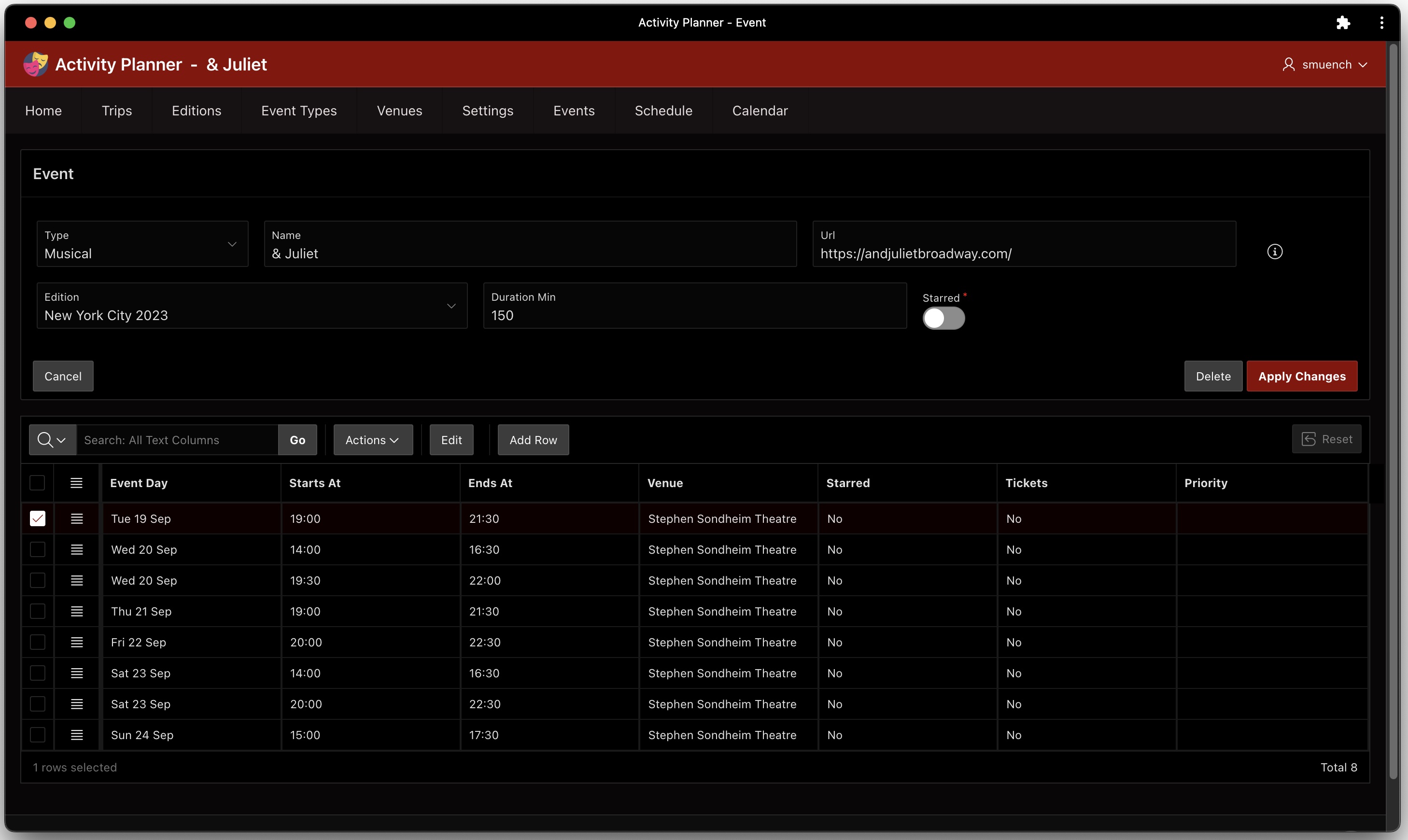
Each event has a duration in minutes, and each event run has a start time and end time. Using two dynamic actions on the Event page shown below, I speed up data entry by computing the duration if it’s null when a pair of Starts At and Ends At times are entered for an event run. In addition, once the duration is set, any other event runs entered benefit from another dynamic action that automatically computes the Ends At time once the user enters a Starts At and tabs out. This feature makes it very quick to enter all the dates and times a particular musical like “& Juliet” is offered during a trip edition.

Event page editing the Broadway musical & Juliet and its event runs

The page contains the following two helper functions in its JavaScript Function and Global Variable Declaration section the the property editor:

function addMinutesToTime(time, minutes) {
  return apex.date.format(
           apex.date.add(
             new Date("2023-01-01 "+time),
             parseInt(minutes),
             apex.date.UNIT.MINUTE),
           "HH24:MI");
}

function minutesBetween(time1, time2) {
  var date1 = apex.date.parse(time1, "HH24:MI");
  var date2 = apex.date.parse(time2, "HH24:MI");
  var diff = Math.abs(date2.getTime() - date1.getTime());
  return Math.floor((diff / 1000) / 60);
}

Then, the dynamic action on the interactive grid’s ENDS_AT column has a Set Value action step that executes JavaScript to call minutesBetween() to compute the duration of the event:

minutesBetween($v('STARTS_AT'), $v('ENDS_AT'))

It only runs if the duration is currently null and both the STARTS_AT and ENDS_AT columns in the current row have a value using the client-side condition boolean expression:

$v('STARTS_AT')       !== '' && 
$v('ENDS_AT')         !== '' &&
$v('P7_DURATION_MIN') === ''

Similarly, the dynamic action on the grid’s STARTS_AT column has a a Set Value action step that executes JavaScript to call addMinutesToTime() to compute the ENDS_AT time, based on the duration of the event:

addMinutesToTime($v('STARTS_AT'), 
                 $v('P7_DURATION_MIN'))

It only runs if the duration is not null, the STARTS_AT has a value, and the ENDS_AT is null using the client-side condition boolean expression:

$v('STARTS_AT')       !== '' && 
$v('P7_DURATION_MIN') !== '' &&
$v('ENDS_AT')         === '' 

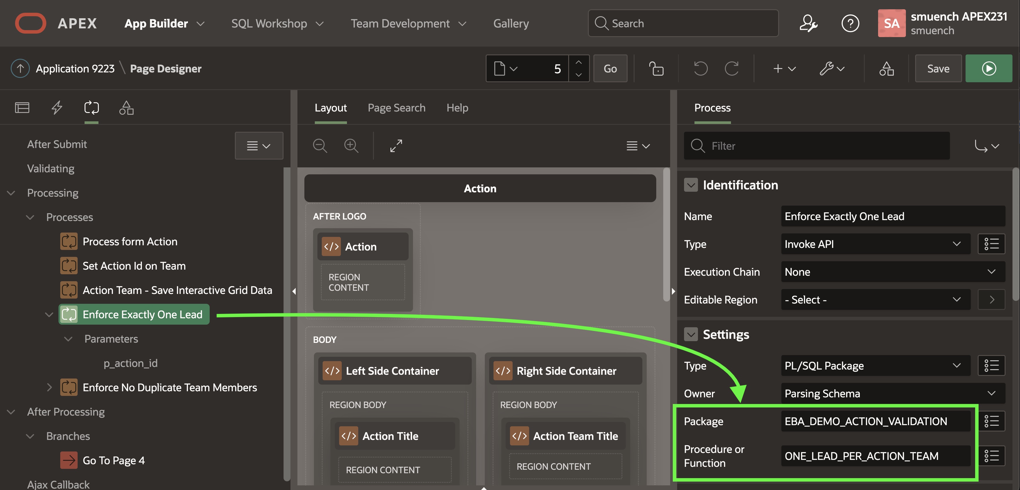
Marking Event Runs as Starred/Ticketed

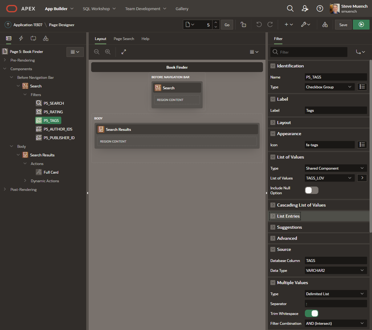
When reviewing a large list of events, there’s a good chance that you’re not interested in all of them. The app lets the user “star” a particular event run to mark it as a “favorite”. This results in setting the STARRED column value to “Y“. In addition, some trips involve a booking or ticketing process to confirm a seat for a particular event run. The app lets the user indicate they’ve confirmed their place by setting a Tickets switch to ON. In the figure below, I’m starring both Wednesday, September 20th performances of musical “& Juliet” and marking the 14:00 showing as ticketed.

Marking a particular event run as both Starred and Ticketed

Conditionally Coloring Selected Bars

It can be useful to conditionally color the Gantt chart bars based on application-specific criteria. In my app, I want “starred” events to show with one color that makes them distinct, while “ticketed” events show with another unique color. This was easy to accomplish. I first included the following SELECT list expression in the query for the Gantt chart region in the Schedule page (14):

case 
   when r.tickets           = 'Y  then 'tickets'
   when r.event_starred     = 'Y' 
     or r.event_run_starred = 'Y' then 'starred'
end as css_classes

Then I set the Task CSS Classes property of the Gantt chart to &CSS_CLASSES. The final step was adding the following simple CSS class definitions to the page’s CSS > Inline section in the property editor:

.tickets {
   fill: blue;
}

.starred {
   fill: yellow;
}

After the user applies changes on the Event page, it conditionally branches back to the calling page. Since the Schedule page passed its page number 14 into the P7_CALLING_PAGE_ID page item, the user returns to the Schedule page. As shown below, we immediately see conditionally colored event run bars reflected in the Gantt chart. As dictated by the above CSS classes, the bar for the ticketed event run is now blue while the bar for the starred one is now yellow.

Gantt bar for starred showing appears in yellow, while ticketed showing is blue

Narrowing Focus: Hiding Clashing Events

When you have identified your starred event runs, it can be useful to narrow your focus to only see your favorites. This can help you decide which particular event runs to book or buy tickets for. The Schedule page has a switch at the top labeled Hide Starred Session Clashes. When this is switched on, as shown below the Gantt chart suppresses all other event runs that would overlap with any of your favorites. Very useful, since you can’t be in two places at once!

Hiding event runs that clash with your favorites to focus your attention

This feature is implemented directly in the SQL query for the Gantt chart region using an appropriate WHERE clause predicate. It uses the switch page item as a bind variable and uses a NOT EXISTS(…) clause to include any unstarred events that do not have clashes with any starred ones.

and (:p14_hide_starred_session_clashes = 'N' 
     or
     (:p14_hide_starred_session_clashes = 'Y' and
       ((r.event_starred='Y' or r.event_run_starred='Y')
         or
         (r.event_starred='N' 
          and not exists (
            select 1
              from eba_demo_ann_event_runs_v starred_run
             where (
               starred_run.event_starred='Y' or
               starred_run.event_run_starred='Y')
               and ((
                 /* starts before and ends after current */
                 starred_run.starts_at < r.starts_at and
                 starred_run.ends_at   > r.ends_at)
                 or (
                 /* starts after and ends before current */
                 starred_run.starts_at > r.starts_at and
                 starred_run.starts_at < r.ends_at)
                 or (
                 /* ends after current starts & before current ends */
                 r.starts_at         <= starred_run.ends_at and
                 starred_run.ends_at <= r.ends_at)
                 or (
                 /* starts after current & before current ends */
                 r.starts_at           <= starred_run.starts_at and
                 starred_run.starts_at <= r.ends_at)))))))

Focusing Further: After Getting Tickets

After you booked your seat or bought your ticket for one particular showing, you no longer need to see all of the other available opportunities to see the same event. The Schedule page has a second switch at the top labeled Hide Already Ticketed Events. As shown below, the Tuesday 19th September showing of “& Juliet” does not appear since above we already marked the Wednesday 2pm showing as being ticketed.

Hiding other showings of an event you have already bought tickets for

Again, this feature is implemented with a different SQL WHERE clause predicate using this other switch page item as a bind variable. When the variable is set to “Y” it uses an event_id not in (…) with a subselect to exclude event runs for ticketed events from days other than the currently selected day (:p14_day).

and (nvl(:p14_hide_ticketed_from_other_days,'N') = 'N' 
     or (
       nvl(:p14_hide_ticketed_from_other_days,'N') = 'Y' 
       and 
       event_id not in (
         select distinct event_id
           from eba_demo_ann_event_runs_v
          where tickets='Y' 
            and event_day !=  :p14_day)
       )
     )

Since the Gantt chart query references three different page items as bind variables, we have to ensure that its Page Items to Submit property mentions all their names so that their values are sent to the server whenever the region refreshes its query results. The figure below shows the three page item names in a comma-separated list.

Always ensure Page Items to Submit includes names of any page items used as bind variables

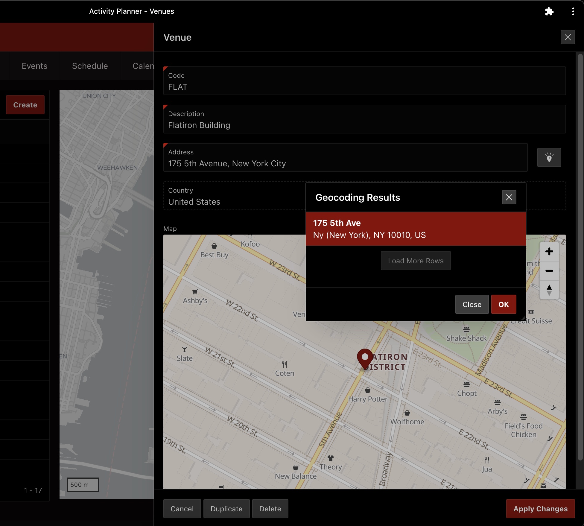
Geocoded Date in the Venues Page

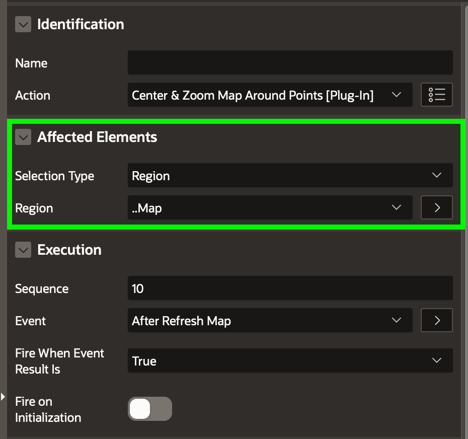
As shown below, the Venues page uses the techniques explained in my article Refitting Filtered Map Points to provide a filterable list of venues with an automatically-synchronized map that zooms and recenters to show the locations of the filtered venue list.

Filtering the list of venues to see the narrowed results on a map

The companion Venue page for creating and editing venues uses a Geocoded Map page item to simplify finding the longitude and latitude for a given address. In order to have the Geocoded Map page item show the appropriate pin on the map when editing an existing venue, we use the following expression in the region query to create an appropriate SDO_GEOMETRY value based on the v.longitude and v.latitude values stored in the table. Importantly, the Query Only property of the corresponding P11_GEOCODED_ADDRESS page item is set to ON so that the APEX engine doesn’t try to update any SDO_GEOMETRY column in the underlying EBA_DEMO_ANN_VENUES table that has LATITUDE and LONGITUDE instead.

/* 
 * if latitude/longitude have values, then
 * return sdo_geometry structure representing
 * the point (longitude,latitude)
 */
case 
  when v.longitude is not null 
   and v.latitude is not null then
     sdo_geometry(2001,
                  4326,
                  sdo_point_type(
                    v.longitude,
                    v.latitude,
                    null),
                  null,
                  null)
        end geocoded_address

Since we’re not asking APEX to save the SDO_GEOMETRY value directly to an underlying SDO_GEOMETRY column, when the user enters a new address and triggers the geocoding, we need to pick out the longitude and latitude so they get stored correctly in the respective, underlying columns of the same name. The P11_GEOCODED_ADDRESS page item has a dynamic action named When Address Confirmed that reacts to the Result Selection [Geocoded Address] event to trigger two Set Value dynamic action steps to set the P11_LONGITUDE and P11_LATITUDE page items with the values the geocoding service has returned. They reference the this.data.longitude and this.data.latitude JavaScript expressions to get the job done.

Geocoded Address page item lets APEX resolve longitude and latitude automatically

APEX’s geocoding service depends on knowing the country code of the address the user is typing in. The Venue page has a Pre-Rendering page process in the Before Header section named Default Trip Info for Current Edition. It contains the following PL/SQL block that looks up the trip ID and country code based on the value of the current edition the user is working with. Note that it only assigns the P11_TRIP_ID if the primary key P11_CODE is null (meaning that we’re creating a new venue):

for j in (select e.trip_id,t.country_code 
            from eba_demo_ann_editions e 
            left join eba_demo_ann_trips t on t.id = e.trip_id
           where e.id = :CURRENT_EDITION) loop
    if :P11_CODE is null then
        :P11_TRIP_ID := j.trip_id;
    end if;
    :P11_CURRENT_TRIP_COUNTRY_CODE := j.country_code;
end loop;

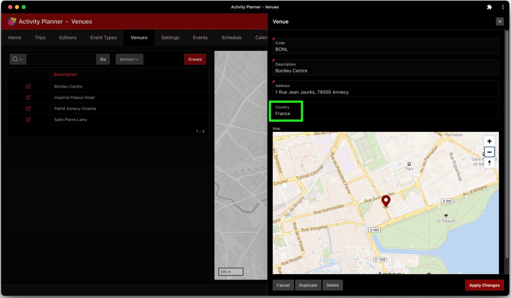
Then, the Geocoded Address page item is configured to use the P11_CURRENT_TRIP_COUNTRY_CODE page item for geocoding country information. This ensures that when defining a venue for my Annecy trip it uses FR for France as the geocoding country and when creating one for my New York City trip, it uses US for the United States.

Configuring geocoded address country

Let’s suppose we defined another trip for “Annecy Festival” with the country of France configured, then defined a new edition of this trip for the year 2024, and then finally set this new “Annecy Festival 2024” as the current trip event to work with using the Settings page explained in the next section. Then as shown below, the geocoding of venue addresses would be done with France as the country.

Venue address geocoding uses current trip edition country code

Settings Page

The Settings page (8) lets the user change four user preferences: the current trip edition to view/edit, whether to show countries and languages information, and the start time and end time to use in the Schedule Gantt chart page. The page shown below uses conditional Before Header computations to set the values of the page’s items based on first trying to use user preferences, then conditionally falling-back to using the same-named application items. The application item names (which match the corresponding user preferences) are CURRENT_EDITION, SHOW_COUNTRIES_AND_LANGUAGES, DAY_START_TIME, and DAY_END_TIME. I admit that I wasn’t super excited about the way I had to capture the Day Start Time and Day End Time using four separate select lists, but this was the user experience I had in mind for the task. Maybe a future APEX release will offer a time picker page item for this purpose.

Setting four different user preferences that affect the Activity Planner app

To save the Settings page item changes back to the user preferences, the page has one page process in the Processing section for each user preference that each use the built-in User Preferences page process type to save the updated value to the corresponding same-named user preference. Another four Execute Code page processes in the same section set the preference values into the corresponding application items, since those are what get referenced in various SQL queries around the app.

Focusing Calendar on a Date Range

Once you’ve marked one or more event runs as ticketed, get a bird’s eye view of your trip on the Calendar page. This page focus the users attention on the current trip edition by ensuring the right start day is shown immediately. It sets the calendar to use the START_DATE of the current edition to be the current date displayed, and to start the week display with this date, too.

Calendar gives bird’s eye view of ticketed event runs during the current trip edition

Assuming the calendar region has a static ID of calendar, setting its initial display date requires just one line of JavaScript in the Execute when Page Loads section of the page properties that calls the gotoDate() function on the calendar widget:

apex.region("calendar")
    .widget()
    .data('fullCalendar')
    .gotoDate($v('P12_START_DATE'))

With similar ease, after first computing the day of the week the START_DATE represents, we can set the first day of the calendar week in the calendar region’s Initialization JavaScript Function. The calendar expects its firstDay property to be a day number: 0=Sunday, 1=Monday, etc. I use a Pre-Rendering computation in the Before Header section to compute the value of a hidden P12_ZERO_BASED_FIRST_DAY using the following SQL query:

select to_number(to_char(first_day,'D'))-1
from eba_demo_ann_editions
where id = :CURRENT_EDITION

Setting the calendar’s firstDay property is essentially a one-line task. The code for the Initialization JavaScript Function on the Attributes tab of the property editor for the calendar region appears below. It assigns the value of the zero-based first day to the firstDay property of the pOptions object passed in.

function ( pOptions ) {
    pOptions.firstDay = $v('P12_ZERO_BASED_FIRST_DAY');                                    
    return pOptions;
}

Augmenting App Title with Page Name

It’s a personal preference of course, but as you can see in the previous screenshots, I like the “Top” style Navigation Menu layout since its options stay visible. I combine this style with the use of the After Logo position that lets me place additional context like the page name in the application navigation bar. This leaves more room for content on each page. For example, on the Calendar page I added a Page Title Static Content region with the following HTML Code:

<span class="apex-logo-text"> -&nbsp; Calendar</span>

This uses the same font as the logo text, and adds a hyphen separator and the name of the current page. As shown below, I set its Template to None and its Position to After Logo. This combo gives me a result that feels clean and spacious, and I’ve done the same thing on every non-modal page of the app.

Adding custom content like the page name to the After Logo position in the navigation bar

Grouping Event Runs by Event

The application’s Home page (1) has an Interactive Report showing a searchable list of all event runs for the current trip edition. To group the list of event runs by the event they belong to, I ran the page and used the Actions > Format > Control Break menu to add the Event break column as shown below.

Adding control break group to an Interactive Report to group event runs by event name

Next, to ensure the event runs sort in the most logical sequence for the end user, I used the Actions > Data > Sort menu to configure the report to first sort by Event then sort by Event Day Number as shown here.

Defining the sort order to show event runs in a logical day order

Finally, I saved the current state of the Interactive Report as the new default primary report for all users. As shown below, I used the Actions > Report > Save Report menu, choosing As Default Report Settings in the Save Report dialog, then ensured the Default Report Type was set to Primary in the Save Default Report dialog before clicking Apply.

Updating the primary default report to use current settings of the Interactive Report

Of course, the option to update the primary default report does not appear for end users. I was able to access it since I ran this page as a developer from the APEX Builder.

Formatting a URL as a Hyperlink

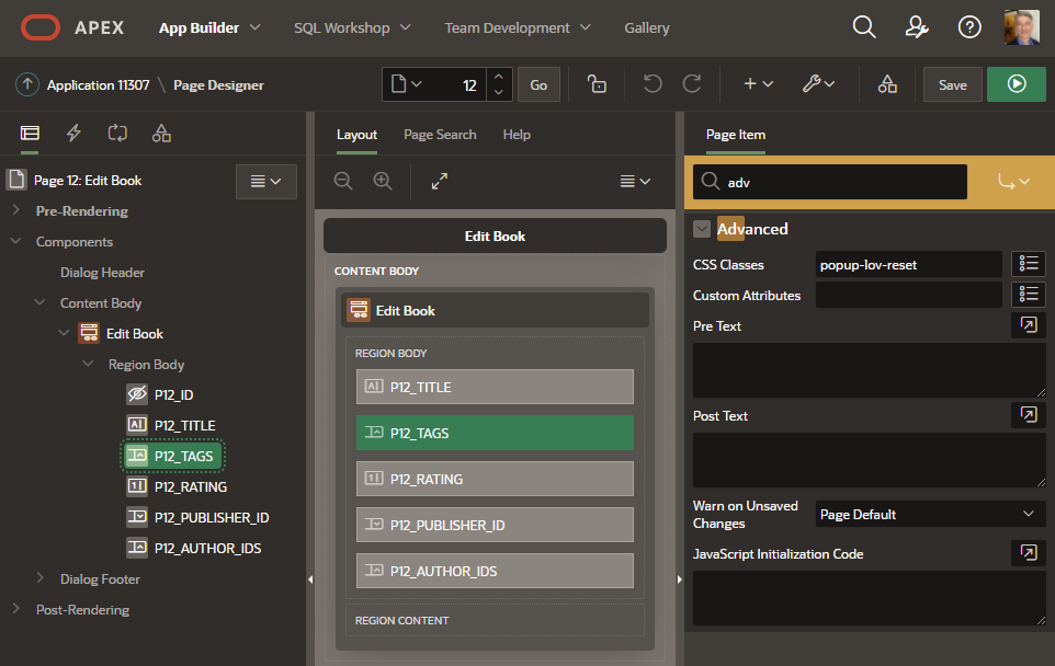
My colleague Jayson Hanes helped me figure out how to display an info icon on the Event page to open the event URL in a new browser tab. This should have been a simple task, but the first several approaches I tried didn’t work like I wanted. Luckily, Jayson gave me this helpful tip. The trick was to add a P7_URL_LINK page item of type Display Only to my page, set its Icon property to the fa-info-circle-o, then use the Advanced > Pre Text setting to add an enclosing, open tag for the hyperlink. It uses the substitution string &P7_URL!ATTR. in the value of the <a> tag’s href attribute. The special suffix !ATTR makes sure the value is escaped correctly to appear in an HTML attribute. I added a title attribute so the hyperlink would gain a “tooltip” when the end-user hovers over the info icon with their mouse.

<a href="&P7_URL!ATTR." 
   target="_blank" 
   title="Click to open this page in a new tab">

Then I used the corresponding Post Text setting on the page item to add the closing </a> tag. This produced exactly the desired effect I wanted as shown below. Thanks, Jayson!

Giving the end user an easy way to open the Event URL in a new browser tab

PWA: Instant Desktop/Tablet Use

I took most of the screenshots of the Activity Planner app in this article while running it as a Progressive Web App (PWA). This lets me launch the app directly from the dock of my Mac laptop whenever I need to use it. Combined with my enabling the Persistent Authentication feature at the APEX instance level, this produces a great user experience. I launch the planner app like any other app on my desktop or iPad and instantly continue my trip planning work.

Enabling an APEX app for PWA use takes just two clicks on the Shared Components > Progressive Web Page page in the APEX Builder. Just switch the Enable Progressive Web App switch to ON, as well as the Installable switch just below it. Enabling Persistent Authentication is an APEX instance administrator task in the Manager Instance > Security page.

Saving Quick SQL in Supporting Objects

The idea for this final tip was hatched after realizing every script in the Supporting Objects area of an APEX app could be made conditional. The feature uses the same options as a Server-side Condition elsewhere in the Builder. It offers a powerful way to control which scripts should run when. A simple corollary is that I can easily store the Quick SQL text for my application data model as a script with Condition = Never. This makes it easy to reference and maintain the QuickSQL as requirements change and enhancements get implemented, but ensures that APEX never tries to execute it.

Consistent Switch Value Labels in Grids

While doing final edits of this article I noticed that the Starred and Tickets switch columns in the Event page’s interactive grid would show values Yes and No for unmodified event run rows, but changed to show On and Off for rows I had edited. I resolved that by explicitly setting the On Label and Off Label properties for the Switch component settings in my app under Shared Components > Component Settings> Switch as shown below.

Explicitly setting the On and Off labels for Switch components

Planning Your Next Trip?

Just in case you might find my Activity Planner app useful, or even just educational to experiment with, you can download the app here. Its Supporting Objects scripts install the event run data for my most recent New York City trip, with none of the event runs starred or ticketed yet so you can experiment with those aspects yourself. Enjoy!

Broadway musical “& Juliet” cast members take their bows

Parent/Child Validation Made Easy

When working with parent/child data, an app often needs to validate an aggregate condition about all of the child rows related to a parent row. For example, say each teammate assigned to an action item can have a role of “Lead” or “Member”. Some typical parent/child validations for an action item’s team members might require the team to…

  • have a Lead
  • only have one Lead, and
  • not contain any duplicate members.

Ideally, the app will refuse to save anything unless the pending changes to parent and child rows satisfy all 3 business rules. The app should show the user a message so they know what to fix before trying to save again.

Starting with APEX 23.1, aggregate validations are easy to implement using simple SQL statements. This article first explains how to do them, and then why a new feature in 23.1 makes them possible. It goes on to highlight a few other techniques I learned while building the sample app. At the end, I provide a download link to try it out for yourself.

Sample App Overview

The sample app uses the three tables shown below. One stores the Action Items, another the Staff Members, and the third holds the action item team list relating an action to the staff members collaborating to complete it.

Three tables involved in the “One Lead on a Team” sample application

The sample includes a page to maintain Staff Members and, as shown below, another page to maintain Action Items.

Page to maintain action items

You can see the page used to create, edit, or delete an Action Item below. It includes a “parent” Form region for the Action Item row and an editable Interactive Grid “child” region for the list of action team members.

Page to edit an action item and its related action team members

Ensuring Child Rows Get a Parent Id

When building an editable page including parent and child data, I first ensure any child row gets its parent id foreign key set correctly. My preferred technique is adding an Execute Code page process after the Process form Action one that saves the parent row and before the Save Interactive Grid Data one that stores the grid’s child rows. This approach works for both create and edit use cases.

This new Execute Code page process assigns the parent foreign key column with the one line of PL/SQL below. The :ACTION_ID bind variable references the ACTION_ID foreign key column in each grid row being created or modified, and :P5_ID is the ID of the parent Action Item row being created or edited.

-- Assign the parent foreign key to the team row from the grid
:ACTION_ID := :P5_ID;

As shown below, by setting the Editable Region property of the process to the Interactive Grid region Action Team, APEX runs it once for each created or modified child row in the grid region.

Ensuring child rows have their parent foreign key set correctly

If an APEX page has multiple child grids on an edit page with their parent row — perhaps each one on a different tab — just repeat this technique for each grid involved. Sequence all the foreign key assignment processes after the parent row save process and before any of the child grids’ save processes.

Adding Aggregate Validations

Next we can add the aggregate validations as additional Invoke API page processes following the page processes that save the data. The Enforce Exactly One Lead process shown below invokes the one_lead_per_action_team procedure in the eba_demo_action_validation package, passing the value of the P5_ID page item for the p_action_id parameter.

Adding the aggregate validation procedures using Invoke API page processes

The PL/SQL package containing the validation procedures has the specification shown below in the Object Browser.

eba_demo_action_validation package spec in the Object Browser

In the package body, the code for one_lead_per_action_team is below. It first checks the Action Item parent row is valid by using a zero-or-one-row for loop based on the primary key value in the p_action_id parameter. This is important since one of the operations the page can perform is to delete the action item. We want our validation code to work correctly — by consciously doing nothing — in that situation. If the loop’s SELECT returns a row, then the code inside the loop runs once. It counts how many Team child rows for the current Action Item have the role = 'LEAD' using a simple select count(*). If the l_lead_count does not equal one, then the validation check fails. We use a case statement to conditionally display the appropriate error message depending on whether the lead count is less than one or greater than one. If the lead count equals one, then by not reporting any error it lets the transaction commit successfully.

-- Ensure the action has exactly one Lead
procedure one_lead_per_action_team(
    p_action_id in number)
is
    l_lead_count number;
begin
    -- Ensure the action id still exists since it might
    -- have been deleted. If it exists, perform the check
    -- on the children rows.
    for j in (select id 
                from eba_demo_action
               where id = p_action_id) loop
        select count(*)
        into l_lead_count
        from eba_demo_team
        where action_id = p_action_id
        and role = 'LEAD';
        if l_lead_count != 1 then
            error(  case 
                        when l_lead_count < 1 
                        then c_msg_team_must_have_lead
                        else c_msg_team_max_one_lead
                    end);
        end if;
    end loop;
end;

The simple, package-private error() helper procedure is below. It calls the add_error() procedure in the apex_error package with a display location of On Error Page using the appropriate package constant. This causes the APEX engine to rollback the transaction and display the error message to the user. It uses the apex_lang.message() function to return the translated error message based on the message key passed in. The net result is that no changes submitted from this parent/child page get saved to the database when this aggregate validation error occurs.

-- Raise an error with indicated message key
procedure error(
    p_message_key in varchar2)
is
begin
    apex_error.add_error (
        p_message          => apex_lang.message(p_message_key),
        p_display_location => apex_error.c_on_error_page);
end;

The no_duplicate_team_members procedure uses a similar technique, with a slightly different select statement. Its code is shown below. We count the number of team member rows, grouping by the user_id and only returning ones having a count greater than one. If at least one of such row is returned, then we have a duplicate team member name and we report the error as above using a different error message key constant.

-- Ensure the action has no duplicate team members
procedure no_duplicate_team_members(
    p_action_id in number)
is
begin
    -- Ensure the action id still exists since it might
    -- have been deleted. If it exists, perform the check
    -- on the children rows.
    for j in (select id 
                from eba_demo_action
               where id = p_action_id) loop    
        for k in (select user_id, count(*)
                    from eba_demo_team
                   where action_id = p_action_id
                   group by user_id
                   having count(*) > 1
                   fetch first row only) loop
            error(c_msg_team_no_duplicates);
            exit;
        end loop;
    end loop;
end;

Using Translatable Error Messages

Since the application might need to be translated into multiple languages, it’s best practice to define the error messages as Text Messages in the Shared Components area of the APEX builder. The figure below shows the three text messages I defined to support the error messages my aggregate validation code may display to end users.

Translatable text messages in Shared Components showing message key and base language text

The eba_demo_action_validation package body defines the following three constants to hold the message keys:

------------------------------------------------------------
-- Constants for error message keys
------------------------------------------------------------
c_msg_team_must_have_lead constant varchar2(25) 
                                   := 'TEAM_MUST_HAVE_A_LEAD';
c_msg_team_max_one_lead   constant varchar2(25) 
                                   := 'TEAM_MAX_ONE_LEAD';
c_msg_team_no_duplicates  constant varchar2(25)
                                   := 'TEAM_NO_DUPE_MEMBERS';

Hiding the Grid’s Toolbar Save Button

Since we want the aggregate validation to always take into account both parent and child data, we use the Action Item form region’s default CREATE and SAVE buttons that both submit the page. APEX automatically submits the data from all page regions when the user clicks one of these buttons. Accordingly, to avoid the user’s saving child grid row changes on their own, we hide the default (Save) button in the Interactive Grid’s toolbar. To perform this task, the figure below shows where to find the checkboxes on the Attributes tab of the property editor after selecting the Interactive Grid region. While I was there, to keep things simple, I turned off a number of the default toolbar controls.

Hiding Interactive Grid’s built-in (Save) toolbar button to use a page submit button instead

Taking the Sample For a Spin

If the end user tries to create or edit an action item and save without having designated a team Lead, then she’ll see the error message below.

Error message when user tries to save an action item with team containing no Lead

If she tries to create or edit an action item whose team contains more than one Lead, when she tries to save she’ll see this different error message:

Error message when user tries to save action item with team having multiple Leads

Finally, if the user inadvertently adds the same staff member twice to the action item team, she’ll see the error message:

Error message when user tries to save action item with team having duplicate members

Using the SQL Commands page in the APEX builder, you can have a quick peek at the eba_demo_action and eba_demo_team tables before and after to convince yourself that no data has been inserted or updated when these parent/child validations fail.

What Changed in 23.1 to Make This Easy?

APEX 23.1 introduced a new Session State Commits setting in the Session Management section of the app definition’s Security tab. For new apps, it defaults to the value End of Request which defers the database transaction commit to the end of the current submit page request. The figure below shows where this setting lives in the APEX App Builder.

Reading the help text for the Session State Commits application definition setting

This one change, combined with the Oracle database’s read consistency model, lets aggregate validations be implemented so easily. They can use simple SQL select statements to reason over the pending parent and child row changes that APEX has made in the current database transaction. Importantly, they can do so before the transaction gets committed. This means they are still in time to “veto” the transaction by adding an error to the APEX error stack.

In the remaining sections, I highlight some additional techniques I learned while building this sample app that I found interesting. They are not directly related to parent/child validation, but they made me smile when I learned how to do them so I wanted to share the knowledge…

Dynamic Grid Cell Defaulting

The Action Item page can guide end users to follow the “One Lead on a Team” rule by using dynamic defaulting. When the first team member row is added to the grid, it should default to being a Lead. In constrast, the role should default to Member for other rows added. I wanted to learn how this could be done on the client side, so I asked my colleagues for advice.

John Snyders taught me about the Interactive Grid’s ability to associate a dynamic defaultValue function with a column using its Column Initialization JavaScript Function property. After selecting the ROLE grid column whose default value I wanted to be dynamic, the figure below shows where I needed to add my code in the Page Designer.

Configuring a dynamic defaultValue function for the ROLE grid column in Page Designer

The few lines of JavaScript appear below. The initialization function receives an options object on which it sets the defaultGridColumnOptions property to configure a custom defaultValue function for the column. This one-line function calls getTotalRecords() on the interactive grid’s model object it receives and returns the literal string LEAD if the model’s row count is zero and MEMBER otherwise.

function( options ) {
    options.defaultGridColumnOptions = {
        // Setup a dynamic default value for the ROLE column
        // to return LEAD when there aren't any rows yet, and
        // MEMBER otherwise.
        defaultValue: function(model) {
            return model.getTotalRecords(true) == 0 ? "LEAD" 
                                                    : "MEMBER";
        }
    };
    return options;
}

NOTE: If you use this technique in your own applications to return a default value for a number column or date column, remember to return the value as a String from this function.

Setting Width of the IR Columns

While fine-tuning the sample, I noticed the link column of the Interactive Reports pages for Staff and Action Items was extra wide and didn’t look so great. The Staff page initially appeared like this:

Extra wide link column in Interactive Report on the Staff page

The Action Items page had three columns, but still the column widths looked less than ideal…

Extra wide link column and Lead columns in the Action Items page

I learned how to set the width of the interactive report link column across all Interactive Reports in the application, and added the following snippet of CSS to a global app.css file in the Static Application Files area of Shared Components.

th#a-IRR-header--linkCol,
td.a-IRR-linkCol
{
  width: 6em;
  text-align: center !important;
}

Colleagues taught me it was best practice to reference the desired column width using em CSS units instead of pixels. So above I’m setting the link column to be 6 characters wide relative to the base font size of a letter M. That way, if the user zooms their browser — increasing the base font size — then the column always remains wide enough to show six of those larger-sized characters.

After creating the app.css file, I copied its path and pasted it into the CSS > File URLs section of the application definition’s User Interface tab as shown below. At runtime, APEX replaces #APP_FILES# with the URL to access the static app files content, and replaces the #MIN# as appropriate to use the more compact “minified” version of the CSS style sheet when not running in debug mode.

Setting the path of a global app.css file that “lives” in Static Application Files

To set the width of the Lead column in the Action Items page, first I set the Static Id of the LEAD column to action-team-lead, then I added the following small amount of CSS to the page-level CSS > Inline property:

td[headers=action-team-lead], th#action-team-lead {
  width: 10em 
}

The result is that the link column is set across the app to 6 characters wide — affecting both the Staff and Actions Items page — and the Lead column is set to 10 characters wide. We can see below that the Staff page now looks more professional:

Staff page with 6-character-wide link column from application-wide app.css styling

Similarly, the Action Items page also looks more polished, with the same 6-character-wide link column, and a 10-character-wide Lead column. This leaves the most amount of horizontal space for the action item name:

Action Items page with 6-character-wide link column and 10-character-wide Lead column

Merging Seed Data from Static App JSON

The last interesting technique I used in the sample app is how I’m seeding the data for the 26 example Staff members. I’m aware of the APEX built-in Supporting Objects feature called Data Package. It lets developers choose a set of tables whose data they want to install when an APEX app is first imported into a target workspace. That feature is great, but I wanted to explore how to gain more control over seed data installation to more seamlessly handle the situation where new seed data rows could be added over time in later versions of the app.

First, I added a staff.json file with the following format into the Static Application Files area in Shared Components:

{
    "staff": [
        {"NAME": "Abigail"},
        :
       etc.
        :
        {"NAME": "Zelda"}
    ]
}

Then I added the following Supporting Objects installation script that uses a merge statement to insert any Staff names from the staff.json file that don’t yet exist into the eba_demo_staff table. Its using clause selects the contents of staff.json from the static application files view and uses json_table() to select the NAME column data out of that JSON file. With this technique, subsequent versions of the app could add new NAME entries to the staff.json file and they would be added to the eba_demo_staff table at application import time. If the seed data were more complicated and multi-columned, the merge statement could also use a when matched then clause — which wasn’t needed for this simple sample — to update the values of other seed data columns that might have changed since the last time they were inserted/updated.

merge into eba_demo_staff tgt
using (
    with x as (
        select aaf.blob_content 
          from apex_application_files aaf, 
               apex_applications aa
         where aa.application_id = 
                    coalesce(
                        apex_application_install.get_application_id,
                        to_number(v('APP_ID')))
           and aaf.flow_id = aa.application_id
           and aaf.filename = 'staff.json'
    )
    select y.name
    from x,
         json_table(x.blob_content, '$.staff[*]' columns
        (
            name varchar2(255) path '$.NAME'
        )) y
) src
on (tgt.name = src.name)
when not matched then
    insert (name)
    values (src.name)

Trying the Sample App

You can download the sample app from here. Try creating a new action item and causing some of the validation messages to appear. Then try editing an existing action item and repeating the process to cause the aggregate validations to fail. Finally make sure you can delete an action item. I hope you find useful ways to incorporate this technique into the next APEX app you build.

Final Thoughts

Using appropriate SELECT statements and the technique outlined in this article, you can make quick work of other kinds of typical aggregate validation use cases like checking that the …

  • sum of a child row column does not exceed a limit
  • sum of percentages across child rows equals 100%
  • count of child rows is within an expected range

The validations can get even more complex like ensuring the changes to the line items of an order don’t put the customer’s total monthly orders above their credit limit. Let your imagination be your guide!

Designer Collab for Date Ranges

When searching for hotels, I often specify check in and check out dates with two clicks on the same mini-calendar. The new date picker’s dayFormatter function let me achieve the same user experience in an APEX app, with some CSS help from my designer colleague Jeff Langlais. I got the basic functionality working; then Jeff updated the stylesheet with his CSS magic to make it sing. Finally, a tip from colleague Stefan Dobre about JavaScript classes unlocked how my Java programming experience could be an asset while learning this new language. It inspired me to refactor my code to make using a date range picker very simple in future APEX apps I build.

Overview of the Strategy

My strategy involved using an inline date picker page item as the “surface” the user interacts with to set and see the date range. The date picker page item works together with two other date fields that capture the actual start and end dates. Depending on the application, it might be desirable for the user to see the start and end dates in an alternative display format. However, in my sample application I decided to set them to be Hidden page items. As shown in the figure below, the dayFormatter function associated with the date range picker, considers the values of the hidden Check In and Check Out dates to decide how to format the days in the date range between start date and end date. It also decides the appropriate tooltip to show the user based on these values.

The dayFormatter function on the date range picker styles the range of days and tooltips

CSS Style Classes Involved

The date picker used as the date range picker is tagged with the CSS class date-range-picker. This allows targeting the CSS style rules so that they only affect date range picker page items, without disturbing the styling of other date pickers used in the application. Next, I identified three different styles required to render the “stripe with rounded ends” look I imagined in my head. As shown below, the CSS class dateRangeStart represents the start date of the range, the dateRangeEnd for the end date, and thedateRangeMiddle class for those days in between. I wrote the dayFormatter function to return null for the CSS class property for any days in the “mini-month” that were before or after the date range. For those days within the range, it returns one of these three CSS class names depending on whether the day being formatted is the beginning, middle, or end of the range. The apex.date namespace functions parse(), isSame(), isBefore(), isAfter(), and isBetween() came in handy for writing the date-related logic in the dayFormatter function and the date change handler function described later.

Three CSS class names involved in formatting a date range as a “stripe with rounded ends”

After getting the initial dayFormatter logic working, I realized that some use cases might need a date range that starts and ends on the same day. For example, this would be the case for the dates of a single-day event. To allow for a more visually pleasing single-day date range, I decided a fourth CSS class dateRangeSingleDay was needed to achieve the appropriate “pill” shape the user would expect a one-day event to have. I adjusted the dayFormatter function to return this new class name if start date and end date were the same.

Additional CSS class to handle single-day events as a special case

Handling Date Range Input & Reset

When the user clicks on a day in the “mini-month” calendar of the date range picker, the Change event will fire for that page item. I wrote the logic of the change handler to work as follows:

  • If start date is not set, then set it to the clicked-on date
  • Otherwise, if the clicked day is after the start date, then set the end date to the clicked-on date
  • If the clicked day is before the current start date, then set start date to the clicked-on date
  • Finally, set the date range picker to the value of the start date again, and
  • Refresh the date picker item to re-evaluate the dayFormatter in the process

When the user clicks on the button to reset the date range picker, the Click event will fire for that button. I wrote the logic of the click handler to:

  • Set the value of the start date to null
  • Set the value of the end date to null
  • Set the value of the date picker to null
  • Refresh the date picker item to re-evaluate the dayFormatter in the process

Following good practice, I had written the bulk of my JavaScript logic in a shared application file dateRangePicker.js It defined a dateRangePicker JavaScript object with three functions:

  • assignDayFormatter() called from the Page Load dynamic action event
  • onChanged() called from the Change dynamic action event on the date picker
  • reset() called from the Click dynamic action event of the reset button

In the page containing the date range picker page item, the hidden start date item, the hidden end date item, and the reset button, I setup dynamic actions to invoke the helper methods like this:

Initial implementation using dynamic actions to call JavaScript functions in a helper object

Abstracting Interesting Bits into Metadata

After initially hard-coding the values of the date range picker item, the start date and end date page items, I next tried to add a second date range picker on the same page and rework my code to accept the interesting information as parameters that made the two instances unique. Instead of passing in 10 separate parameters, I decided to pass all the info required as a single parameter in a structured JavaScript object. An example of this parameter object appears below. It captures the names of the page items involved in a single date range picker:

{
  picker: {
    name: "P2_CHECKIN_CHECKOUT_PICKER",
    format: "DD-MON-YYYY",
    allowSingleDay: false 
  },
  start: {
    name: "P2_CHECKIN",  
    label: "Check In"
  },
  end: {
    name: "P2_CHECKOUT",
   label:"Check Out"
  }
}

By passing the appropriate JavaScript object to each of the helper methods, I was able to rework the code to easily support date range pickers on any page in my application and even multiple ones on the same page.

Working in Parallel with a Designer

Since I’m not a CSS expert, I started with the simplest possible dateRangePicker.css file containing the style classes for the four states the date range picker needed, setting a different font color and italic style for the different date range classes. I used the Chrome browser tools Inspect Element… feature to study what elements and classes would need to be selected by these basic CSS rules. In words, for example, the first rule below selects a <td> element having the CSS class dateRangeStart wherever it’s nested inside a containing element with class a-DatePicker-calendar (the “mini-month”) where that is nested inside a containing <a-date-picker> element having the class date-range-picker:

a-date-picker.date-range-picker .a-DatePicker-calendar td.dateRangeStart
{
    color: yellow;
    font-style: italic;
}

a-date-picker.date-range-picker .a-DatePicker-calendar td.dateRangeMiddle
{
    color: darkmagenta;
    font-style: italic;   
}

a-date-picker.date-range-picker .a-DatePicker-calendar td.dateRangeEnd
{
    color: green;
    font-style: italic;   
}

a-date-picker.date-range-picker .a-DatePicker-calendar td.dateRangeSingleDay
{
    color: blue;
    font-style: italic;   
}

The effect wasn’t exactly what I had predicted, but as shown below I could see after selecting February 13th as the start date and 16th as the end date, that the dates in the date range were showing with the indicated colors and in italic. As you can see below, there was something about the date picker’s default styling of the current date (which, recall, coincides with the start date of the date range) that was overriding my styles. That current date was colored with a blue circle. However, I could see that the font style was italic, so I knew my style rule was correctly selecting that dateRangeStart day. I also noticed that today’s date was showing in the calendar with a different colored circle.

Initial attempt at CSS stylesheet to style the date range days differently

Rather than trying to become a CSS expert, I decided to pass these requests along to Jeff the designer so that he could incorporate solutions into the final CSS stylesheet he gave me back. In addition to the “stripe with rounded ends” look for the date range, I also asked him to explore hiding the current day indicator. You can explore the sample application’s dateRangePicker.css static application file to see the CSS magic that Jeff worked to make the date range picker look great. This was a concrete example of how an APEX developer with only the most basic CSS skills could easily collaborate with a highly-skilled CSS web designer to produce a nice-looking result.

Leaning Into JavaScript Classes

As a final step, I asked my colleague Stefan Dobre to review my JavaScript newbie code to suggest any improvements. He recommended I explore further encapsulating the logic of the date range picker into a self-contained DateRangePicker class. Its constructor could accept the JavaScript object describing the combination of picker, start date, and end date page items, and then internalize the details of:

  • Setting the date-range-picker CSS class on the picker page item
  • Assigning the dayFormatter function to the picker page item
  • Adding an event listener to the picker’s Change event to call onChanged()

By expanding the metadata captured by the constructor to also include the static id of the reset button, the DateRangePicker class could also internalize adding an event listener to the button’s Click event to call reset().

Since I’d programmed for many years in Java in my previous roles at Oracle, the idea of using a class felt second nature. But as a JavaScript neophyte, the idea never crossed my mind. So Stefan’s suggestion unlocked a positive path in my Java brain that will hopefully make future JavaScript development more familiar. You can see the full code for the DateRangePicker JavaScript class in the sample application’s dateRangePicker.js static application file, but the skeleton of the implementation looks like this. Its constructor accepts the JavaScript object describing the configuration details of the date range picker page items, sets the date-range-picker CSS style class on the picker page item, assigns the initial value to the date picker from the start date, assigns a dayFormatter function to the picker, and wires up the change and click event listeners to run the appropriate code to handle those actions.

window.DateRangePicker = class DateRangePicker {
    // Construct the DateRangePicker accepting object that describes
    // the picker, start date, end date names, and reset button id
    constructor(pConfig) {
        this.#config = pConfig;
        // Assign the date-range-picker CSS class to the picker
        this.#pickerItem().element.addClass("date-range-picker");
        // Assign the initial value of the picker from the start date
        this.#assignInitialValueFromStartDate();
        // Assign the dayFormatter funtion
        this.#assignDayFormatter();
        // Wire up the change event on the picker to call onChanged()
        this.#pickerItem().element.on("change", () => {
            this.#onChanged();
        });
        // Wire up the click event on the reset button to call reset()
        document.getElementById(this.#resetId()).addEventListener(
            "click", () => {
            this.#reset();
        })
    }

    // Private fields ==================================================
    #config;

    // Private methods =================================================
    #assignDayFormatter() {...}
    #onChanged() {...}  
    #reset(){...}
}

With this class in place, you can see how it’s used in page 2 and page 4 of the sample app. Their respective page load JavaScript code contains two simple calls like the following to construct two DateRangePicker class instances, passing the interesting info into each’s constructor.

// Example from Page 4 in the sample app's Page Load JavaScript
// Setup config for Event Start/End Date Range Picker
// Allows a single day to be both start and end
window.eventStartEndDateRangePicker = new DateRangePicker({
    picker: {
      name: "P4_EVENT_DATE_RANGE",
      format: "DD-MON-YYYY",
      allowSingleDay: true 
    },
    start: {
       name: "P4_EVENT_STARTS",  
       label: "Event Start"
    },
    end: {
        name: "P4_EVENT_ENDS",
        label:"Event Start"
    },
    reset: {
        id:"Reset_Event_Dates"
    }
});

With all the logic encapsulated in the JavaScript class, there is no setup left in the page other than making sure the picker, start date, and end date page items have their Value Protected property set to false and that they all use the same format mask. This resulted in a page you can experiment with in the sample to create or edit the details of an Event. Each Event in the sample app has a start and end date (which can be the same day) as well as a default check in and check out day for event attendees (which must be at least two different days).

Two date range pickers in action in a sample app editing Event details

Get the Sample App

You can download the APEX 22.2 sample application by clicking here. Thanks again to designer Jeff Langlais for helping me with the CSS styles to deliver the visual idea I had in mind, and to Stefan Dobre for teaching me about JavaScript classes to simplify how to uptake the date range picker functionality in future APEX apps I will build.

Refitting Filtered Map Points

Using a public dataset of New York City high schools, I built a page that lets students or parents filter the list based on various criteria. As they narrow their options, a map region reflects where the remaining schools are located, and a stacked bar chart lets them compare the contenders on a few important metrics. While the map initially centered and zoomed itself to fit the unfiltered set of schools, to give users the sense of “homing in” on their perfect school I wanted to refit the map around the narrowed search results. To reflect the filtered results from the cards region in the map and chart, I used the region data sharing technique from my colleague Carsten’s article Add a Chart to your Faceted Search Page. Then I got a little help from my colleagues Christian Lara and Stefan Dobre to learn how to build my first simple “Center/Zoom Map Around Points” dynamic action plug-in to make it easy to build this feature into any map-based pages I build in the future. You can check out the sample using the link at the end of the article.

Refreshing the Map and Chart

The data source for the map is a query from a pipelined table function I created following Carsten’s technique. It retrieves the high school data using the same filters currently applied to the schools region in the page:

select school_name, latitude, longitude
from eba_demo_nyc_highschool_data( 
       p_page_id => :APP_PAGE_ID,
       p_region_static_id => 'schools')

Similarly, the chart’s datasource is a query that selects a few different columns from the same pipelined table function:

select school_name, graduation_rate, 
       attendance_rate, college_career_rate
from eba_demo_nyc_highschool_data( 
       p_page_id => :APP_PAGE_ID,
       p_region_static_id => 'schools')

When the cards region changes due to the user’s applying new filters, we want to refresh the map and chart regions. The lesson I learned while getting this to work was that rather than using the “After Refresh” event on the cards region, I needed to instead use that region’s “Page Change [Cards]” event to trigger the dynamic action refresh, using two dynamic action steps of type “Refresh”.

Centering & Zooming the Map After Refresh

Whenever the map region gets refreshed, my goal was to have it refocus the user’s attention by using the new set of filtered data points to center and zoom the map appropriately. After hunting for a built-in APEX map JavaScript API, or a built-in dynamic action, I realized the solution would take a bit more research. My teammate Christian Lara pointed me at the MapLibre Fit a map to a bounding box example, and gave me this snippet of JavaScript below to consider.

The first statement accesses the map’s (post-refresh) bounding box from its mapData.map.bbox member and defines a new bounds array that contains the two points representing that rectangle. The second line gets the MapLibre map object from the APEX map region on my page, and calls its fitBounds() method to perform the centering and zooming to the new dimensions. It uses 30 pixels of padding so points near the edge of the box stay visible.

// Define the bounds using refreshed map bounding box coordinates
let bbox = apex.region("map").mapData.map.bbox,
    bounds = [
        [ bbox[0], bbox[1] ],
        [ bbox[2], bbox[3] ]
    ];
// Fit the map to the new bounds
apex.region("map").getMapObject().fitBounds(bounds,{padding: 30});

Creating a Reusable Dynamic Action Plug-in

With the code above in a dynamic action step triggered by the “After Refresh” event on the map region, the functionality I desired was working, but I wanted to learn how to encapsulate that little bit of code into a reusable dynamic action plug-in. I first watched Stefan Dobre’s The Ultimate Guide to APEX Plug-ins video from the APEX@Home 2020 conference, and then created a new dynamic action plugin named “Center & Zoom Map Around Points” in my application. Following best practice, I put the JavaScript code in a with a centerZoomMap.js file, and referenced its qualified name in the File URLs to Load section using the syntax PLUGIN_FILES#centerZoomMap#MIN#.js

I instinctively knew that to be reusable, the name of the map region’s static id would have to be a function parameter, so my first attempt at writing the contents of this centerZoomMap.js file looked like this:

// centerZoomMap.js -- First Attempt
function centerZoomMap(staticId) {
  // Define bounds using refreshed map bounding box coordinates
  let bbox = apex.region(staticId).mapData.map.bbox,
    bounds = [
        [ bbox[0], bbox[1] ],
        [ bbox[2], bbox[3] ]
    ];
  // Fit the map to the new bounds
  apex.region(staticId).getMapObject().fitBounds(bounds, {padding: 30});
}

After that, I defined a custom attribute in the plug-in named “Map Region Static Id” as attribute slot number one. However, I admit to getting a bit confused on how to pass the value of the plug in’s dynamic attribute to the JavaScript function. After asking my colleague Stefan Dobre for a tip, he used the occasion as a teachable moment to show me about the two standard plug-in attributes:

  • For Region
  • Affected Element Required

By leveraging these standard plug-in attributes, the developer using the plug-in gets a more native-feeling experience of picking the region to associate the plug-in with. It also allowed me to remove the custom attribute I had created in the plug in. The developer now configures the map she wants to center and zoom by simply picking the map region in the Affected Element section as shown below:

Configuring Affected Elements in the Properties editor to pick Map region to zoom and center

Stefan also took the opportunity to teach me a best practice of defining the centerZoomMap function as a property on the window to make its scope more clear when reading the code. So the final contents of centerZoomMap.js after consulting with Stefan looked like this:

// centerZoomMap.js - Final version
window.centerZoomMap = function() {
    // Ensure dev-configured affected element has a static id 
    const id = this.affectedElements.attr( "id" );
    if ( !id ) {
        throw new Error( "Affected Region must have an ID" );
    }
    // Use static id to ensure dev chose a map region
    const region = apex.region( id );
    if( !region || region.type !== "SpatialMap" ) {
        throw new Error( "Affected Region must be a Map" );
    }
    // Define bounds using refreshed map bounding box coordinates
    let bbox = region.mapData.map.bbox,
        bounds = [
            [bbox[0], bbox[1]],
            [bbox[2], bbox[3]]
        ];
    // Fit the map to the new bounds
    region.getMapObject().fitBounds(bounds, {padding: 30});
};

The last piece of the simple dynamic action plug-in was writing the render function using the appropriate function specification that I copied from the online help to use as a guide. The only job it had to do was tell the APEX engine the name of my JavaScript function to invoke when the dynamic action gets used at runtime:

function render (
    p_dynamic_action in apex_plugin.t_dynamic_action,
    p_plugin         in apex_plugin.t_plugin )
    return apex_plugin.t_dynamic_action_render_result is
    l_result apex_plugin.t_dynamic_action_render_result;
begin
    l_result.javascript_function := 'centerZoomMap';
    return l_result;
end;

Using the New Plugin in the Page

With the plug-in now defined, I went back to the Page Designer and removed the dynamic action step that was directly calling Christian’s snippet of JavaScript and replaced it by using the new “Center & Zoom Map Around Points” plugin we built. After picking the “Map” region from the Affected Elements section, it was ready to go.

Page Designer showing use of new plug-in to center & zoom the map after the map gets refreshed

Giving the Sample a Spin

To try out the sample, you can download the APEX 22.2 application from here. It gives the end user a nice school-searching experience like what you see in the screen recording below. Thanks again to Christian and Stefan for sharing their wisdom in getting to this end result.

Data-Driven Diagrams

I often want to visualize my Oracle APEX app’s data model as an Entity/Relationship diagram to remind myself how tables are related and exactly how columns are named. After recently stumbling on the open source Mermaid JS project, I had a lightbulb moment and set out to build my own data model visualizer app with APEX itself.

Mermaid Diagram Syntax

The Mermaid JS open source project aims to improve software documentation quality with an easy-to-maintain diagram syntax for Markdown files. The typical README.md file of a software project can include an Entity/Relationship diagram by simply including text like this:

erDiagram
DEPT ||--|{ EMP : "Works In"
EMP ||--|{ EMP : "Works For"

Including a diagram like this into your product doc is as simple as shown below:

Adding a Mermaid diagram to a Markdown file

If your markdown editor offers a WYSIWYG experience, the effect is even more dramatic and productive: you immediately see the results of the diagram you’re editing. For example, editing a Mermaid diagram in a readme file using Typora looks like this:

Editing a Mermaid diagram in a WYSIWYG Markdown editor like Typora

Popular source control repository sites like GitHub and GitLab have also embraced Mermaid diagrams. Since Markdown is used to provide check-in comments, on these sites (and others like them) it’s easy to include Mermaid diagrams in the helpful summaries you provide along with every commit.

Mermaid’s Diagram Types and Live Editor

Mermaid supports creating many different kinds of diagrams, each using a simple text-based syntax like the ER diagram above. At the time of writing, supported diagram types include Entity/Relationship, Class, Gantt, Flow, State, Mindmap, User Journey, Sequence, Git branch diagrams, and pie charts. The handy Mermaid Live site provides a “sandbox” editor experience where you can experiment with all the different kinds of diagrams, explore samples, and instantly see the results.

Mermaid Live editor for experimentation at https://mermaid.live

For example, after consulting their excellent documentation, I immediately tried including column details into my ER diagram for the DEPT table as shown below:

Mermaid Live editor showing ER diagram with column info and library of diagram samples

Rendering Mermaid Diagrams in Web Pages

To maximize the usefulness of the diagrams, the Mermaid project provides a simple JavaScript API to incorporate scalable vector graphics (SVG) renderings of text-based diagrams into any web page or web application. After referencing the Mermaid JS library URL, including a diagram into a page in my APEX application took a truly tiny amount of JavaScript: one line to initialize the library and one line to render the diagram from the text syntax.

In order to reference the current version of the Mermaid JS library on my page, I typed this URL into my page-level JavaScript > File URLs property:

https://cdnjs.cloudflare.com/ajax/libs/mermaid/9.3.0/mermaid.min.js

Then, after including a Static Content region in my page and assigning it a Static Id of diagram, the two lines of JavaScript code I added to the page-level Execute When Page Loads section looked like this:

mermaid.initialize();
mermaid.mermaidAPI.render('diagramsvg',
    `erDiagram
    DEPT ||--|{ EMP : "Works In"
    EMP ||--|{ EMP : "Works For"`,
    (svg) => {
    document.getElementById('diagram').innerHTML = svg;
});

These two lines of “When Page Loads” JavaScript do the following:

  1. Initialize the Mermaid library
  2. Render the diagram defined by the text passed in as an SVG drawing
  3. Set the contents of the diagram region to be this <svg id="diagramsvg"> element.

In no time, my APEX page now displayed a text-based Mermaid ER diagram:

APEX page including a Mermaid ER diagram based on its text-based syntax

Generating Mermaid Diagram Syntax from a Query

After proving out the concept, next I tackled generating the appropriate Mermaid erDiagram syntax based on the tables and relationships in the current APEX application schema. I made quick work of this task in a PL/SQL package function diagram_text() that combined a query over the USER_CONSTRAINTS data dictionary view with another query over the USER_TABLES view.

The USER_CONSTRAINTS query finds the tables involved in foreign key constraints as a “child” table, and gives the name of the primary key constraint of the “parent” table involved in the relationship. By joining a second time to the USER_CONSTRAINTS table, I can query both child and parent table names at once like this:

  select fk.table_name as many_table, 
         pk.table_name as one_table
    from user_constraints fk
    left outer join user_constraints pk
                 on pk.constraint_name = fk.r_constraint_name
   where fk.constraint_type = 'R' /* Relationship, a.k.a. Foreign Key */

The USER_TABLES query, using an appropriate MINUS clause, finds me the tables that aren’t already involved in a “parent/child” relationship above. By looping over the results of these two queries and “printing out” the appropriate Mermaid ER diagram syntax into a CLOB, my diagram_text() function returns the data-driven diagram syntax for all tables in the current schema.

I ultimately decided to include some additional parameters to filter the tables based on a prefix (e.g. EBA_DEMO_CONF), to control whether to include column info, and to decide whether common columns like ID, ROW_VERSION, and audit info should be included or not. This means the final PL/SQL API I settled on looked like this:

create or replace package eba_erd_mermaid as
    function diagram_text(p_table_prefix    varchar2 := null, 
                          p_include_columns boolean := false, 
                          p_all_columns     boolean := false )
    return clob;
end;

Wiring Up the Data-Driven Diagram

With the diagram_text() function in place, I added a hidden CLOB-valued page item P1_DIAGRAM to my page, added a P1_TABLE_PREFIX page item for an optional table prefix, and added two switch page items to let the user opt in to including column information.

Next, I added the computation to compute the value of the hidden P1_DIAGRAM page item using the diagram_text() function:

eba_erd_mermaid.diagram_text(
  p_table_prefix    => :P1_TABLE_PREFIX,
  p_include_columns => :P1_INCLUDE_COLUMNS = 'Y',
  p_all_columns     => :P1_ALL_COLUMNS = 'Y')

Lastly, I adjusted the “When Page Loads” JavaScript code to use the value of the P1_DIAGRAM hidden page item instead of my hard-coded EMP/DEPT diagram syntax:

mermaid.initialize();
mermaid.mermaidAPI.render('diagramsvg',
    apex.items.P1_DIAGRAM.value,
    (svg) => {
    document.getElementById('diagram').innerHTML = svg;
});

With these changes, I saw the instant database diagram I’d been dreaming of.

The Mermaid library handles the layout for a great-looking result out of the box. The diagram helped remind me of all the tables and relationships in the APEX app I wrote to manage VIEW Conference, Italy’s largest annual animation and computer graphics conference. It’s one of my volunteer nerd activities that I do in my spare time for fun.

Mermaid ER diagram of all tables in current schema matching prefix EBA_DEMO_CONF

However, when I tried installing my ER Diagram app in another workspace where I’m building a new app with a much larger data model, I realized that the default behavior of scaling the diagram to fit in the available space was not ideal for larger schemas. So I set out to find a way to let the user pan and zoom the SVG diagram.

SVG Pan Zoom

Luckily, I found a second open source project svg-pan-zoom that was just what the doctor ordered. By adding one additional JavaScript URL and one line of “When Page Loads” code, I quickly had my dynamically rendered ER diagram zooming and panning. The additional library URL I included was:

https://bumbu.github.io/svg-pan-zoom/dist/svg-pan-zoom.min.js

The extra line of JavaScript code I added to initialize the pan/zoom functionality looked like this:

var panZoom = svgPanZoom('#diagramsvg');

The combination of Mermaid JS and this SVG pan/zoom library puts some pretty impressive functionality into the hands of APEX developers for creating useful, data-driven visualizations. Even for developers like myself who are not JavaScript experts, the couple of lines required to jumpstart the libraries’ features is easily within reach.

With this change in place, now visualizing larger diagrams including showing column information was possible.

Dream #2: Reverse Engineer Quick SQL

Since I sometimes create APEX apps based on existing tables, a second schema-related dream I had was to reverse-engineer Quick SQL from the current user’s tables and relationships. This would let me quickly add additional columns using a developer-friendly, shorthand syntax as new application requirements demanded them. Googling around for leads, I found a 2017 blog article by Dimitri Gielis that gave me a headstart for the code required. Building on his original code, I expanded its datatype support and integrated it with my table prefix filtering to add a second page to my application that produces the Quick SQL syntax for the tables in the current schema.

Quick SQL syntax reverse-engineered from existing schema’s tables and relationships

I expanded the eba_erd_mermaid package to include an additional quicksql_text() function for this purpose:

create or replace package eba_erd_mermaid as
    function diagram_text(p_table_prefix    varchar2 := null, 
                          p_include_columns boolean := false, 
                          p_all_columns     boolean := false )
    return clob;
    function quicksql_text(p_table_prefix varchar2 := null)
    return clob;
end;

Copying Text to the Clipboard

As a last flourish, I wanted to make it easy to copy the Mermaid diagram text syntax to the clipboard so I could easily paste it into the Mermaid Live editor if necessary. And while I was at it, why not make it easy to also copy the Quick SQL text syntax to the clipboard to paste into APEX’s Quick SQL utility?

After searching for a built-in dynamic action to copy the text of a page item to the clipboard, I ended up looking for an existing plug-in to accomplish that functionality. I found an aptly-named APEX Copy Text to Clipboard dynamic action plugin from my colleague Ronny Weiss to get the job done easily with a few clicks of declarative configuration.

APEX, SQL & Open-Source JavaScript for the Win!

In short order, by using APEX to combine the power of the SQL that I know and some minimal JavaScript (that I don’t!), I was able to build myself two dream productivity tools to improve my life as an APEX developer in the future.

If you want to give the sample application a spin, download the APEX 22.2 application export from here. It installs only a single supporting PL/SQL package, so any tables you visualize with it will be your own.

Further Reading

For a full-featured, web-based ERD modeling solution from Oracle, make sure to check out the Data Modeler in SQL Developer Web.

Postscript (December 2024, Update)

My colleague Stefan Dobre helped me recently to repackage the Mermaid JS integration as an APEX plug-in and I reworked the diagram generation logic into helper code in the same plug-in. This avoids the app from needing to install any supporting objects at all. You can check out this more modular See DB application (APEX 23.2 export) that uses this plug-in if interested.

Reordering Cards Using Clicks

Sometimes your data needs to be explicitly ordered rather than sorted by an intrinsic property like a name, salary, or hire date. In these cases we introduce an additional number column like SORT_SEQUENCE into the data model and sort on that manually-assigned position number. For a volunteer project I’m working on, I needed the ability to explicitly order the speakers at a conference, and easily adjust it as the organizer moves speakers around in the lineup. Before implementing the feature in my actual application, I built a simpler example based on employee names first to get the basic idea working. This article explains how I used a new feature of APEX 22.1 called Declarative Action URLs along with a dynamic action custom event to let users easily adjust the explicit ordering by clicking on a source card and a target card in a cards region.

Sorting Cards by Sequence in Related Table

To more closely mimic the data model of my actual conference management application, I have a simple employee table EBA_DEMO_REORDER_EMP with just an ID and NAME column and a separate table called EBA_DEMO_ORDER_EMP_LINEUP that contains an EMP_ID column referencing the ID primary key of the main table, along with the SORT_SEQUENCE number column. Out of a possibly larger set of employee names, a certain set get introduced into the “lineup” and then their explicit ordering is established as part of that lineup.

I started by building a cards region based on the following query, that joins the two tables and orders by the SORT_SEQUENCE column in the employee lineup table. I configured card title to use the NAME column and the badge to use the CARD_NUMBER.

select e.id, 
       e.name, 
       row_number() over (order by lu.sort_sequence nulls last,
                                   e.created)
       as card_number
from eba_demo_reorder_emp_lineup lu
left join eba_demo_reorder_emp e on e.id = lu.emp_id
order by lu.sort_sequence nulls last, e.created

This quickly produced the basic card layout for the lineup of employee names.

Cards region showing the explicitly ordered lineup of employee names

Getting the Reordering Working

The lineup in my actual application can include hundreds of names, so I decided to let the user click on the card of the employee that needed to move, then click on the card of the place they’d like to move that employee. Using these two clicks, the end-user identifies first a “source” employee and then chooses a “target” employee position.

Inspired by the “source” and “target” naming, I created two hidden page items, P1_EMP_ID_TO_MOVE and P1_EMP_TARGET_POSITION, each with its Maintain Session State property set to Per Request (Memory Only). My strategy was to populate the first page item with the employee ID value of the initial click, and set the value of the second page item with the ID of the second click.

I wrote the PL/SQL package procedure to accept the source and target employee ids and perform the automatic reassignment of the SORT_SEQUENCE values of the affected rows:

create or replace package eba_demo_reorder is
   procedure move_source_to_target(p_emp_source_id number,
                                   p_emp_target_id number);
end;

With this backend business logic in place, the two remaining tasks were:

  1. Handle the card click to assign the hidden page item values, and
  2. Invoke the above procedure once both source and target were defined, refresh the cards region, and clear out the hidden page items again.

I chose to tackle the second task first using a Dynamic Action custom event to maximize the amount of APEX’s declarative functionality I could take advantage of.

Using a Custom Event to Maximize Low-Code

Assuming the two hidden page items have the source and target employee ids populated, executing the server-side PL/SQL code, refreshing the cards region, and clearing out the hidden page items are all actions I can easily accomplish using dynamic action steps in response to a custom event. As shown below, I created a dynamic action event handler for a custom event with event name move-source-to-target-da. The Selection Type is jQuery Selector and I used the page’sbody as the jQuery Selector to be the anchor element for the event listener. I chose the page body at the recommendation of my colleagues John and Stefan who reminded me that refreshing the cards region would remove any event listeners on the cards themselves. The body targets the event listener on a element of the page that contains the cards region, but which is not itself getting refreshed.

Custom dynamic action event anchored to the page body.

The dynamic action steps include an Execute Server-side Code step to run this block of code to perform the reordering, making sure to include both P1_EMP_ID_TO_MOVE and P1_EMP_TARGET_POSITION in the page Items to Submit list:

eba_demo_reorder.move_source_to_target(
   p_emp_source_id => :P1_EMP_ID_TO_MOVE,
   p_emp_target_id => :P1_EMP_TARGET_POSITION);

That is followed by a Refresh step to refresh the cards region on the page, and finally a Clear step to clear the values of the two hidden page items.

Wiring a Full Card Click to a Named Action

To tackle the remaining task of handling the click on the card, I added a card action and set the action Type to be Full Card. Following a suggestion from my colleague John, I used the new Declarative URL action invocation syntax he describes more in depth in his blog article Exploring new APIs in APEX 22.1. To put it to use, for the link type I chose Redirect to URL and provided a special URL syntax that invokes a named action, passing along one or more parameters in the process:

#action$move-source-to-target?id=&ID.

A URL of this syntax lets a click on my card invoke an action named move-source-to-target, passing along a parameter named id whose value is provided by the ID column of the current employee card.

Defining the named action at the moment requires a bit of JavaScript code. I added the following to my page’s Execute when Page Loads code block. If the P1_EMP_ID_TO_MOVE item is blank, it sets its value to the value of the id argument passed in. If P1_EMP_ID_TO_MOVE is set but P1_EMP_TARGET_POSITION is blank, then it sets the target and triggers the custom event named move-source-to-target-da that we configured above to perform the server-side PL/SQL call, refresh the cards region, and clear out the two hidden page items again.

apex.actions.add([
{
   name: "move-source-to-target",
   action: function( event, element, args)
           {
              /* If both are blank, set emp to move */
              if (apex.items.P1_EMP_ID_TO_MOVE.value      === '' && 
                  apex.items.P1_EMP_TARGET_POSITION.value === '') {
                 apex.items.P1_EMP_ID_TO_MOVE.value = args.id;
              }
              // If emp to move is set and target blank, set target
              // and trigger the custom event to complete the job
              // using declarative DA action steps to invoke the
              // server-side PL/SQL package procedure to move the
              // source emp to the slot where the target is.
              else if (apex.items.P1_EMP_ID_TO_MOVE.value      !== '' && 
                       apex.items.P1_EMP_TARGET_POSITION.value === '') {
                 apex.items.P1_EMP_TARGET_POSITION.value = args.id;
                 // Trigger custom event to perform the server-side call
                 $("body").trigger("move-source-to-target-da");
              } 
           }
}
] );

My colleague Stefan gave me the great idea to use a custom event for this and to trigger it programmatically from the named action code. This allowed me to benefit from the simple action URL-wiring syntax as well as from the simplicity of using declarative dynamic action steps to perform the rest of the functionality.

The result is the click-click card reordering you see in this short video:

Example app for reordering cards with two clicks

If you’d like to try out the working example, download the app from here.

Trick to Reference Field Value in Dynamic Action on Grid Column

The Oracle APEX interactive grid region is a richly functional component with a JavaScript API for all aspects of its multi-row user interface and client-side data model, but this article concerns something simpler. I was recently building an application with an interactive grid and wanted the change in one date field in the row to update the value of another date field in the same row. I knew it would be simple to achieve, but there was a little trick I needed to learn from a colleague to crack the nut.

Consider the interactive grid below that displays an Order Date, Ship Date, and Bill Date for some line items. Let’s investigate the two easiest ways I could find to set the Ship Date and the Bill Date to the value of the Order Date whenever the end-user changes the Order Date.

Interactive grid with three date fields per row

To react to the change in Order Date, I right-clicked on the ORDER_DATE grid column in the Page Designer and created a dynamic action event handler named “When Value Changed” keeping the default “Change” event.

Creating a dynamic action on the ORDER_DATE interactive grid column

Since I wanted to set the value of the Ship Date field to the value of the Order Date in the current row, the “Set Value” type of action step felt like a good choice. I wanted it to affect the Ship Date field, so I chose the SHIP_DATE column name in the Affected Elements section. I needed the ORDER_DATE column in the current row to provide the value to assign. My first instinct was to look for a Set Type of “Column”, but that wasn’t listed among the types available. The next most likely candidate for Set Type was “JavaScript Expression”, so I selected that and used the expression: $v('ORDER_DATE') Alas, after trying this expression, I wasn’t seeing the desired result. Luckily, my colleague Interactive Grid master John Snyders taught me the trick I needed to get things working.

In the JavaScript world of the grid, the ORDER_DATE is the name of the column. Here what I learned I needed to reference instead was the value of the “column item”, the name of the particular item in the current row of the ORDER_DATE column. John explained that by setting the Static ID of the ORDER_DATE column to some name other than ORDER_DATE, I could assign a meaningful name to the column item for this column. Just to make it really clear what I was doing, I set the Static ID for the ORDER_DATE column to be COLUMN_ITEM_FOR_ORDER_DATE. Then I updated my “When Value Changed” dynamic action event handler’s “Set Value” action step to reference $v('COLUMN_ITEM_FOR_ORDER_DATE') as shown below for the JavaScript expression providing the value to set.

After setting Static ID of the ORDER_DATE column, referenced it as column item in the “Set Value”

After doing that, the Ship Date in the current row suddenly started updating interactively as I had hoped whenever the Order Date got changed. This technique illustrates the way to implement the requirement on the client-side without incurring a round-trip to the server to perform the assignment.

To assign the Bill Date, I wanted to show off the other technique I experimented with. Building on the same dynamic action event handler, I added a second action step with action type “Execute Server-side Code”. For the PL/SQL code, as shown in the figure below, I simply used the page item names as bind variables and APEX automatically interprets them as the values in the current row:

:BILL_DATE := :ORDER_DATE;

As the name of the action type implies, this approach executes the PL/SQL on the server-side, so we need to remember to configure the Items to Submit to include the ORDER_DATE and the Items to Return to include the BILL_DATE as shown below.

Setting interactive grid column Bill Date to the value of Order Date using Server-side PL/SQL

In this second server-side approach, I was able to directly reference the name of the ORDER_DATE and BILL_DATE columns without involving the Static ID name. That additional trick was only required for use in the JavaScript expression shown earlier.

Of course, since the “Set Value” using the JavaScript Expression is performed completely on the client-side in end-user’s browser, it is faster than the Execute Server-side code technique that requires an additional HTTP round-trip to the server to perform the assignment. It’s good to understand both approaches and pick the one that meets your needs best in your own applications.

You can download the sample application if you want to check out the technique in your own APEX workspace.

Adding Tags Using Multi-Value PopupLOVs and Smart Filters

Overview

Google’s Gmail was the first app I remember that popularized users’ inventing their own descriptive labels and applying them as “tags” to data. Instead of moving an email from the “Inbox” folder into one named “Charitable Donations 2019 USA”, for example, it encouraged me to tag the message with multiple, distinct labels like “2019”, “taxes”, “charitable donations”, and “USA”. While not initially as intuitive as folders, this approach quickly proved its value. It let me quickly locate mails related to a particular year, to charitable donations, to taxes in general, or to the US, or any combination of those criteria.

For the same reasons, a flexible tagging facility comes in handy for many kinds of data we work with everyday. Whether it’s pictures in a photo library, products in an online store, or books in your collection, tags that help users quickly find what they are looking for are a boon. When combined with Oracle APEX’s powerful faceted search and Smart Filters capabilities, it packs a powerful productivity punch.

In this article, I explain the technique I used over the holidays to add a flexible tagging facility to my art tracker application using a no-code approach that takes advantage of APEX’s multiple value support in popup LOV page items and Smart Filters. Here, we’ll apply the approach to a simple application that tracks books, publishers and authors. You can find the link to download the example application at the end of the article.

Book Finder page featuring Cards region showing title, authors, publisher, and tags

Multi-Value PopupLOV for Tags

The BOOK_TAGS table defines an ID and NAME for the descriptive tags you can apply to books. The sample data includes pre-defined tags like “Trains” (2), “Travel Narrative” (1), “Children” (5), “Fiction” (6), and others.

The BOOK_TITLES table contains a book’s TITLE, the PUBLISHER_ID, and a TAGS column, whose value is a colon-separated list of tag ids. For example, a book that is a fictional travel narrative about riding on trains might have the value “6:1:2” representing the id values of the three tags “Fiction”, “Travel Narrative”, and “Trains”. Since the order of the the tags is not significant to our use case, it also might have the value “1:2:6” depending on the order in which the end-user added the tags to the list.

The figure below shows how I configured the P3_TAGS page item in page 3’s form region to support visualizing and editing the possibly-multiple tags applied to a book. Notice that the page item type is Popup LOV, the Multiple Values property is enabled, the literal colon character (:) is indicated as the value Separator, and the Search as You Type property is on. I’ve configured a shared component TAGS_LOV List of Values to provide the alphabetized list of available tags.

Configuring multi-value popup LOV page item in an edit form page

Pay special attention to the Manual Entry setting above. We’ve consciously disabled that property since by design at the moment APEX shows the end user the underlying values (e.g. 6 , 1 , 2 ) for a manual-entry popup LOV instead of showing their corresponding display text values (e.g. Fiction , Travel Narrative, Trains ). That may be appropriate for some multi-value use cases where the LOV entry’s display and return values are the same, but here I preferred that my end-users would see the tag display values.

The result is the easy-to-use book editing page shown below. Notice that the P3_AUTHOR_IDS page item is configured in the same way as P3_TAGS to allow entering the colon-separated list of one or more author ids for the book.

Multi-value popup LOV page items editing book details at runtime

Multi-Value Smart Filter for Tags

APEX makes it simple to easily filter on one or more tags applied to records in both faceted search as well as the new Smart Filters region. The figure below shows how the P5_TAGS smart filters search facet in the Book Finder cards region page (5) is configured to enable this behavior. Notice the search facet Type is set to Checkbox Group, the Multiple ValuesType is set to Delimited List with the Separator configured to be a literal colon character (:), and we’ve enabled the Trim Whitespace option.

Configuring multi-value P5_TAGS smart filter facet to handle colon-delimited values

This is the only configuration necessary to get the tags field working for searching. The result produces a smart filter search field (above our cards region) on page 5 in the example app that looks like the figure below. Ticking one or more tags in the list narrows the search results to show only books having that/those tags applied (in any order).

Checkbox Group smart filters facet to search for books by one or more tags applied.

As above, the P5_AUTHOR_IDS search facet has been configured identically to the P5_TAGS one to allow narrowing down the search results by any combination of authors and/or tags as shown below where we’ve found books authored by Brian Spendolini about APEX.

Applying two multi-value smart filters: one for authors, one for tags

Displaying Multi-Value Fields in Report Regions

When working with multi-value columns like TAGS and AUTHOR_IDS in our BOOK_TITLES example table, it’s useful in report pages or card regions to show the list of display values corresponding to the one-or-more ids stored in the colon-separated column value. For this task, I employed the handy LISTAGG() function to aggregate the set of related tag display values and author names into an ordered, comma-separated list. I combined it with the useful split_numbers() function in the apex_string utility package. When wrapped by a table() operator, this helpful routine lets us select the numbers in the colon-separated list as a table row source right in the query. To make it easier to use this information from any report or card regions where I needed it in my application, I created the BOOK_TITLES_V database view with the following SELECT statement.

select 
    b.id,
    b.title,
    b.tags,
    b.rating,
    b.publisher_id,
    b.author_ids,
    (select listagg(name,', ')
            within group (order by name collate binary_ai)
       from book_tags 
      where id in (
        select column_value 
          from table(apex_string.split_numbers(b.tags,':'))
        )
    ) display_tags,
    (select listagg(name,', ')
            within group (order by name collate binary_ai)
      from book_authors 
     where id in (
       select column_value 
         from table(apex_string.split_numbers(b.author_ids,':')))
    ) display_authors,
    p.name as publisher
from book_titles b
left outer join book_publisher p 
             on p.id = b.publisher_id

Notice that I’m passing the literal colon character as the separator to the apex_string.split_numbers() function in two places, and passing the separator string consisting of a comma followed by a space to the listagg() function. The collate binary_ai keywords in the order by part of the listagg function’s within group clause ensures that display values sort in an accent-insensitive (and case-insensitive) way.

Enabling Custom PopupLOV Behavior via CSS Class

I had achieved my goal without writing any code and was happy with how simple it was to implement… when I noticed an interesting extra-credit opportunity that piqued my interest.

While interacting with the PopupLOV component, I observed that its Search as You Type filter remained “sticky” across multiple interactions with the dropdown list of choices. For example, consider the screenshot below where I was editing the tags for a Bill Bryson book. If I typed tr into the PopupLOV search field, as expected the list narrowed down to only show relevant tags “Trains” and “Travel Narrative”. However after choosing “Trains”, if I clicked again into the multi-value field to drop-down the list to choose another tag to apply, the list remained filtered as before to only those tags containing tr in their names. However, often the next tag I wanted to apply required me to clear the previous search field text to start fresh with the complete list of tags to choose from or search through.

Search as You Type filter in use in a PopupLOV for tags applied to a book.

After not finding any declarative PopupLOV setting to control the “stickiness” of the search field value, I began by experimenting with various ideas using dynamic actions to force the PopupLOV search field to clear. Not satisfied with the results, I reached out to my colleague John for some expert advice.

He suggested I implement generic JavaScript code in an app.js static application file that would automatically enable a custom behavior whenever a PopupLOV page item had a particular custom CSS class applied to it. This way, the code was reusable and enabled declaratively by simply adding a CSS class name like popup-lov-reset when the non-default search-field-resetting behavior was desired. The figure below shows the modal Edit Book page (12) called by the full card action on the card region of the Book Finder page (5). Notice the custom CSS class name popup-lov-reset in the AdvancedCSS Classes section. This is the signal to our generic code in app.js that this particular PopupLOV prefers the reset-search-field behavior each time the user engages the page item’s dropdown list.

Opting-in to custom application behavior by adding a custom CSS class to a page item

If you’re curious, you can study the full details of the custom JavaScript code John helped me with in the downloaded example app. However, most important were the higher-level principles he taught me along the way about how he recommends structuring application-level JavaScript code. Since I’m not a JavaScript expert, these were the even more interesting bits of precious knowledge that I felt fortunate to learn from him.

The high-level structure of the code in the example application’s app.js file appears below. It exposes a single app namespace inside of which can appear private functions specific to its implementation. This app namespace exports only the members it wants to be the public API. In this application, only the single function handlePopupLOVsWithSearchResetClass() is exported.

// Export just a single global symbol "app" to keep code clean
const app = (function($) {

    // Function private to the impl of the
    // exported 'app' namespace

    function makeResetPopupLov(itemName) {
      // Code removed for clarity here registers an event
      // handler on body of the page to react to the popupopen
      // event of PopupLOV page item in question.
      // See example app for full details.
    }

    // app namespace members
    return {
        //----------------------------------------------------
        // Turn any PopupLOV page items on page into ones that
        // reset their search field when dropdown pops open. 
        //----------------------------------------------------
        handlePopupLOVsWithSearchResetClass: function() {
            $(".popup-lov-reset.apex-item-popup-lov").each(
                function() {
                  makeResetPopupLov(this.id);
                }
             );
        }
    };
    // Ensure $ in app namespace resolves to correct jQuery
})(apex.jQuery);

If we include the “document ready” event handler code below inside the app.js file, then all pages in the application magically inherit the ability to have any PopupLOV page item on the page opt-in to reset-search-field behavior just by adding the CSS class name popup-lov-reset in the page item’s AdvancedCSS Classes section. In contrast, if you only want the functionality to be available on selected pages, then include this event handler code just on the specific pages where you want the behavior to be available.

// Inside app.js, runs for every page after document is ready
// Alternatively, you can just add to the pages where you want
// the behavior to be available.
//
// "Document Ready" event handler code
$(function() {
    app.handlePopupLOVsWithSearchResetClass();
});

If you want to try out the example for yourself, then download the APEX 21.2 example application here.